Authentic Travel Leveraging Local Social Media
The interconnected nature of a community can be leveraged with technology to help travelers get an authentic travel experience.
The solution I propose is called ROVAR.
THE PREMISE
I have always loved to travel. In my travels, I have heard a lot of travel stories. Some good, some not so good, but some spectacular. The kind of stories that stick with you. Makes you wonder why you are not able to have such experiences. So it got me thinking, why is it that having authentic experiences while on travel has become so difficult to achieve? I wanted to explore this more. And so, I chose this as my thesis topic.
Rovar a travel companion which ensures travelers find authentic travel locations or "local gems" in any part of the world they are traveling using augmented reality, gamification, and user-centered design.
Type: Individual Thesis Project
Duration: 1 Year
Skills: UX Research, UI Design, Interaction Exploration, Prototyping
Tools: Adobe Illustrator, Photoshop, After Effects, Principle
THE PROBLEM
75% of the millennial generation want to walk in the shoes of the local ( Millennial study by Airbnb ). In a survey conducted by Forbes, in 2016, revealed that this generation is no longer seeking a party-animal atmosphere when traveling, and instead wants to fully immerse themselves into new cultures, and feast on local cuisine. In fact, of the group surveyed, experiencing a new culture (86%) and eating local foods (69%) were listed as common determining factors for motivating people aged 18 to 24 to travel -- ahead of partying (44%) and shopping (28%). Then how do we help millennials get this?
How to help the millennials leverage local knowledge to get an authentic travel experience and the serendipity accompanied by discovering authentic places?
UNDERSTANDING THE PROBLEM
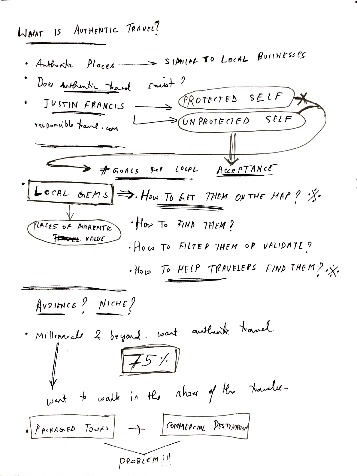
I started brainstorming and trying to identify what exactly is authentic travel? How do I define it? How would I help travelers achieve it through a mobile application?
THE AHA MOMENT
The aha moment occurred to me in my research when I started identifying and defining what exactly authentic travel was. According to Justin Francis the CEO of responsibletravel.com,
“When you read more about human psychology you learn about the ‘protected self’ – the barriers we create and use to hide our hopes, fears, and insecurities from others. The ‘unprotected self’ reveals the soul and is authentic. What can we learn from this in tourism? Do the places and people that reveal most of their souls, who act in an unprotected way, appear the most authentic? I think perhaps they do because they reveal a truth about themselves.” - Justin Francis, CEO responsibletravel.com
So I decided that the locals are the ultimate authority in deciding what the authentic value of their hometown is. And so my proposed solution from then on is,
Let the locals plan the trip for the travelers.
THE TARGET AUDIENCE
According to my research, the demographics of my target audience that is millennial travelers are as follows.
94 % were between 18-30 years of age which meant I need not be restricted to conventional technologies.
98% of younger generations ranked ‘eating local cuisine’ as something that was very important.
88% of them traveled overseas between one and three times a year.
Another piece of information that was important was that an article by Forbes states that the millennial generation is by far the loneliest generation because of immersive experiences of technology causing detachment from the surroundings. This piece of information is particularly important because detachment can cause a huge hindrance to the kind of experience I wanted the users to have on their travels.
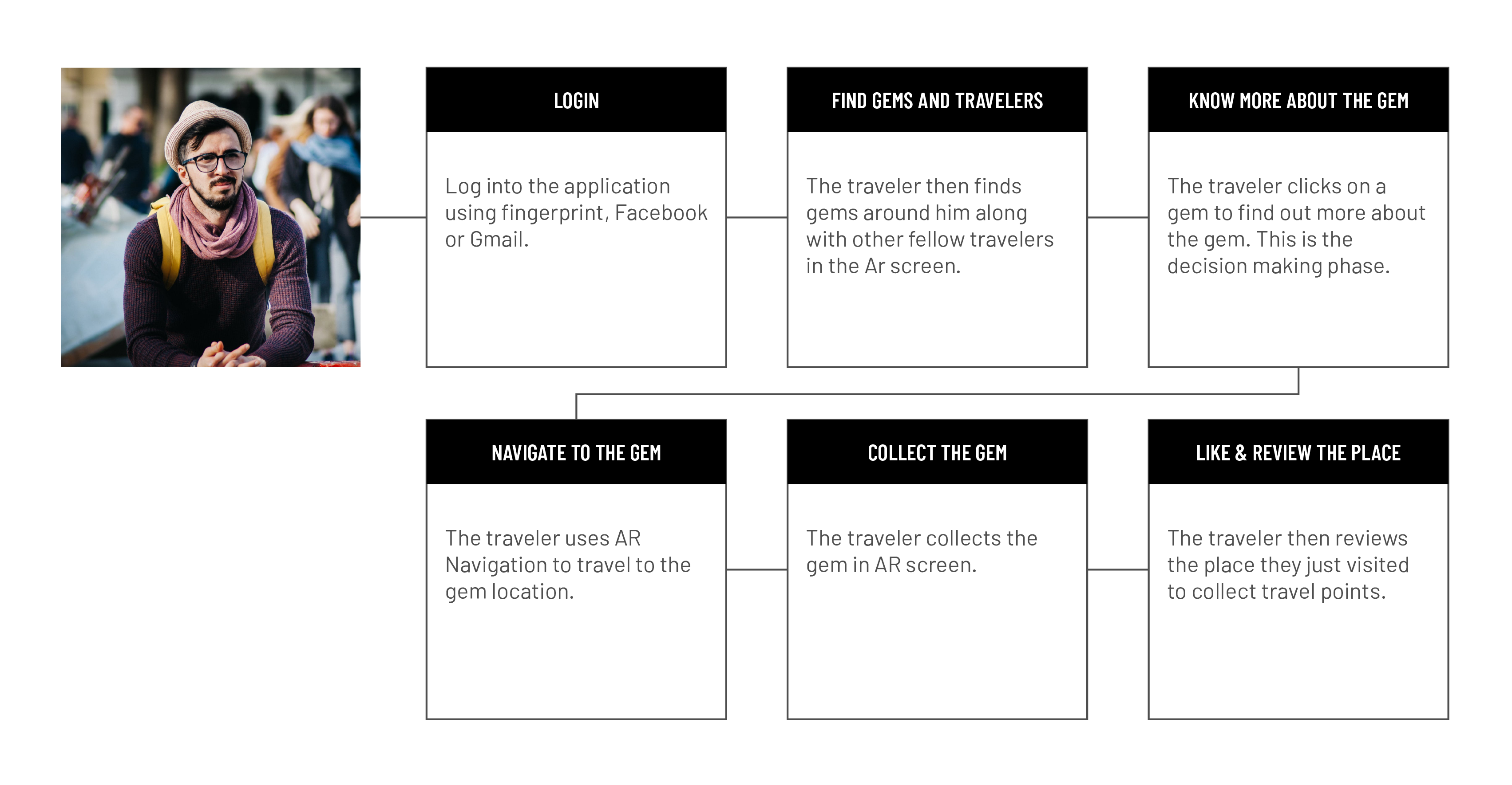
With this research in mind, I came up with a persona for my decision-making process. The persona took into account the typical mindset of the millennial traveler.
Learnings :
- Locals are the main judge of what is authentic or special about their hometown
- Many solutions exist for this problem but none that encompasses serendipity
- Augmented reality has a lot of potential with respect to the gamification of the whole process
Assumptions :
- There is already a database of authentic places created by travel influencers and locals of a community that the platform leverages to enable this interaction model
- The user has seamless connectivity in most areas they travel (or close by)
Considerations:
- There is anxiety involved in choosing a new place
- There is anxiety involved in traveling to a place
- There is a sense of motivation that needs to drive travelers to choose authentic places over packaged tours and chains
INITIAL APPROACH
After I had my concept, I started visualizing the solution. I went with a metaphor for these places of authentic value. I started calling them "local gems" and began incorporating them into my solution as gems. I also took into consideration the technology I would use. I decided on using augmented reality as I felt that it would place the user in the environment even though they are staring at a mobile screen.
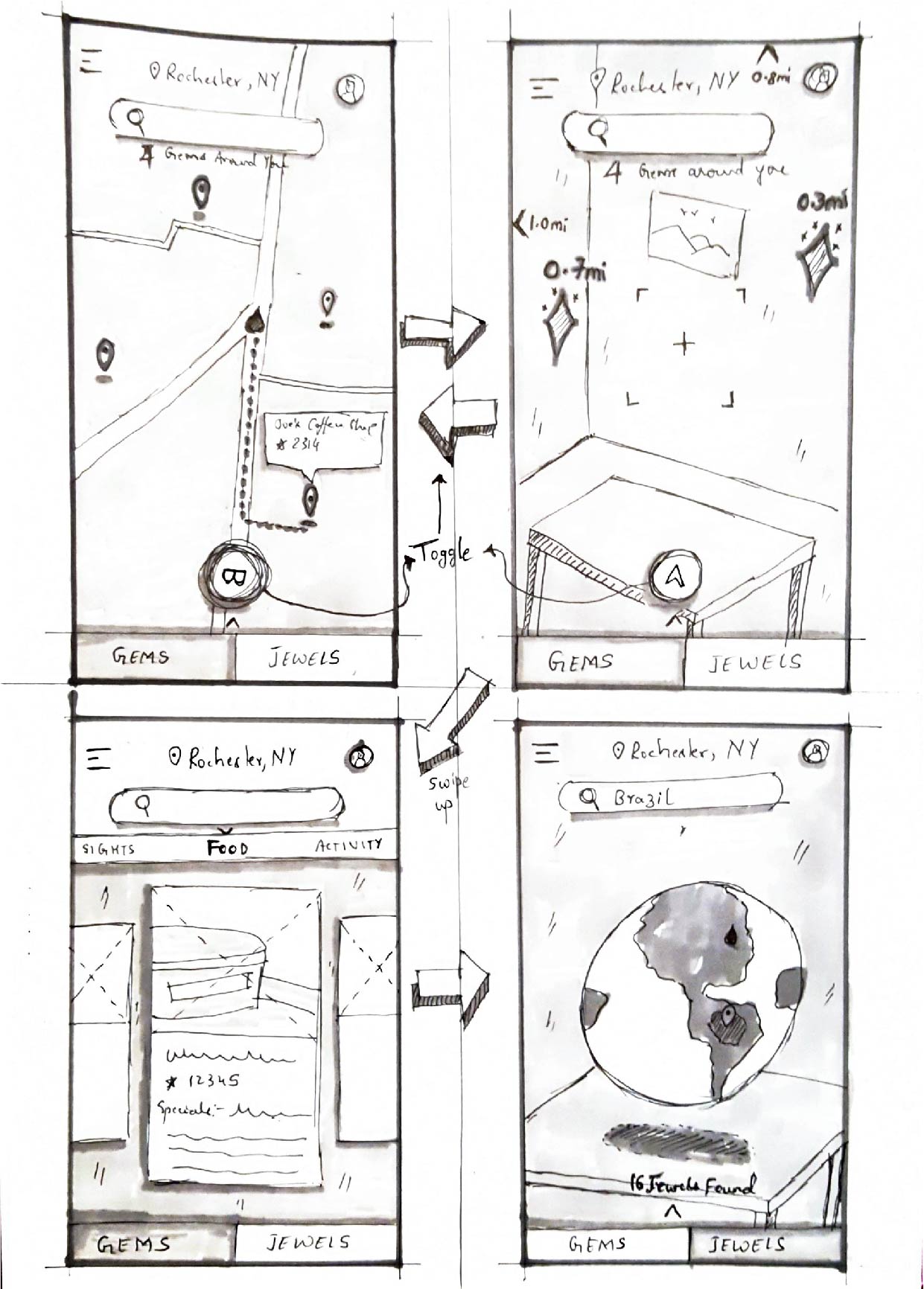
For the first iteration, I went with the concept of visualizing an augmented reality Earth in the living room which would help them add places they would like to go to ( like a bucket list ) but this solution was not pragmatic when it comes to leveraging local knowledge to pin locations.
For the first iteration, I went with the concept of visualizing an augmented reality Earth in the living room which would help them add places they would like to go to ( like a bucket list ) but this solution was not pragmatic when it comes to leveraging local knowledge to pin locations.
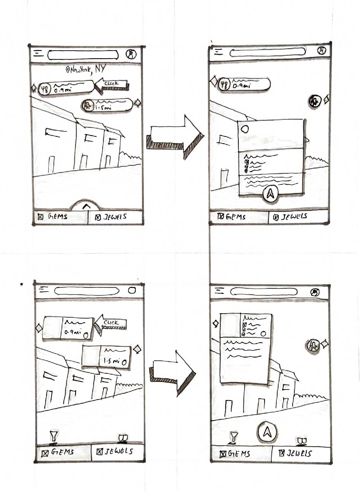
I then started visualizing gems as cards that would appear on the AR screen. The left gems would be gems on the left of the user's direction and right would be gems to the user's right. These would be gems that the user has chosen to see. I developed my next solutions based on this concept.
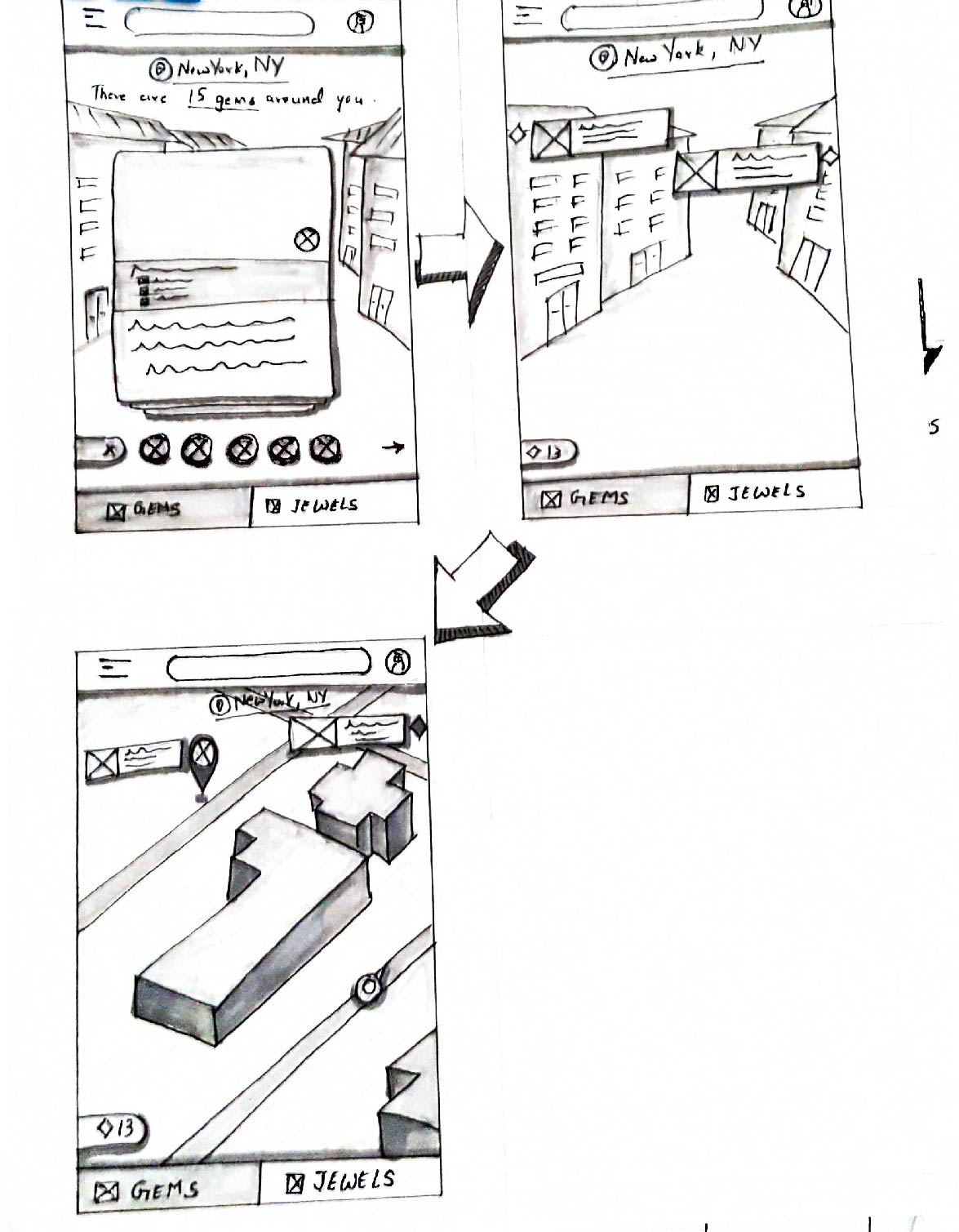
The third iteration was closer to a more pragmatic solution. The traveler would see gems as cards on swipe right on the screen or by clicking on the little button at the bottom. Then proceed to swipe up to add. This solution was rejected because it caused an issue with return and filtering.
ADDING CARDS TO AR SCREEN
There were multiple ways the user could add the gems. Some of them I had explored in my sketches. In this phase of my thesis, I started visualizing them with motion.

PUSH AND ADD
The user swipes through gem cards and pushes them onto the AR screen. The list or "cards" of gems if appears from the bottom of the AR screen without an anchor causes an issue of how it would return back.

SWIPE AND ADD
Users swipe right to add and left to delete. The design solution solves the previous issue but complicated filtering as the number of filters that they will need cannot all be fit on one screen.

SCROLL AND ADD
Users will scroll through a list of gems and add them by swiping right. The gems in a new tab solved the previous issue of return and navigation.
The problem with this approach was that after ideating and visualizing the user adding the gems onto the AR screen and then pursuing them, I realized a hard truth about it. There is no serendipity in adding gems to the AR screen.
REVISED APPROACH
Since serendipity played such a crucial role in the traveler's experience, I started ideating on a model that would circle around the concept. The second approach was inspired by the first one. I wanted to have the locals plan the trip for the travelers by pinning locations and having only authentic locations on the map. The general approach to my solution had 4 main goals.
LOCAL CONTRIBUTION
Leverage local knowledge and let the locals pin locations of authentic value.
AUTHENTIC LOCATIONS
Have only authentic locations on the map and filter out commercial destinations and chains.
SERENDIPITY
Instill a sense of serendipity in the travelers' experience.
TIME SAVING
Reduce time to find places of authentic value while the user is on their travels.
CONCEPTUALIZING SERENDIPITY
Since there was a conceptual flaw in adding gems to the AR screen, It was then decided to start fresh. This time I wanted the gems to appear on their own. But it was not clear when they would appear at first. After some brainstorming, I came to the conclusion that I would use the user's direction of movement to make the gems appear on its own.
A personified field of vision for the gems. The gems would now appear on their own. A field of 90 degrees would be used to make the gems appear in the direction of movement.
VISUALIZING FAMILIARITY
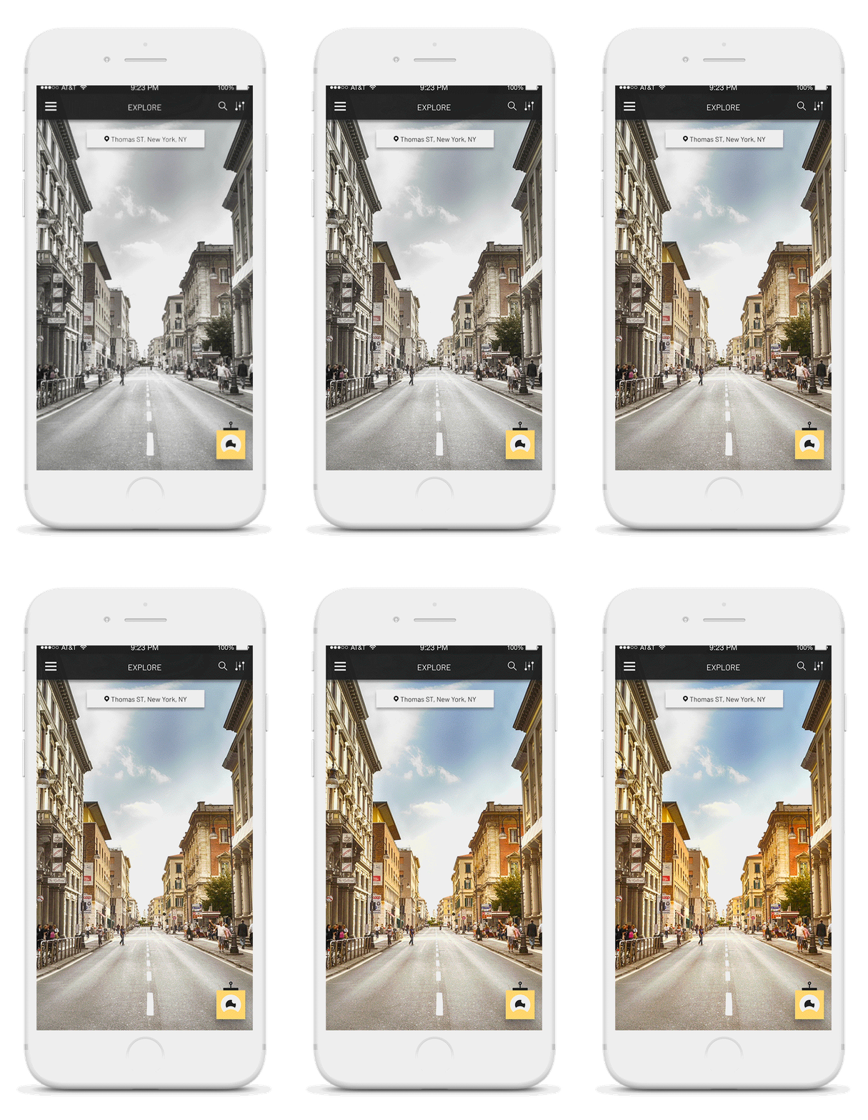
As the users collect gems, their familiarity with the place develops. I wanted to capture this phenomenon in the form of interaction.
The initial screen the user would see in a new location that is not their hometown would be desaturated. As the traveler collects gems, the saturation of the screen keeps increasing as demonstrated here.
REVEALING GEMS
Now that I was clear on when the gems would appear on screen, I wanted to ideate on how they would appear. Below shows the ideation on the gems behavior with the change in direction.

SLIDE-IN
The gems would slide into the screen as soon as it is in the field of vision of the traveler.

EXPAND IN X
The card would expand on the X-axis and disappear in the reverse order.

EXPAND IN Y
The gem cards would expand in Y-axis and disappear in the reverse order.
DISTANCE & DIRECTION
Gems needed to move with distance to act as effective feedback for the traveler. There were multiple ways to achieve this and ideating on them was crucial to determine the best way to do so.

GEM MOVES DOWN
As the traveler gets closer, the gem moves downward.

GEM MOVES UPWARD
As the traveler gets closer, the gem will move upward.

GEM MOVES UP AND EXPANDS
As the gem moves up, the user can expand it with a trigger.
SERENDIPITY IN DISCOVERING GEMS
The gems appearing with the direction of the user's phone is shown below. The different forms of the gems depend on the proximity of the user to the actual location of the gem.
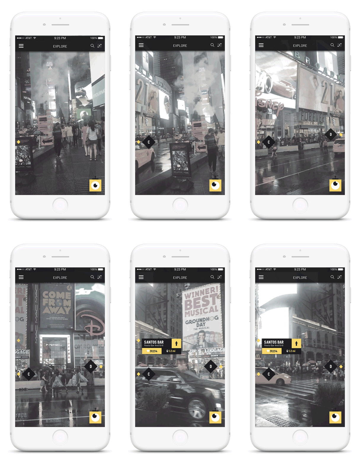
GEM BEHAVIOR WITH DIRECTION
As the traveler changes the direction the camera of the phone is facing, gems appear and disappear as the gems appear in the "field of vision".
GEM BEHAVIOR WITH DIRECTION
As the traveler changes the direction the camera of the phone is facing, gems appear and disappear as the gems appear in the "field of vision".
GEM BEHAVIOR WITH PROXIMITY
As the traveler moves closer to the gems, the gem changes 3 states. The first one is the diamond card that changes into a card at the proximity of 1 mile. And changes again at the proximity of 0.3 miles or 1000 ft.
ROVAR'S ROLE IN SERENDIPITY
Rovar the bot was created with a primary function of being a part of the serendipitous experience of the traveler. The bot is present on every screen of the application and serves two main roles.
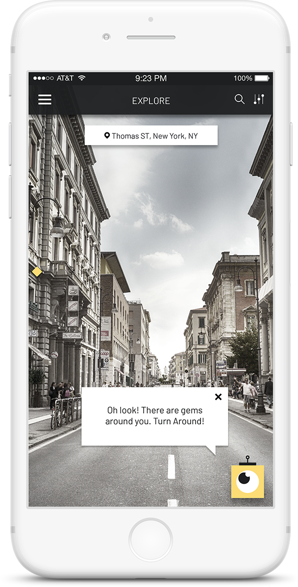
DIRECTION
Rovar the bot acts as a gem compass and directs the users to nearby gems when they are not present on the screen.
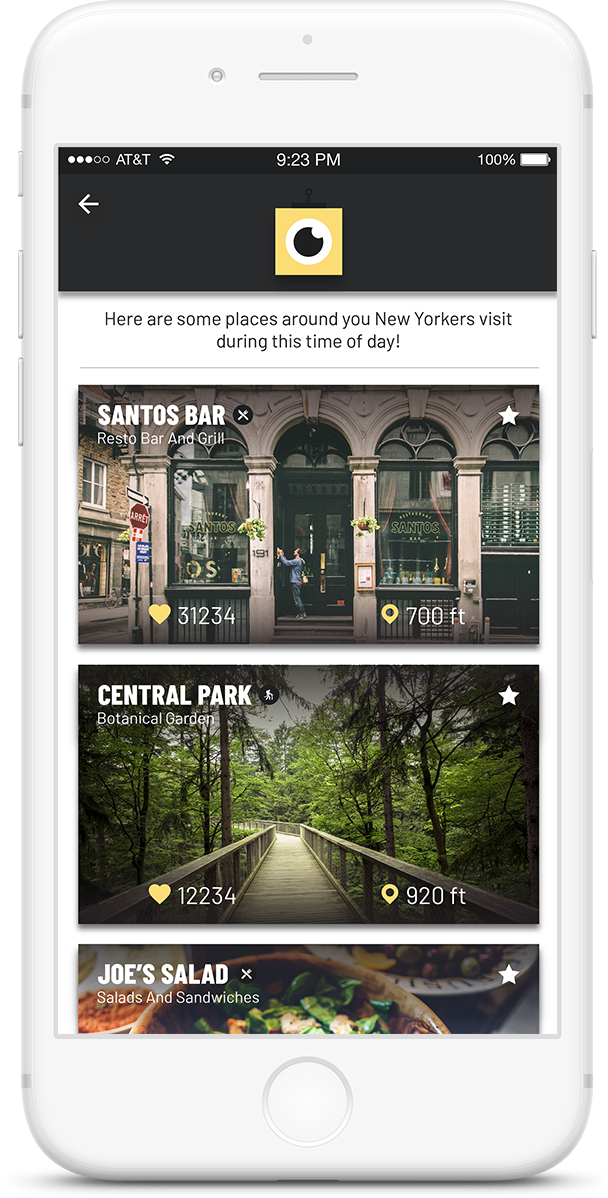
PERSPECTIVE
When the user is confused about places to visit, a click on the bot, reveals a screen with suggestions about nearby gems.
MAKING THE DESIGN COMPREHENSIVE
To add to the serendipity of discovering gems, I wanted the users to be able to explore gems that are not in their field of vision when the need calls. So I incorporated a gem list that has filters such as food, adventure, sights etc that have gems listed from the nearest ones to the farthest at their fingertips.
DISCOVER GEMS
The users can access the discover gems screen from the menu. They can search for locations and the gems within this screen.
SOLVING GEM CLUTTER
By the model I was following, there was a scenario I had to pay close attention to. When two local gems were close to each other, it could cause the gem cards to overlap. So I started to ideate on solving this problem.
ELIMINATING PATTERNS
I further ideated on how visual clutter caused by overlapping gems could be resolved. These are some interaction patterns I eliminated.

MINIMIZE GEMS
Minimize gems when they are in the way of other gems underneath.

TOGGLE BETWEEN GEMS
Toggle between gems when they overlap by clicking on the gem icon.
TOGGLE BETWEEN GEMS
Toggle between gems when they overlap by clicking on the gem icon.

DELETE GEMS
Swiping right on the gem deletes it. The gem icon becomes smaller and disappears.
FINAL SOLUTION
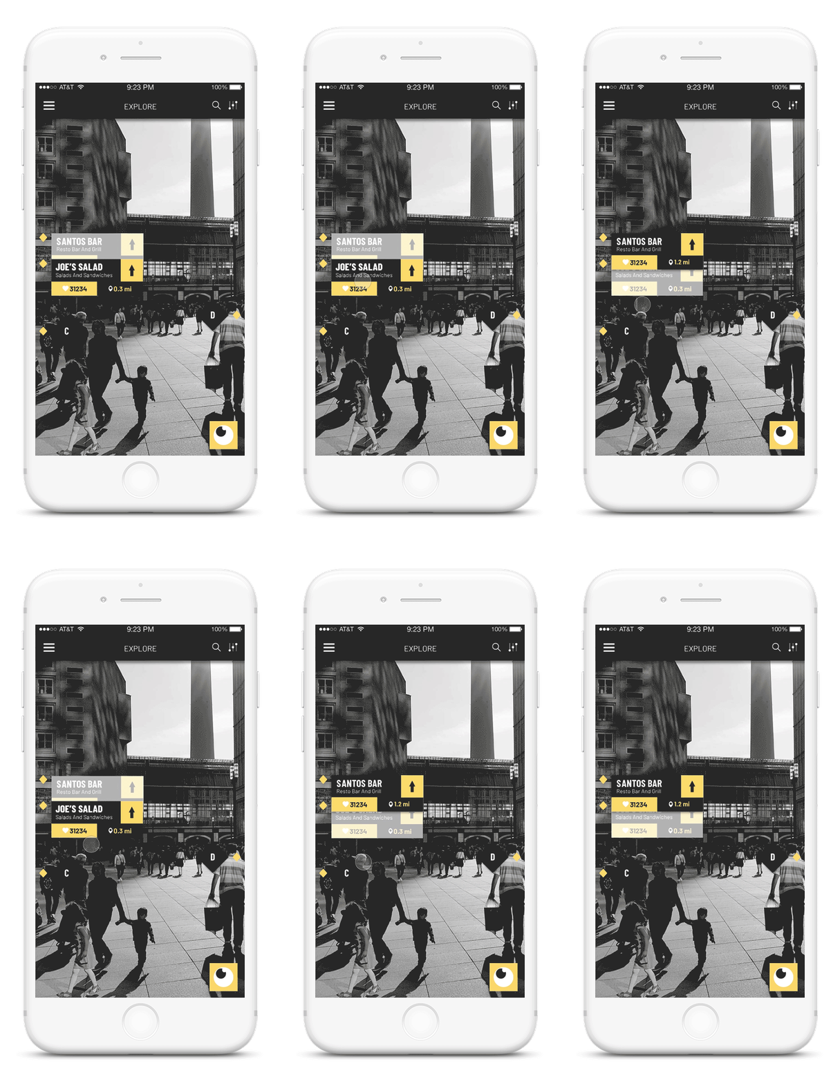
To solve the problem when two gems overlap, I came up with the interaction model where the user would drag the one on the top down to move it down. I chose this method primarily because it was also an affordance.
DRAG AND TOGGLE
The users can drag a gem downward to move it underneath any gem it is overlapping. It is sent to the back of the stack of gems. The gem being overlapped is now more transparent.
AR SCREEN TO MAP
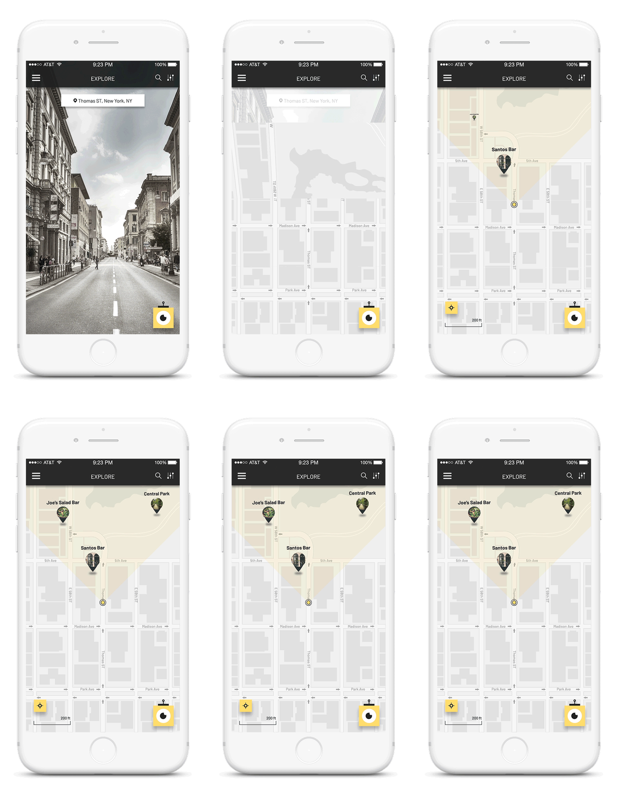
A map is necessary to keep the design comprehensive. It is also convenient and reduces the traveler's anxiety in finding places. I wanted the transition from AR to Map screen done with respect to the inclination of the device.
EXPLORING TRANSITIONS
My initial approach had a trigger such as a button or a screen itself to go from the Ar screen to Map view.


FINAL SOLUTION
My research suggested that users hold their phone to read at a rough angle of 60 degrees from the ground. I leveraged this into my interaction. From the threshold of 90 degrees to 60 degrees, the user would see the AR screen, and then from 60 to 0 degrees, the user would have the map.
TRANSITION WITH AN AFFORDANCE
As the user moves from a 90-degree angle to a 60-degree angle, the screen transitions into the map view.
AR NAVIGATION
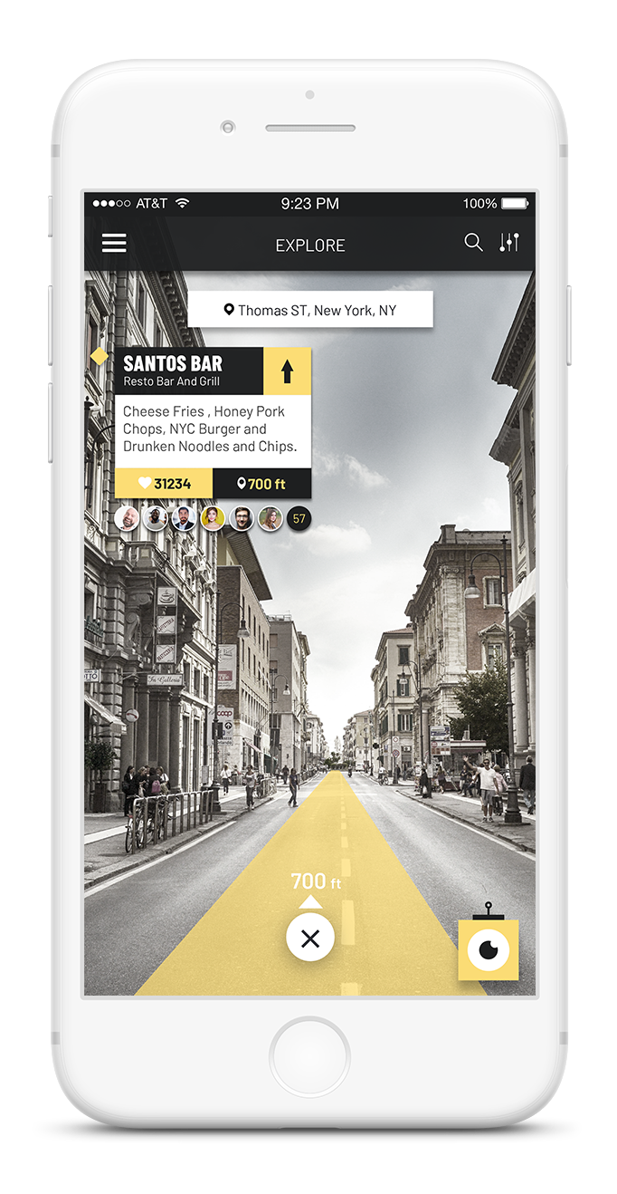
Travel is more about the journey than the destination. Since transit is a major part of it, AR navigation allows the users to be involved with their surroundings more than staring at a map screen while on the move.
LIT PATH
While driving, or in transit, the user can see the path they have to travel on being lit. This is also a convention usually followed in AR navigation.
The last stretch of the use case involves legwork. The same concept of being involved with the surroundings is the reason for the AR navigation model. The fact that crowds can pose a problem while walking when the user is staring at the phone is taken into consideration.
ARROW NAVIGATION
Since the traveler is walking looking into their screens, the arrows accommodate crowds and adjust to give the direction in which they need to walk.
COLLECTING GEMS
The next part I tried to resolve was the collection of gems. The gems would be placed on either the vertical or horizontal surface of the place they were pinned. Here are some of my ideations.
COLLECTION MODELS
I ideated on the interaction that was affordance as well as a metaphor for collecting gems. Some of my ideations are given below.

DRAG AND DROP
The gem in this ideation is dragged from the AR screen and placed in a section. I realized this was not a pragmatic solution when it comes to development.

LONG PRESS
In the version of the long press, I made the design more pragmatic as a click or a long press is possible in AR and that would trigger the capture.
THE FINAL SOLUTION
The final version of the collecting gems problem has the user matching a silhouette of the gem to the actual AR gem. This solution is pragmatic as the silhouette appears when the gem is in the view of the screen which means no extra interaction, and the solution is easy to implement as well.
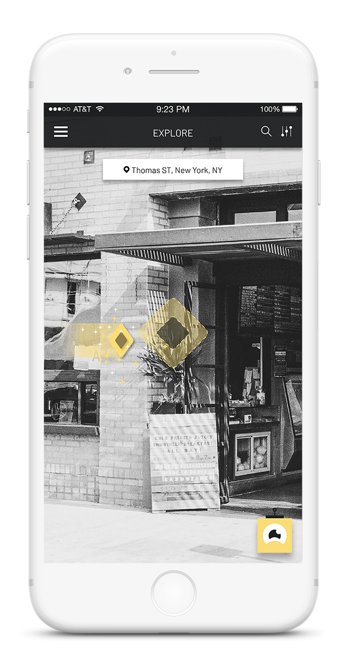
GEM COLLECTION
The user matches the gem diagram to the actual gem on the wall to collect it.
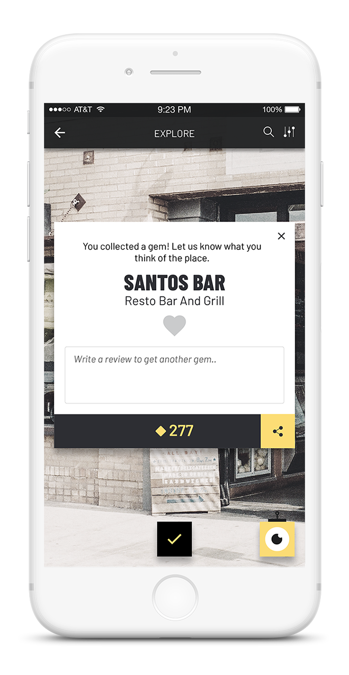
TRAVELER REVIEW
The travelers are notified that they have to write a review as soon as they collect the gem. They can choose to write it after they have visited the place if they collect it prior to their actual visit.
LOCAL CONTRIBUTION
Every traveler is a local somewhere. By taking responsibility as a local, the users can contribute to the application. On the local side of the application, the screen is completely saturated. The gem pinning process looks something like this.
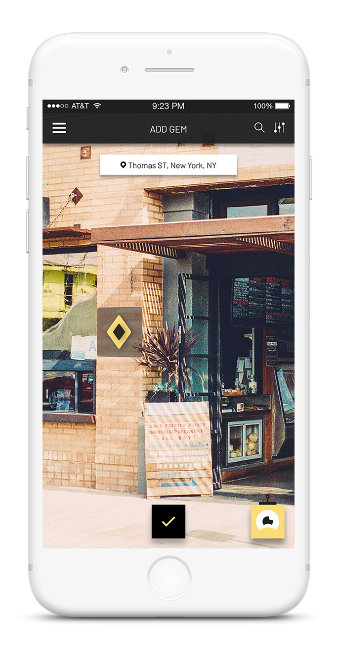
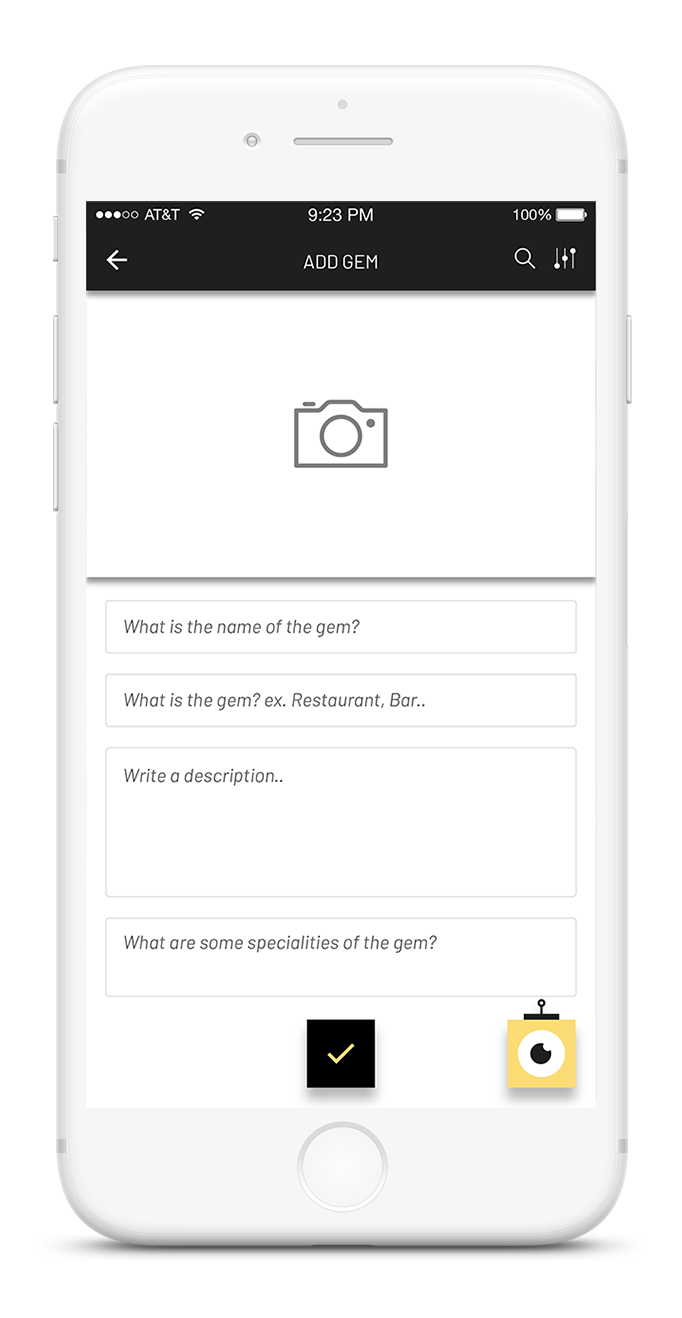
ADD GEM
The user can add a gem by selecting the option from the menu. They can move the gem around in perspective to place it in the area.
THE AUTHOR
When the local pins the gem, they can upload images and fill out the fields to complete the process of adding the gem.
GREY AREA QUESTIONS
There are some grey area questions that I felt needed to be answered before the whole project can be complete.
HOW TO AUTHENTICATE GEMS?
When a local pins a location on the application, there needs to be a workflow to authenticate it. The workflow that I am adopting is that the gems after they are pinned, need to be authenticated by locals before it can appear in the traveler side of the application.
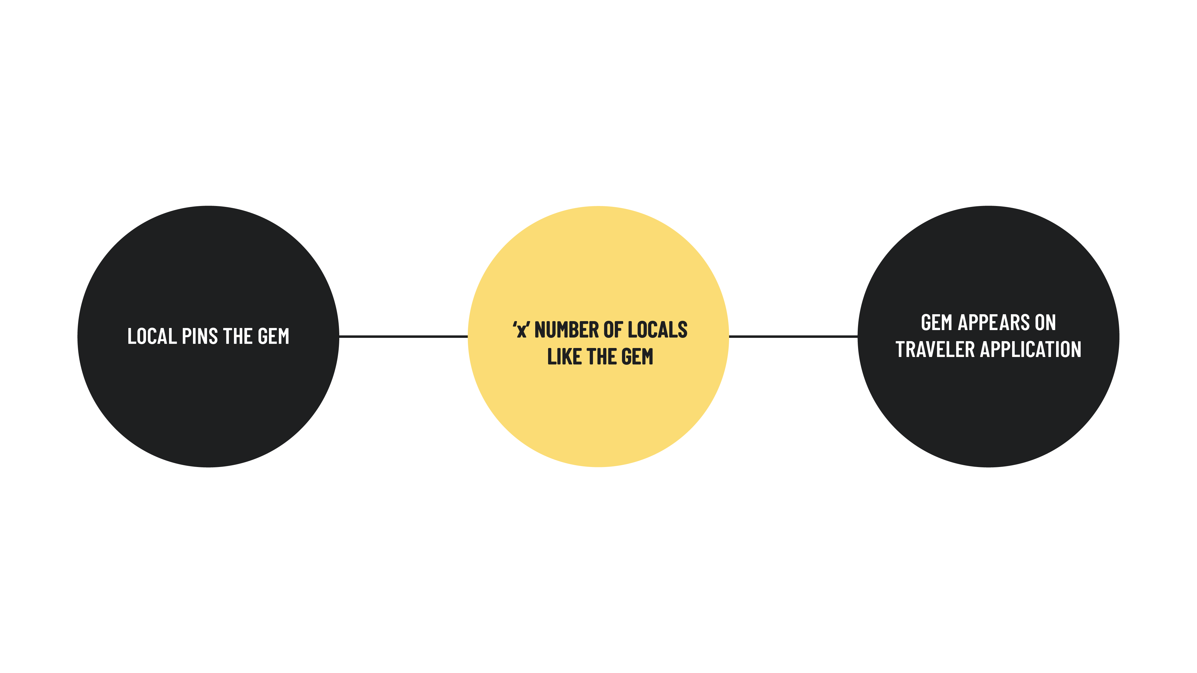
There is a specific number of local likes a newly pinned gem needs to receive before it can appear on the map on the traveler side of the application.
HOW TO FIND THE VALUE OF "x"?
The number of likes a gem needs to receive is deemed 'x' as it is a variable that keeps changing. It depends on parameters such as population density, behavioral patterns etc. The value of 'x' can be found more accurately than I can by using voting algorithms. Here is an example of what I mean.
Consider the user is pinning a fast food restaurant on a Monday in Brighton, Rochester, NY, as a local gem for that area.
The population density as of 2017 in Brighton is 2.38K per sq mile. Behavioral patterns of US eating habits suggest that 25% of people go to a fast food restaurant during a workday afternoon. If in those 2.38K people, if say 1000 local people are using ROVAR, the value of x is calculated in the following manner.
25% * 1000 = 250. Considering possibilities such as people wanting to go eat somewhere else, or people have brought their own lunches etc, we can graciously consider 10% at least will go to the fast food place that afternoon since it is a local gem and they are within 1 mile from it. Which means, 10% * 250 = 25.
So in conclusion, 25 locals would need to like the gem in a 24-hour time span for it to become live on the traveler side of the application.
Considering the prowess of voting algorithms out there, this value can be much more accurate.
IN CONCLUSION
With ROVAR, travelers are able to get an authentic travel experience while succumbing to the serendipity of discovery. The places they see are authentic and have been accumulated leveraging local social media. The travel process of finding these gems have been accounted for with affordances and sufficient decision making to call it an optimal solution for the problem of authentic travel.
PROJECTS
Osmo - PlayOsmo StoreSolving contextual challenges and designing the store infrastructure | UX UI Design | Prototyping |Testing
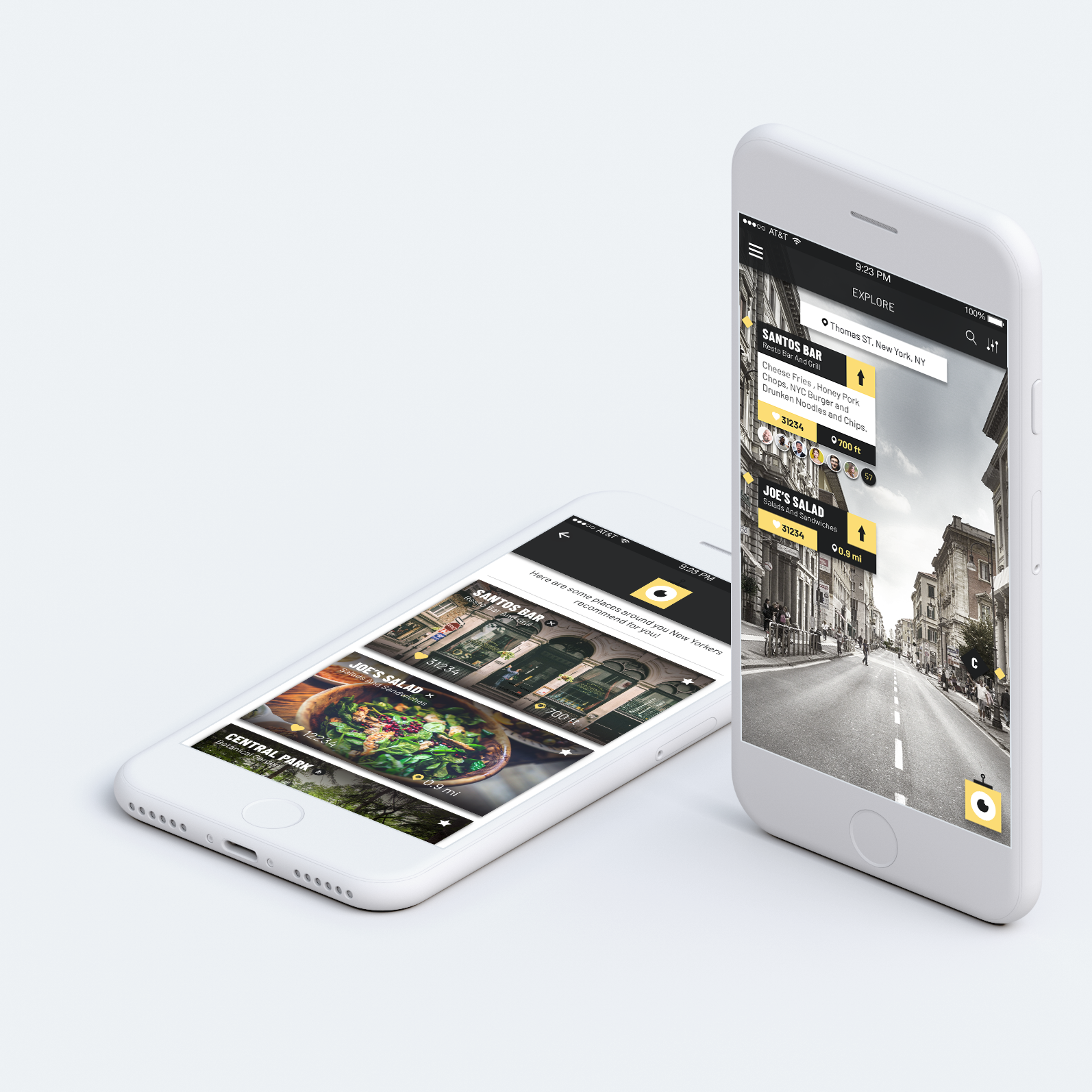
MFA Thesis - ROVAR Authentic Travel Leveraging Local Social Media | Interaction Design | Prototyping

Enel X - TrendsEnergy Management & Demand Response | UX UI Design
SHOPRSmart shopping for events | UX UI Design
GigtherapyAn anxiety free concert experience | UX UI Design
© 2022 Akshay Kumar Arun
