SHOPR
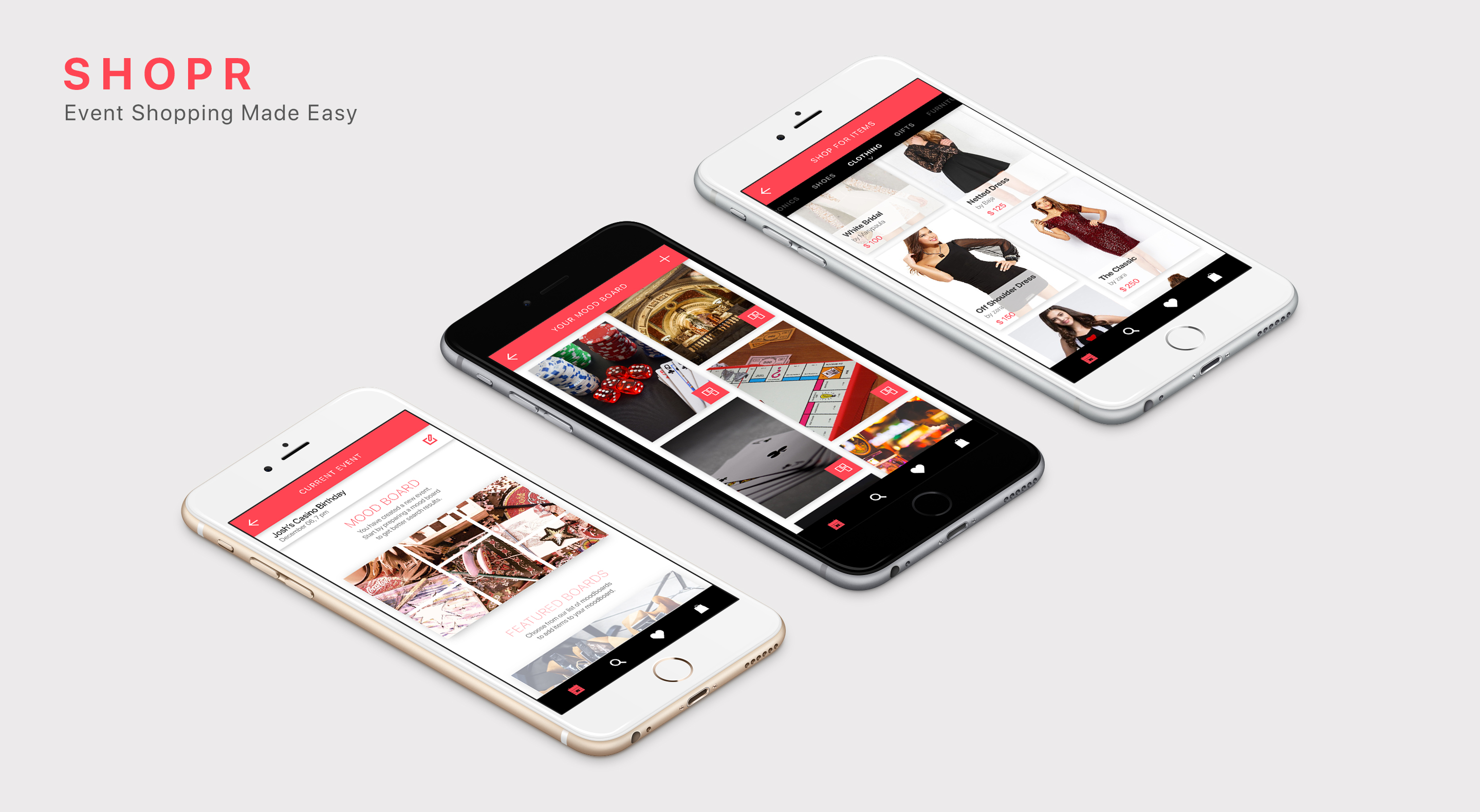
SHOPR is an online marketplace designed specifically for event planners. It helps users shop based on themes by creating mood boards and offering suggestions. When you planning a super bowl party, SHOPR lets you create a mood board of items that fit the theme and recommends items to buy.
Comparison with similar applications: Amazon, eBay etc. are lacking in this way because they are all experience of shopping for individual items. SHOPR allows users to shop for every article based on a theme derived from mood boards the user creates. Pinterest does a similar job but it is not curated for shopping or events.
Motivation: Lack of tool for abstract theme based shopping for events.
Type: Individual School Project.
Duration: 4 Weeks.
Skills: UX research, Wireframing, Visual design.
Tools: Illustrator, Photoshop.
THE PROBLEM
Event planning industry does not rely on just one application for all their needs. There is 24Me to keep track of the outside world, Asana for team building, ArrangeMySeat for seating arrangements etc. My research shows that there is no application that allows for curated theme-based shopping for event planners and shopping for a theme based event becomes tedious. I wanted to give everyone, not just the resourceful event managers, the capabilities to find what they are looking for in shopping and vendors for an event through this application. This will also allow for broadening the application's market pool.
"I wanted to give everyone planning an event the capabilities to find what they are looking for in shopping and vendors for an event through this application"
How to give event planners the necessary shopping tool that is curated to the theme of the event they are organizing?
IDEA
Leveraging image recognition capabilities in search engines.
- The capabilities of image recognition can be leveraged in search engines for abstract theme based shopping.
- A domain of this functionality will be particularly useful is in independent shopping for items while organizing an event.
- Creating mood boards that emphasize a particular theme as a search criterion can be a good way to find items that are curated to the theme of an event.
RESEARCH
I began my research by examining the way users use their phones for online shopping. I found out that 79% users stop using a platform for shopping if they do not find stuff they are exactly looking for quickly.

Shoppers use search engines before buying any product online around the world.
Shoppers use search engines before buying any product online around the world.

Shoppers use a mobile phone instead of computers or tablets for their online shopping needs.
Shoppers who don't find things they were looking for quickly on a shopping website are less likely to return to the same website again.
FIRST THOUGHTS
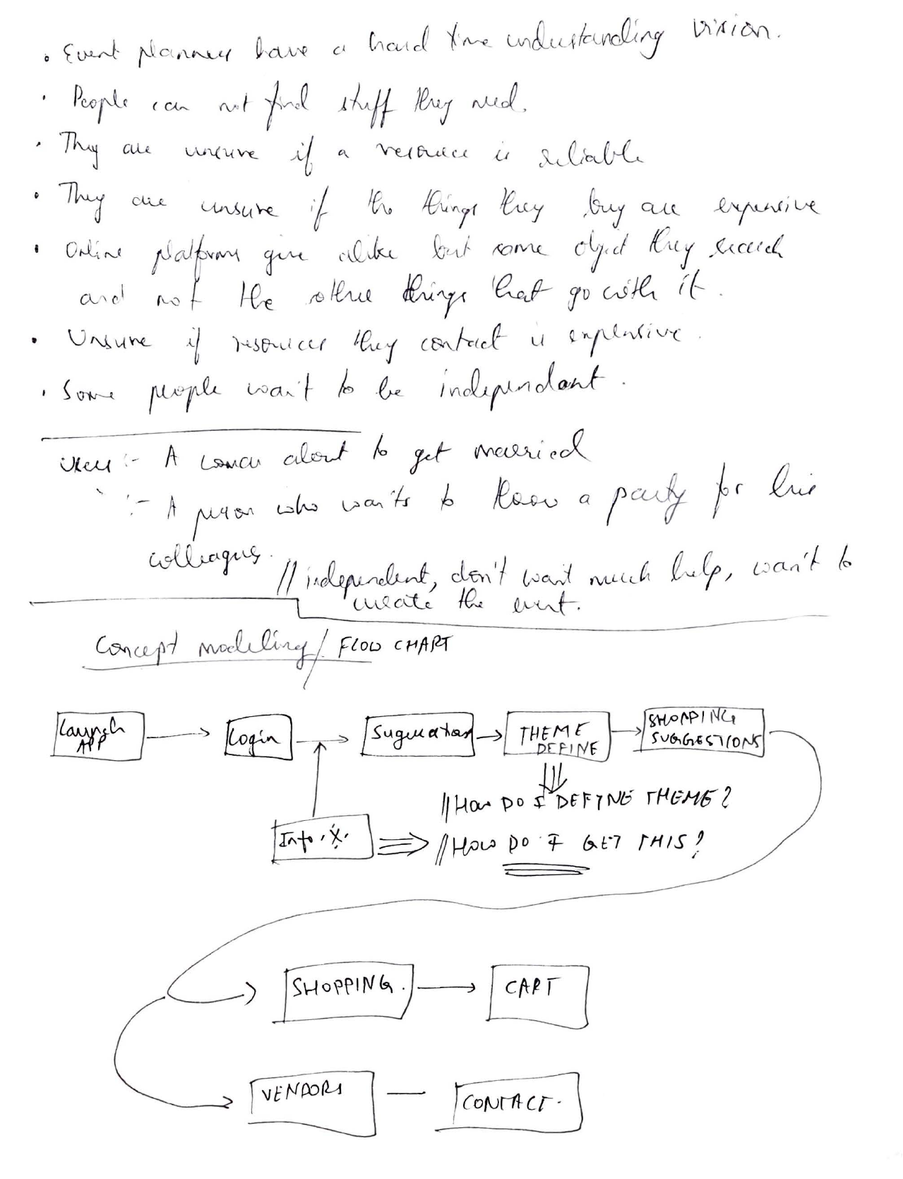
I began my design process with some brainstorming, and that led me to define my users' empathy maps and landing on definitive information architecture. Here are some of the design process notes I took.
Brainstorming
I started off by laying down the ideas in the form of brainstorming. I wanted a basic idea of who my users were and what use they might have with the application.
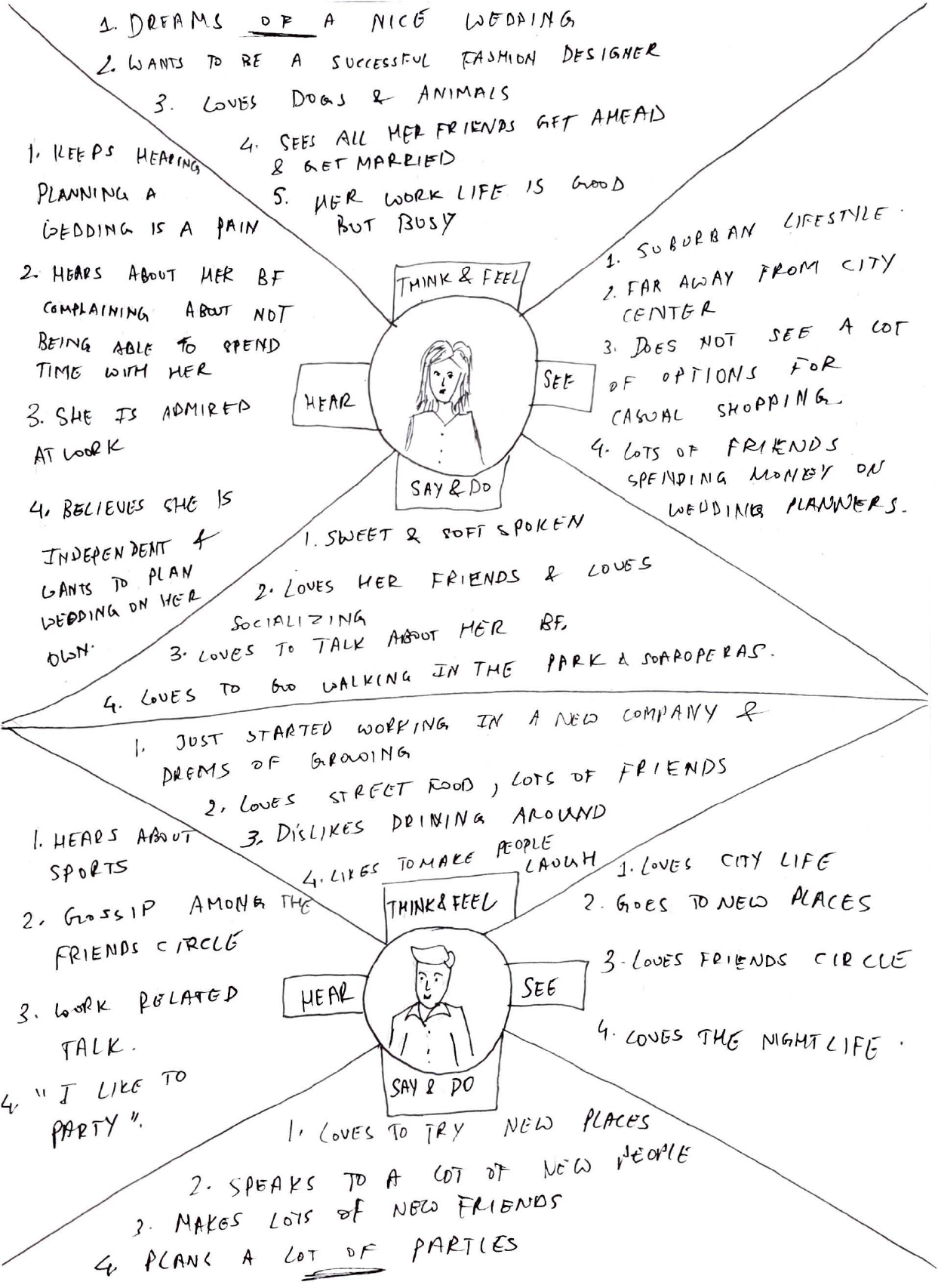
Empathy Map
I then wanted to understand the user so I did an empathy map of two users with different characters and lifestyles. I understood from this that control the user has over the search results is important.
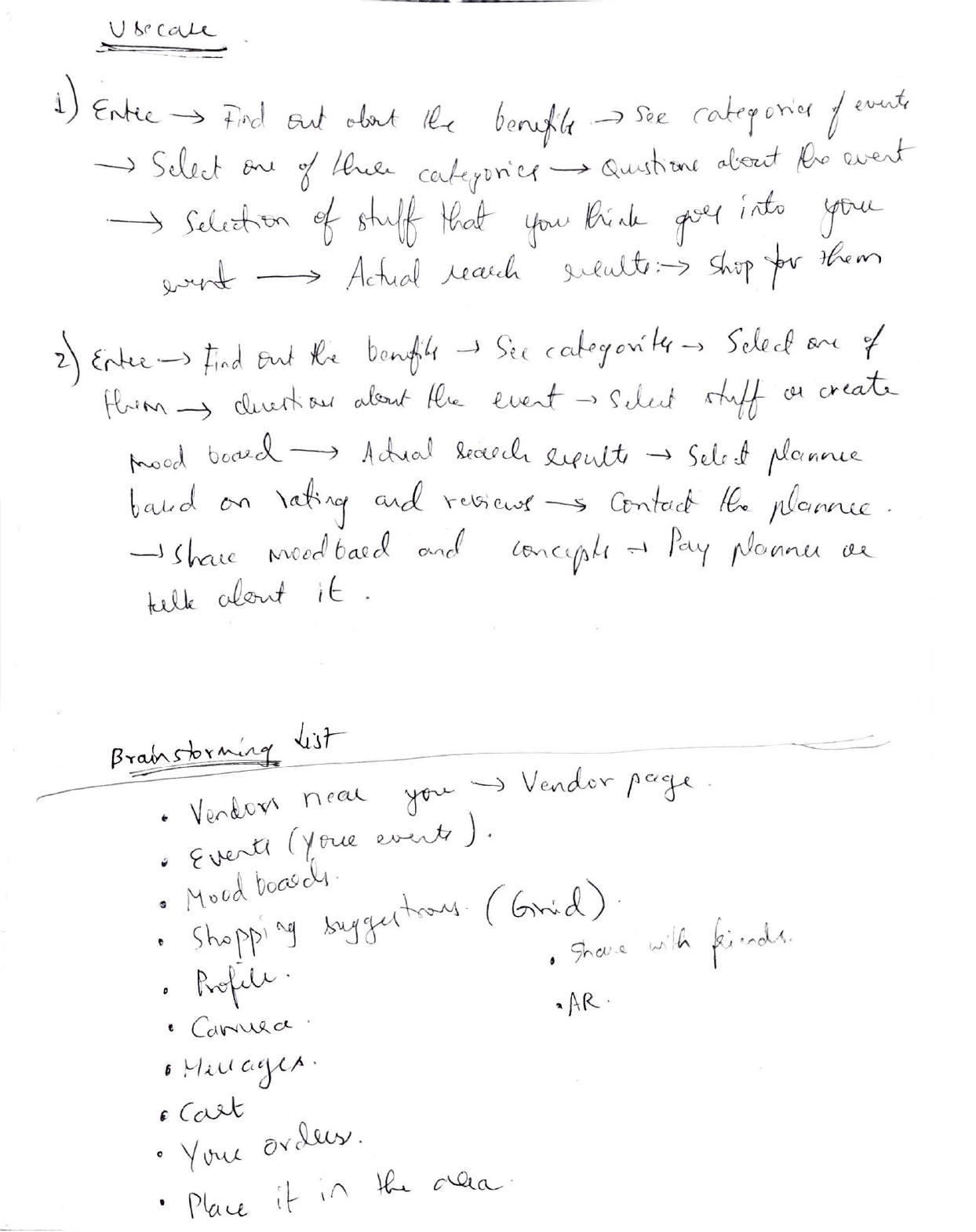
Use Cases
I then proceeded to define the typical use case of my user. I took two scenarios, one where vendors were contacted and one where they were not. The use case had flaws so I brainstormed a list once again.
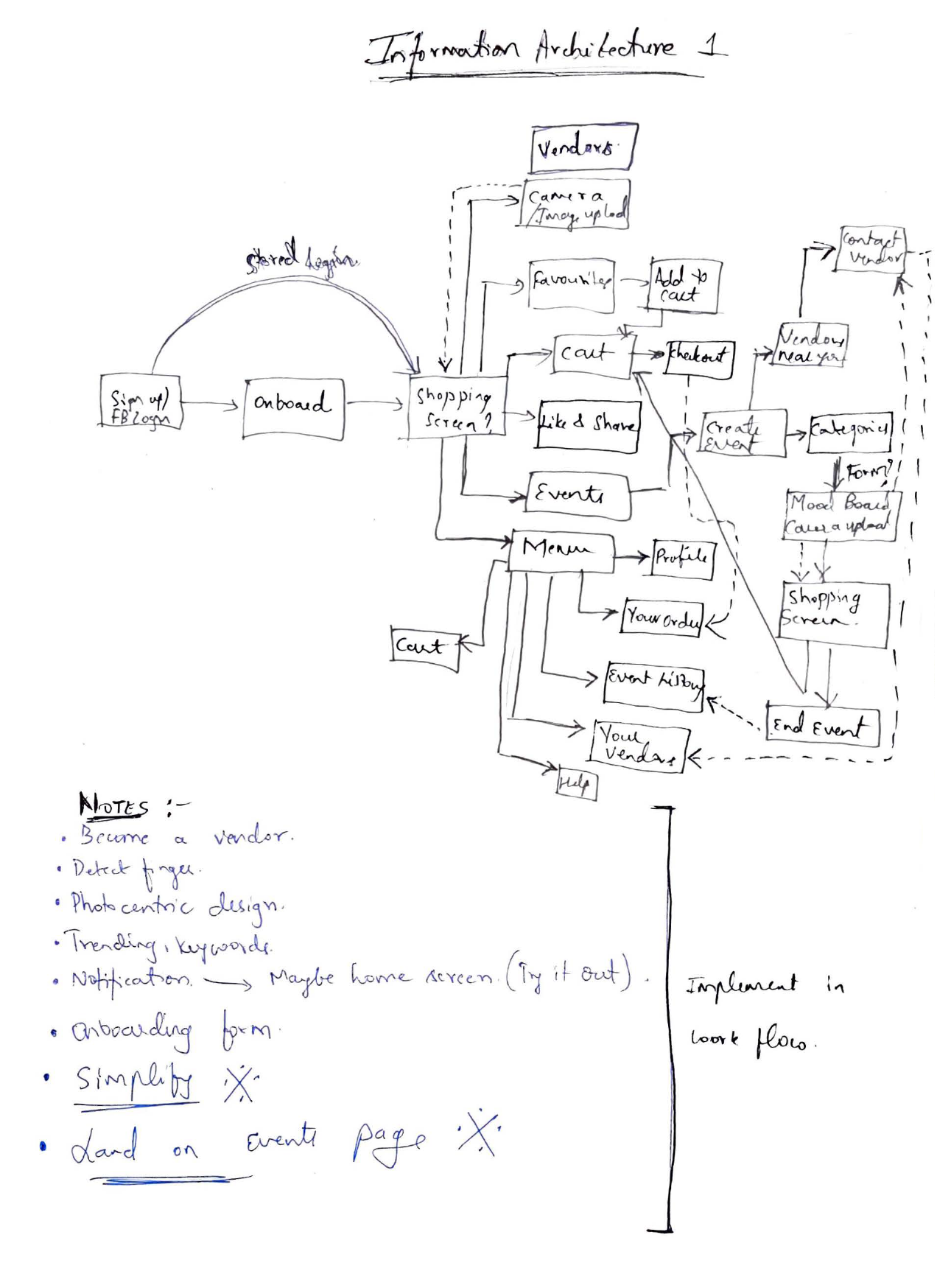
Information Architecture 1
I then made an attempt at defining the information architecture. The first one was too complex so I made some more notes to implement in the second one.
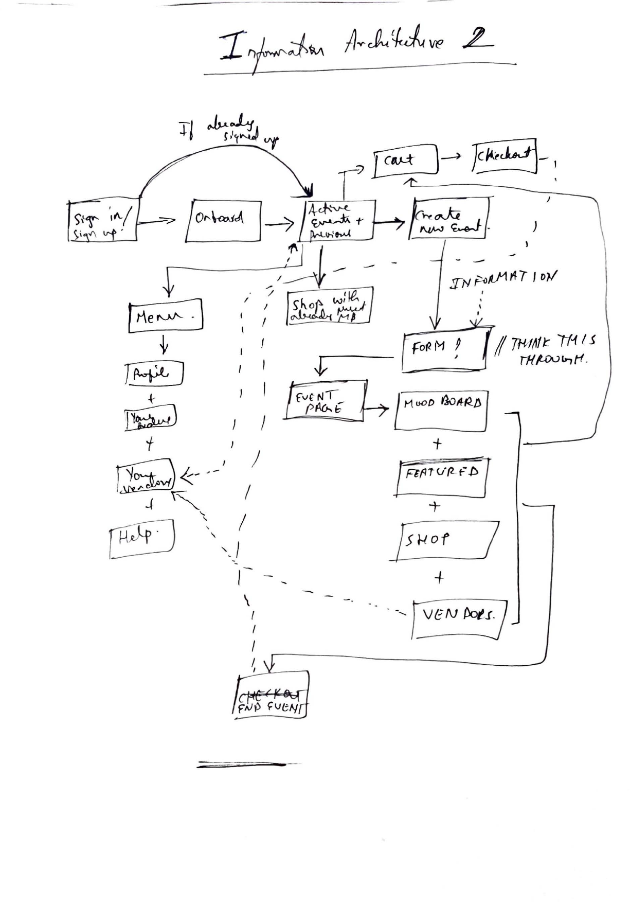
Final Information Architecture
The resulting information architecture was simple and efficient. I chose to implement it in my workflow.
GENERAL APPROACH
The approach I took was defining the theme of the event initially before the users shop for items based on that particular theme. This will curate the suggested items to the event and save time.
The users must first feed initial data about the event, and then prepare mood boards to give the search engine, the necessary knowledge base. The outcome of the application must be to give users only search results based on their event theme for their shopping needs.
GAP IN THE MARKET
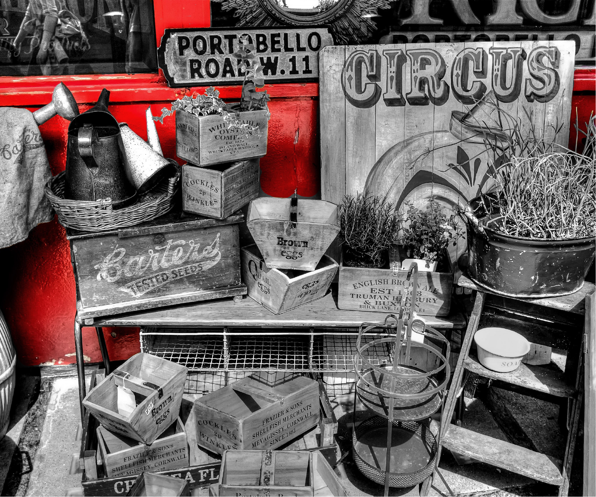
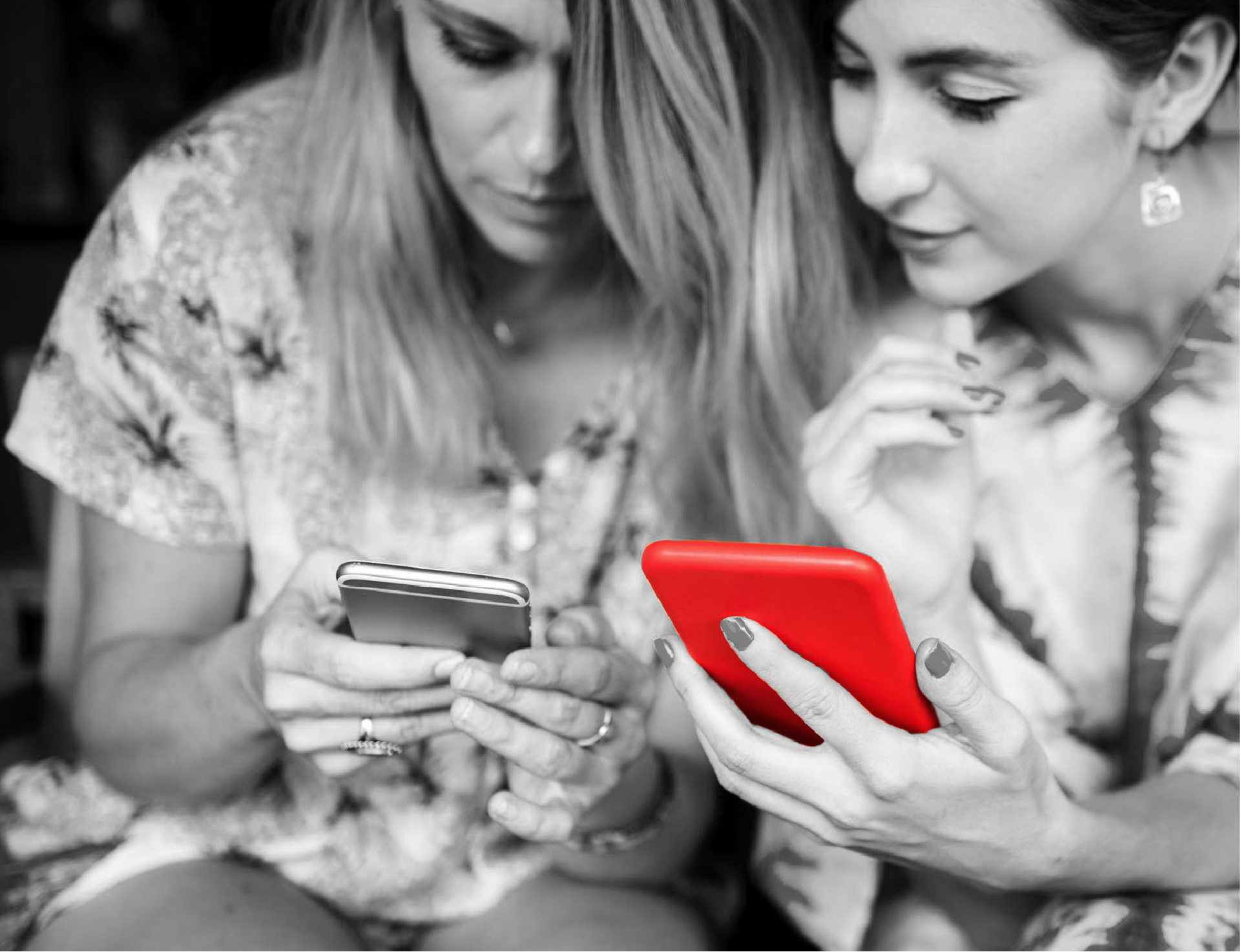
There are multiple applications in the market that use image recognition software to identify objects in a picture taken by the user to give effective search results.
Amazon, eBay, and Pinterest are some applications that have incorporated image-based search engines into their applications. I came to understand from the competitive analysis that the gap in the market was that none of the shopping applications were allowing for theme based shopping.

Pinterest uses other shopping websites and reroutes its users for shopping needs
Pinterest uses cards as their sell point. All articles are cards in a masonry grid.
When it comes to search, uses image recognition for their searches. It gives accurate results but is not curated for shopping.

Amazon has a wide variety of articles to shop from but is not curated to a theme.
Amazon uses lists for their selection process.
Amazon uses images as well for searching, but it searches based on the article, not based on the event theme.

eBay has articles which are tough to search for as it does not give suggestions for a theme.
eBay has articles which are placed in a list format as well.
eBay uses image searches to find similar articles if not the same one.
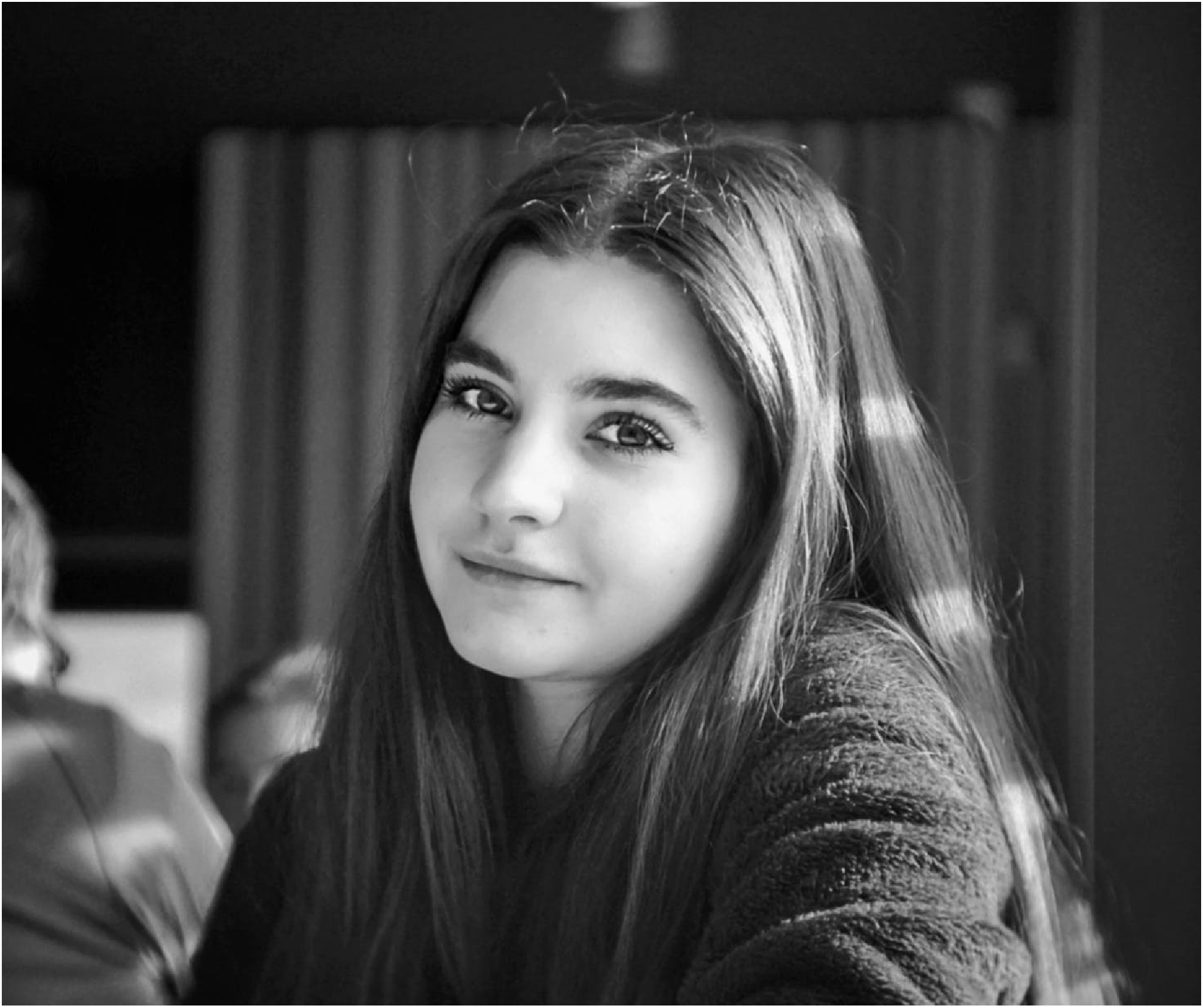
PERSONA - MEET SOPHIA
“ I would love to take my time shopping for things I need while organizing an event, but the problem is I don’t have the time anymore.”
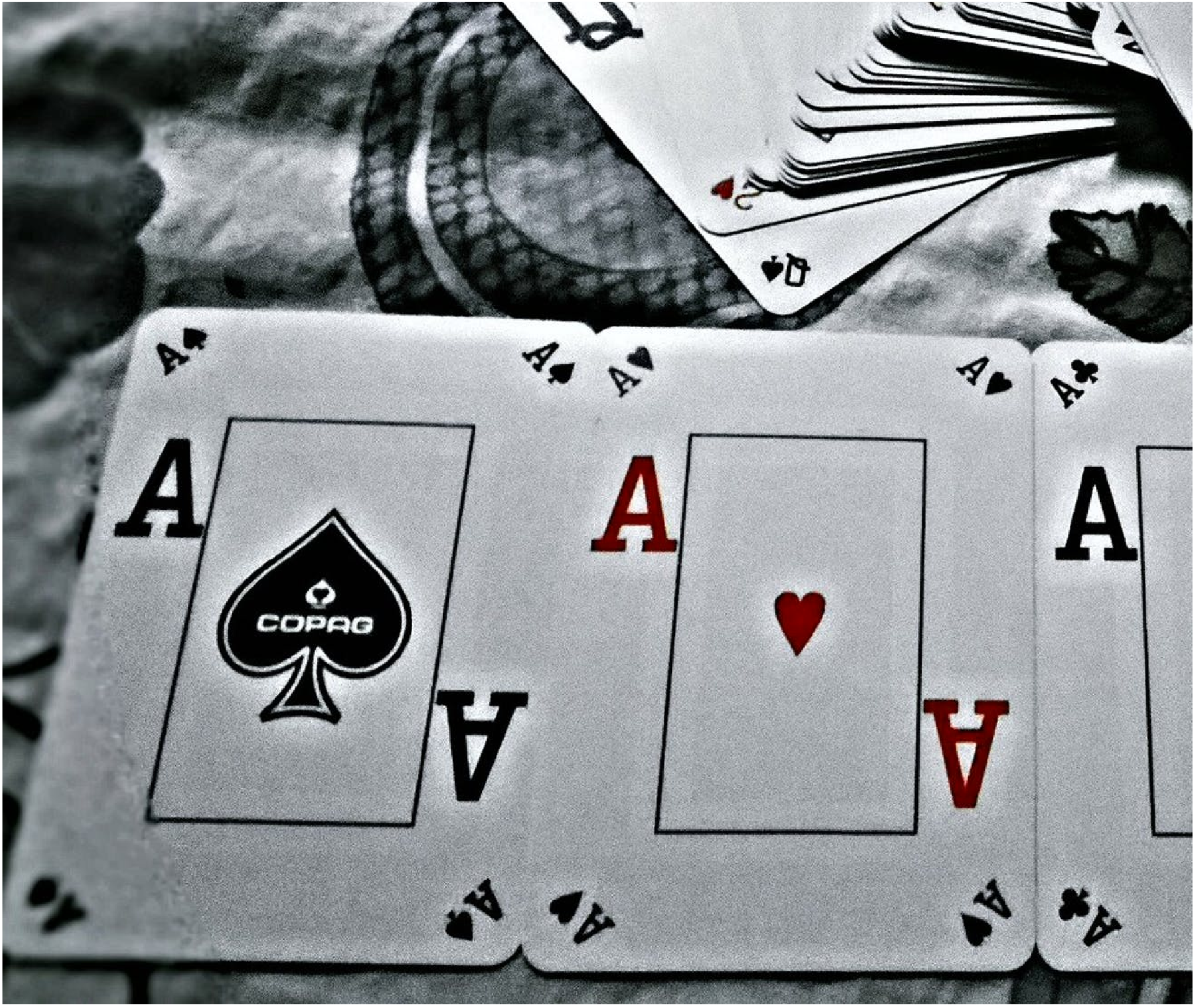
Sophia and her friends were planning to host a birthday party for her friend Josh in Las Vegas. But sadly the trip had to be canceled, so now she plans to give Josh the Las Vegas experience in the comfort of her home for his birthday. She plans to hold a casino theme party and is looking for resources to get clothes, accessories, food and more.
HER FRUSTRATIONS
- Sophia usually has to go to shops or browse through a lot of content before finding stuff for her events.
- She finds it difficult to reach out to reliable resources for help or suggestions.
- She finds it difficult to search for items based on an abstract theme for her events.
- She finds it difficult to recover from event disasters when a vendor cancels on her.
GOALS & OBJECTIVES
- Sophia should be able to shop for her event without having to take time away from her work.
- She needs to be able to shop for items with the help of effective suggestions so that she finds interesting things based on her theme.
- She should be able to find and reach out to vendors and shopping centers for planning her event.
- She needs a curated vendor list for her event, who she can contact when some other vendor cancels on her.
Goals And Objectives
- Sophia should be able to shop for her event without having to take time away from her work.
- She needs to be able to shop for items with the help of effective suggestions so that she finds interesting things based on her theme.
- She should be able to find and reach out to vendors and shopping centers for planning her event.
- She needs a curated vendor list for her event, who she can contact when some other vendor cancels on her.
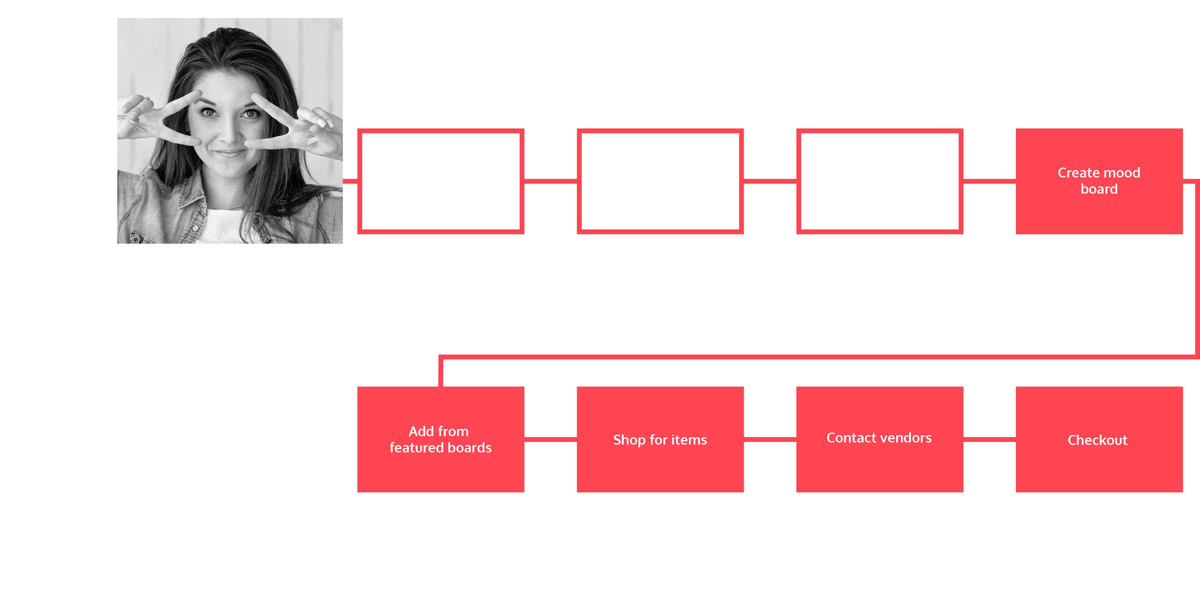
SOPHIA'S USE CASE
After my ideation, I came up with a decided use case for Sophia and how she will make use of the application for Josh's Birthday Party.
CONCEPTUALIZING
After I had a clear idea of the goals and objectives that had to be achieved, I started ideating on the interaction model. This is what I came up with. I later refined the design.
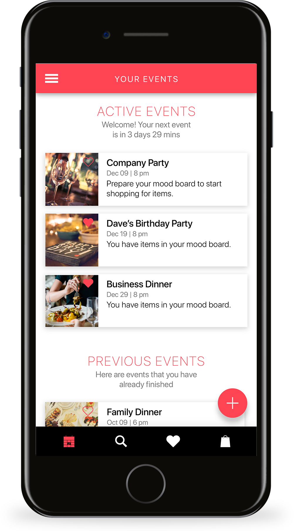
ACTIVE EVENTS
The landing screen displays active events the user has created for their shopping.
A list format was chosen for the display to include more information and the larger number of events on the screen. The active events are arranged in ascending order of date, from the closest event to the farthest.
PREVIOUS EVENTS
On scrolling, the user views the previous events that the user has completed.
A list format was chosen for the display to include more information and the larger number of events on the screen for this as well. The previous events are arranged in descending order of date, from the closest event to the farthest.
NEW EVENT
The floating call to action “New Event” button is placed on the bottom menu tabs. The call to action button appears only on certain screens where it is needed.


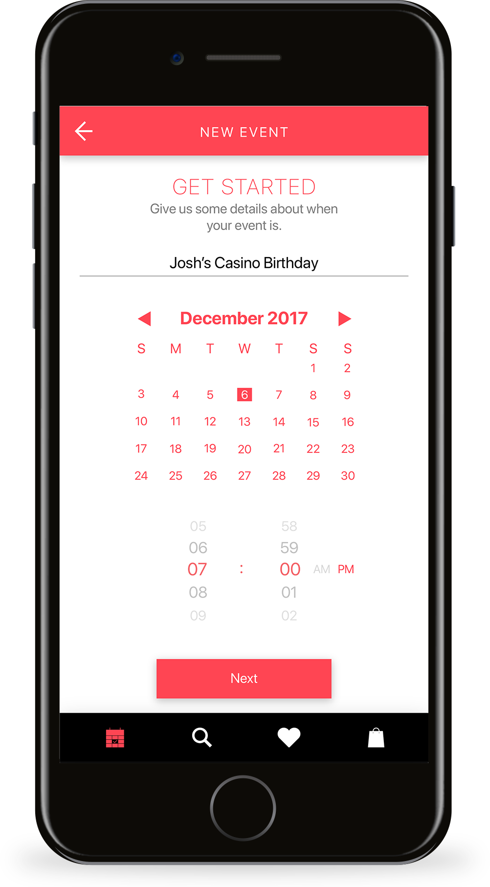
GET STARTED
The most important details in this screen that had to be captured were the event name, the date and time.
This feature was necessary to give users a reminder of the event when it approaches and also to identify the event from the list of active or previous events.
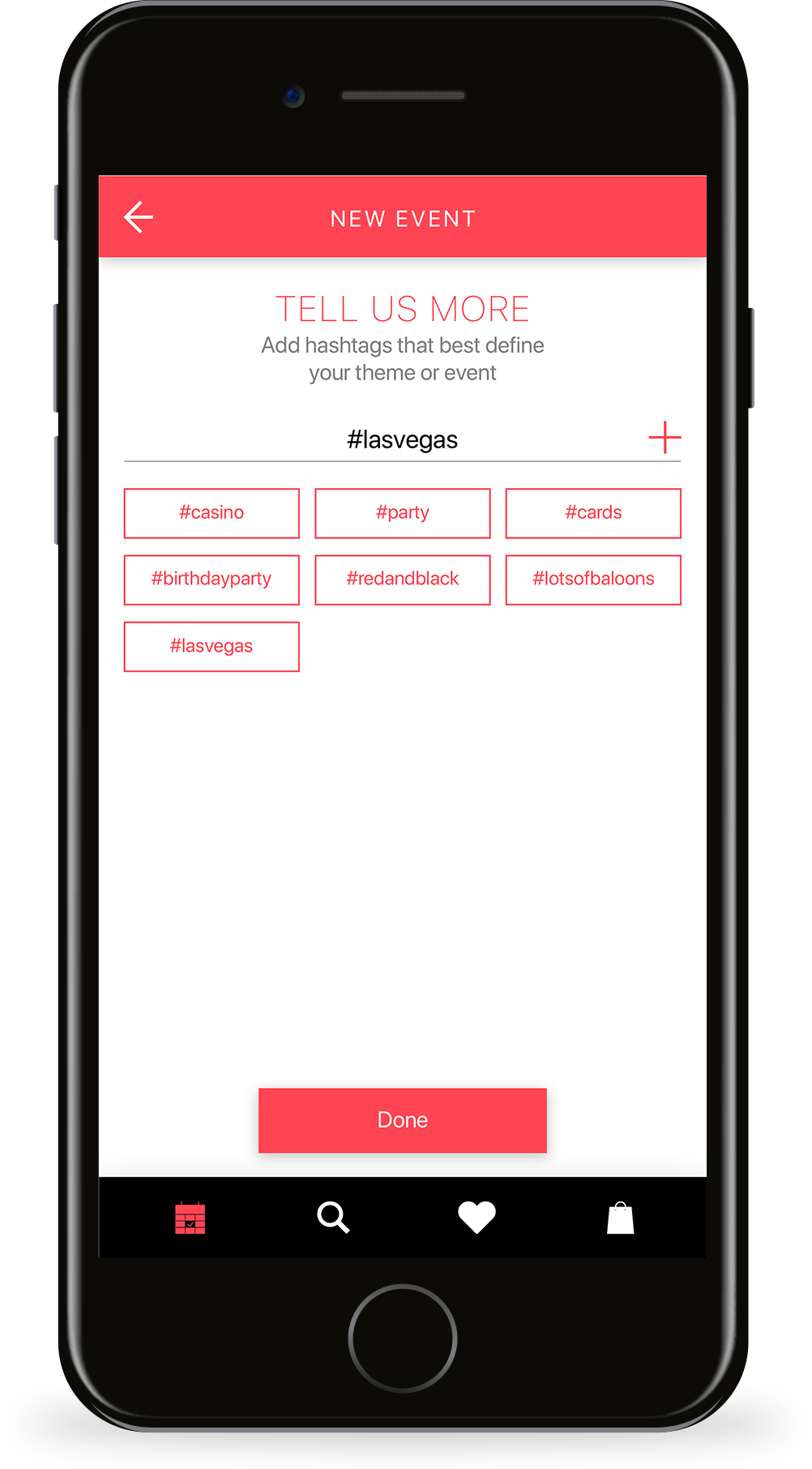
#TAGGING
To get initial search results before the user has a chance to refine it with the mood boards, details about the theme of the event had to be captured. I chose hashtags as an appropriate method to define a theme initially as they are abstract enough to get a vague idea of the theme.
The user goes onto add as many hashtags as possible to get the best possible search results to add to their mood boards.
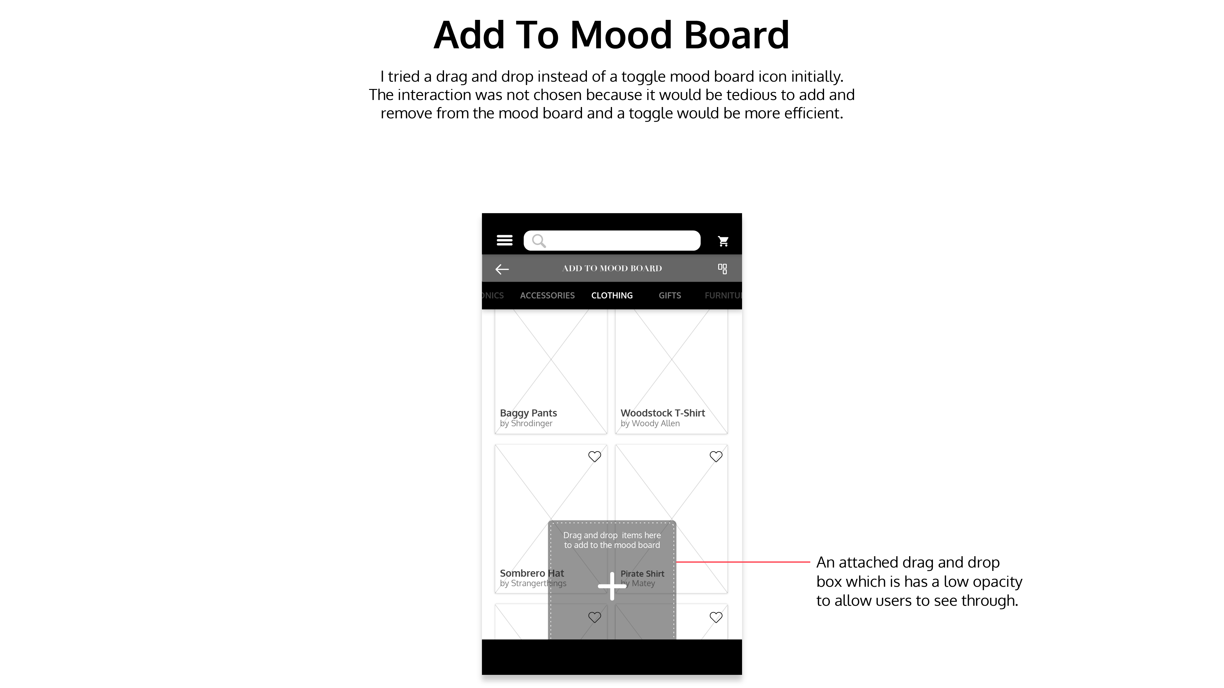
ADD TO MOODBOARD
A carousel-style filter menu is fixed at the top to browse various content.
The add to mood board screen follows a masonry grid to accommodate different image sizes. Along with a floating action camera button, a mood board icon placed at the top right corner of each item which can be used to toggle between adding and removing from mood board.
SHOP FOR ITEMS
The shopping screen after creating the mood board would have only items that will relate to the theme of the mood board.
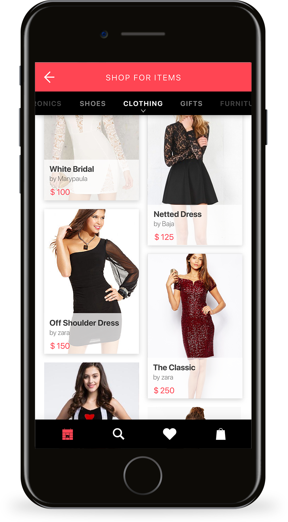
A masonry grid was used for this screen as well to accommodate content. The filter menu is accompanied by a drop-down menu to select shopping options for men, women, or kids.

DESIGN DECISIONS
- Changed the typeface in Heading from Didot to SF Pro Display since it gave the look of fashion related application rather than events shopping platform.
- Changed the padding on either side of the screen from 20 to 15px since the padding was too much.
- Moved the Search bar to a new tab in the bottom navigation bar to prevent two-tier header bars.
- Moved the cart/bag to a new tab in the bottom navigation bar to prevent two-tier header bars.
- Moved the Profile Into the menu since it was not a key feature that the user would frequently use.
OTHER ITERATIONS
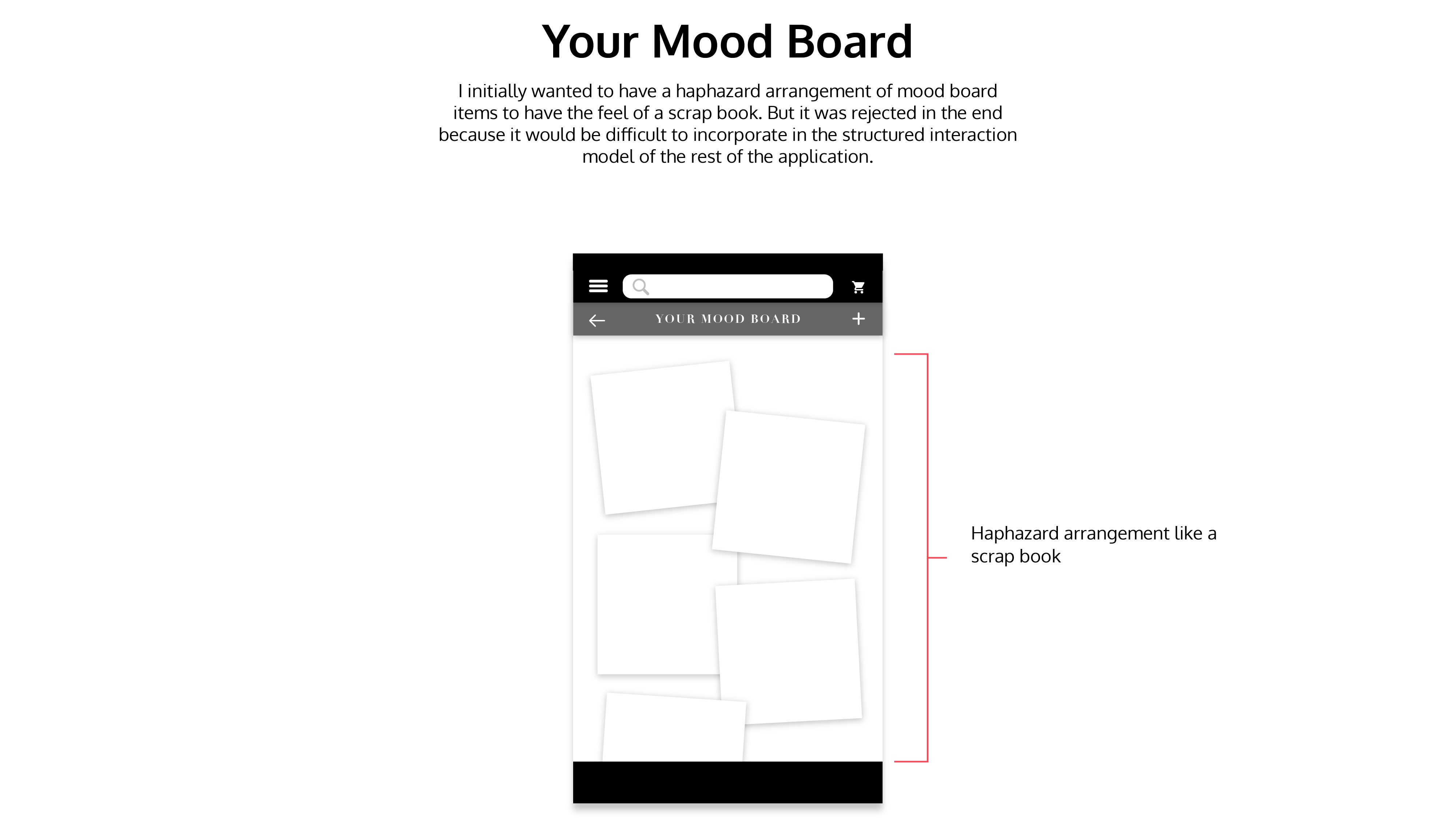
Here are some interaction model iterations that I tried before reaching my solution. These interactions were rejected because of flaws in either interaction flow or usability.

FINAL SOLUTION
SHOPR is a one-stop solution for event shopping needs. These are the polished designs. Let's see how Sophia makes use of it. She starts by logging into the application.
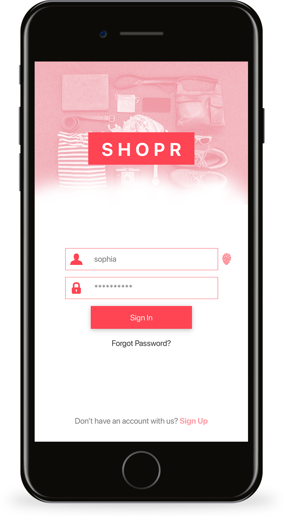
LOGIN
Sophia starts by logging into the SHOPR. She can use her username and password, or she can choose to log in using her fingerprint.
EVENTS
The landing page has details about her upcoming events. On scrolling, she can see her previous events as mentioned before. She clicks on the "+" button to create a new event she is planning for her friend Josh.
NEW EVENT
Sophia adds a date and time for her event. She calls the new event, "Josh's Casino Birthday".
#TAGS
Sophia adds some hashtags to the application which she thinks is appropriate to the theme of the event. She then clicks on "Done" to enter the event landing page as shown below.

MOOD BOARDS
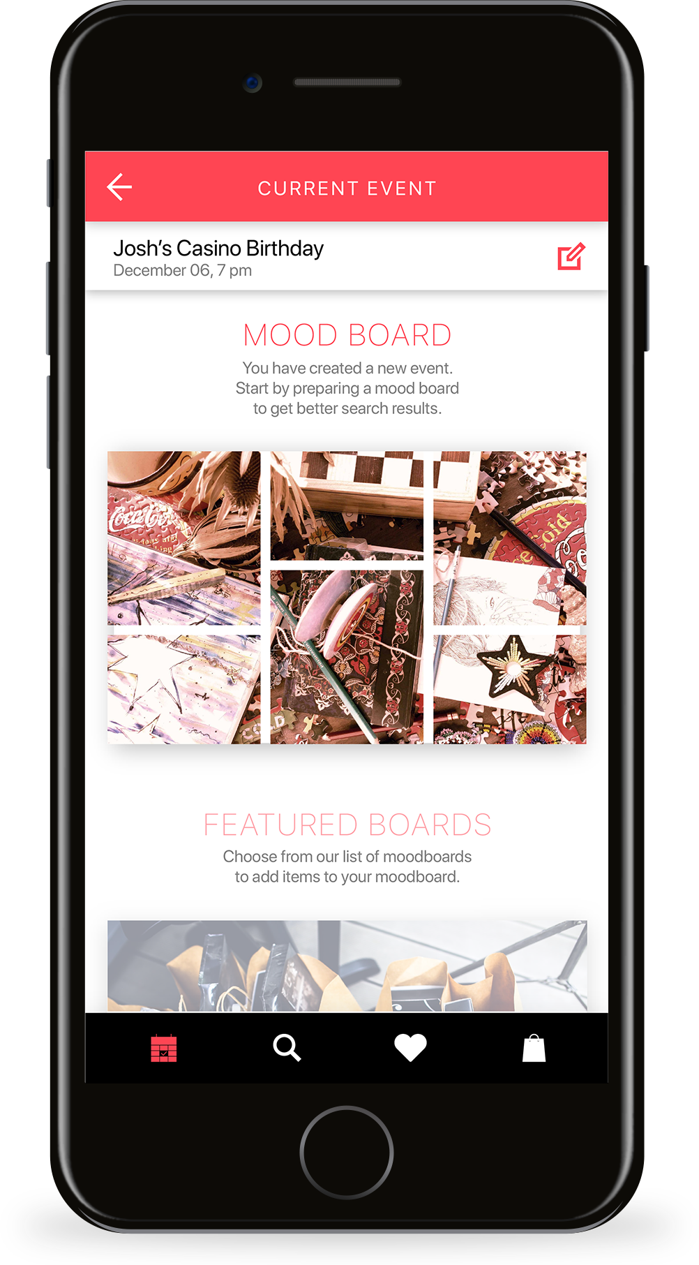
The Mood Board option is the first in the list of items on the event landing page. Sophia needs to create her mood board before she can get curated search results for her event shopping. As soon as she adds some images to her mood board, the following options get unlocked.
FEATURED BOARDS
Featured Boards are pre-made mood boards that get populated as Sophia adds items to her mood board. The featured mood boards option allows her to add more items to her mood board or use the existing boards to get better search results.
SHOPPING
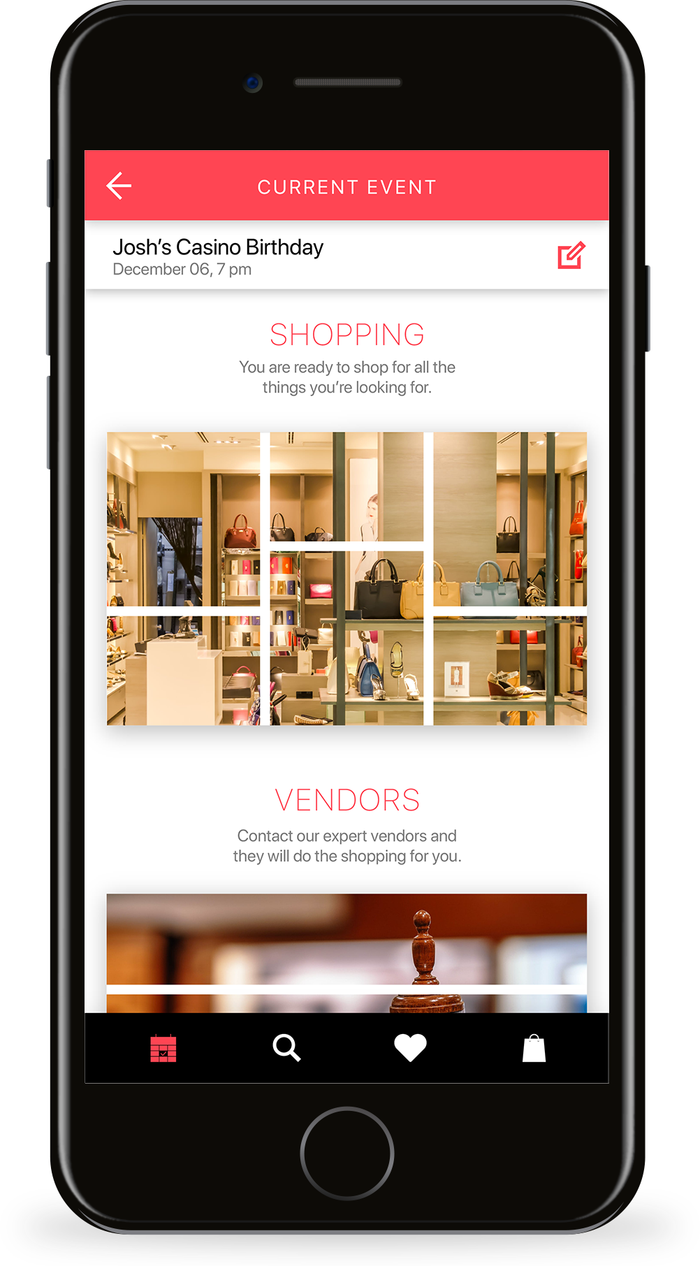
The shopping option is why Sophia is here for. After adding images to her mood board, and using some items from her featured board's list, she can now shop for items that are centered around the theme of the images in her mood board.
VENDORS
The Vendors option allows Sophia to contact vendors and party planners who can help her organize the event for her.
LET'S CREATE
Sophia needs to add images to her mood board so she clicks on the mood board option from the event landing page.
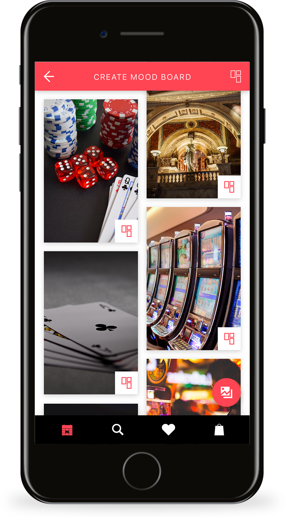
PICKING PIECES
Sophia starts preparing her mood board using the suggestions provided in the application. She even takes pictures of playing cards, money and other things that she thinks is a part of the casino theme, to add to her mood board.
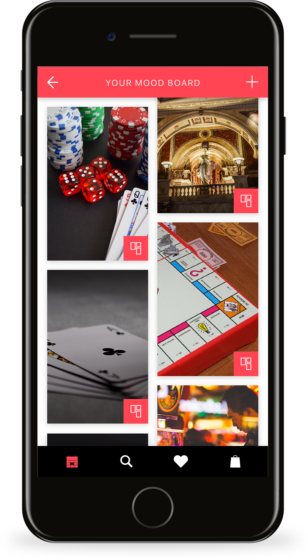
CURATING TO THEME
Sophia takes a look at her mood board and is not happy. So she decides to go back to the landing page and browse through some featured mood boards.
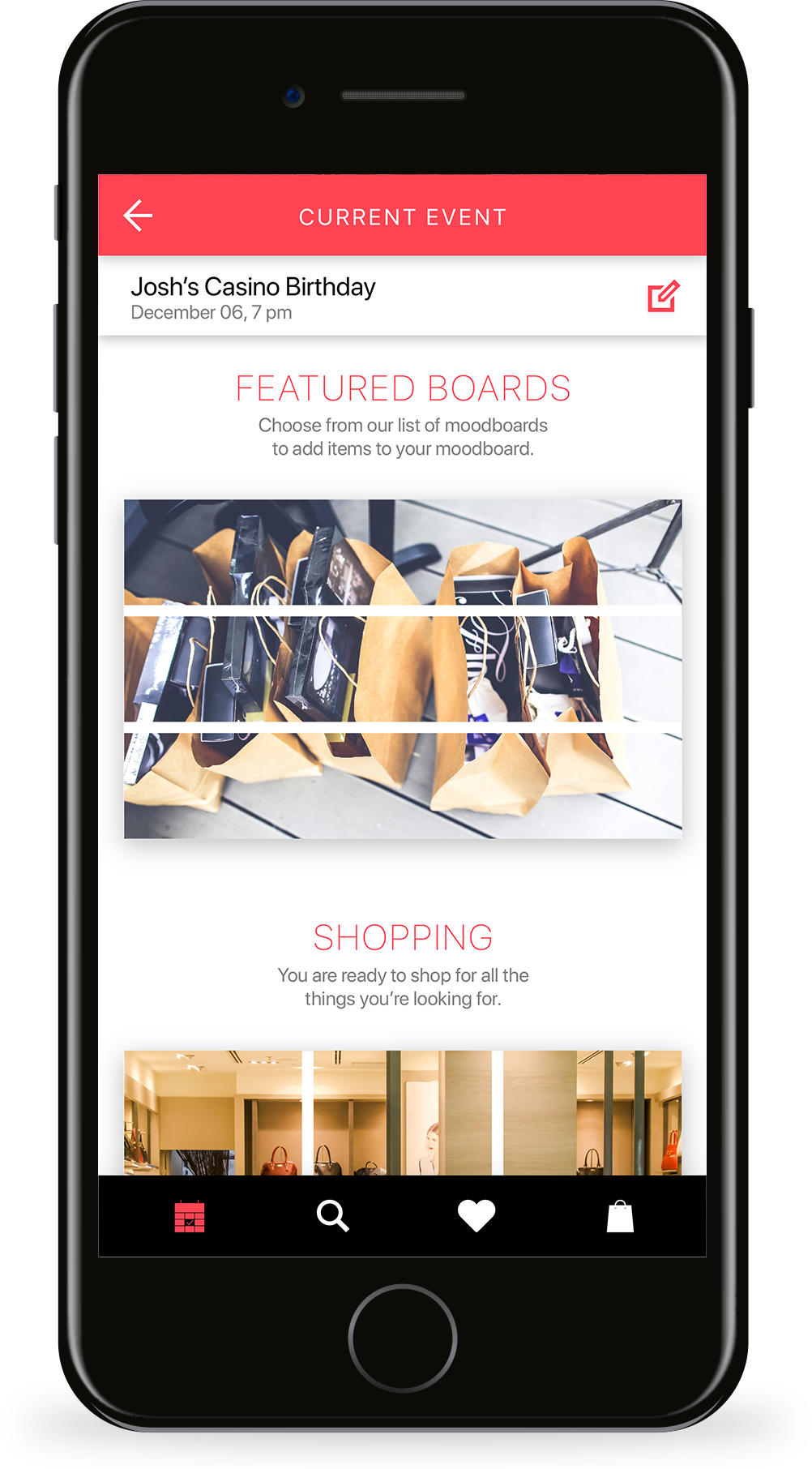
FEATURED BOARDS
Sophia clicks on the featured mood boards after adding some images to get better results for her shopping.
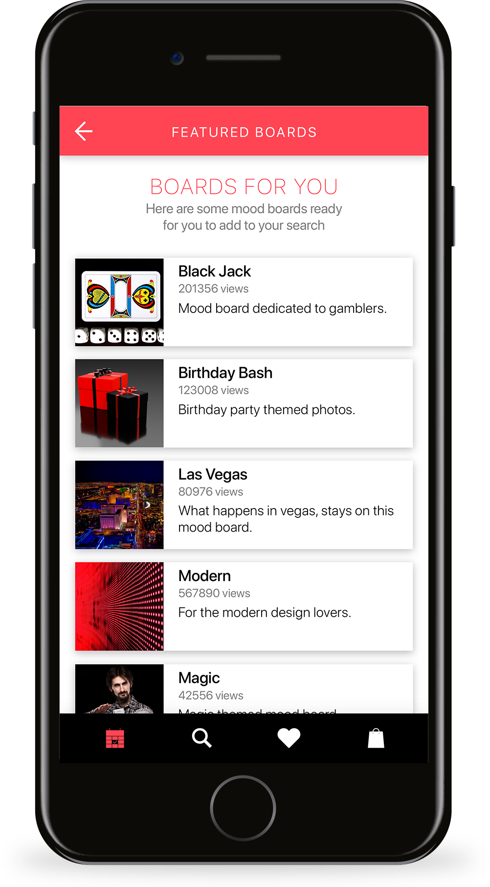
SUGGESTIONS
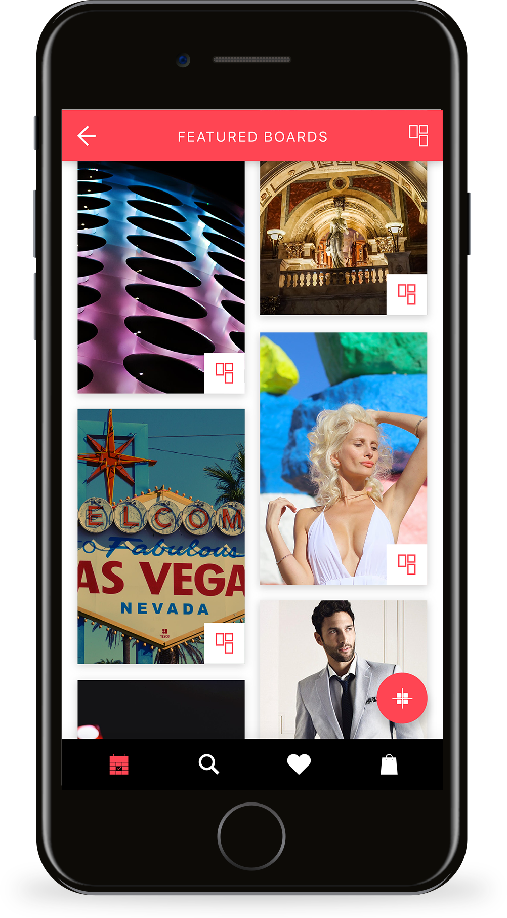
She sees a lot of pre-made mood boards which are populated based on her mood board images. She clicks on the one that says "Las Vegas".
MORE CHOICES
The "Las Vegas" mood board has images that are based on the casino theme. Just what she is looking for. She adds some images to her mood board by clicking on the mood board icon on the image. She can add the while mood board by clicking on the button at the bottom right of the page.
SHOPPING
After adding images and preparing her mood board, Sophia is ready to shop. She clicks on the "Shopping" option from the landing page of the event.
RESULTS
Sophia is now happy with the search results she is getting after adding the mood board. She clicks on the black dress she likes.
CLOSER LOOK
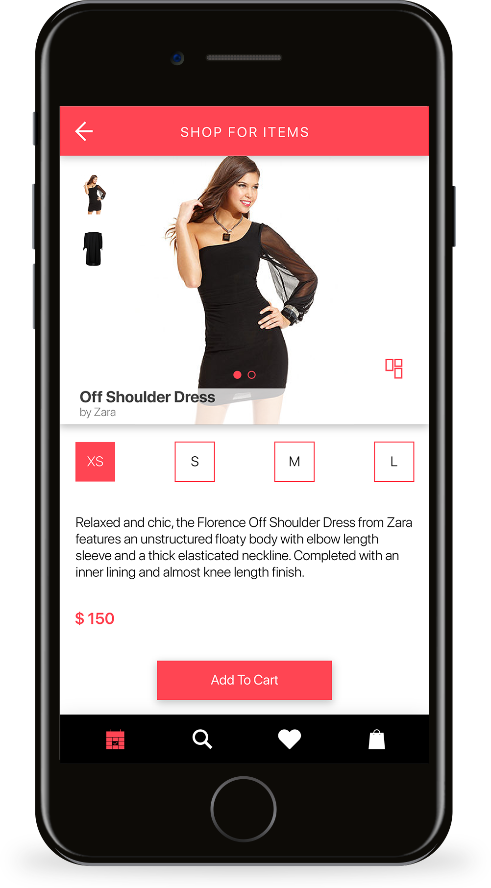
Sophia views the dress and selects her size. She adds the item to her cart by clicking on the "Add To Cart" button.
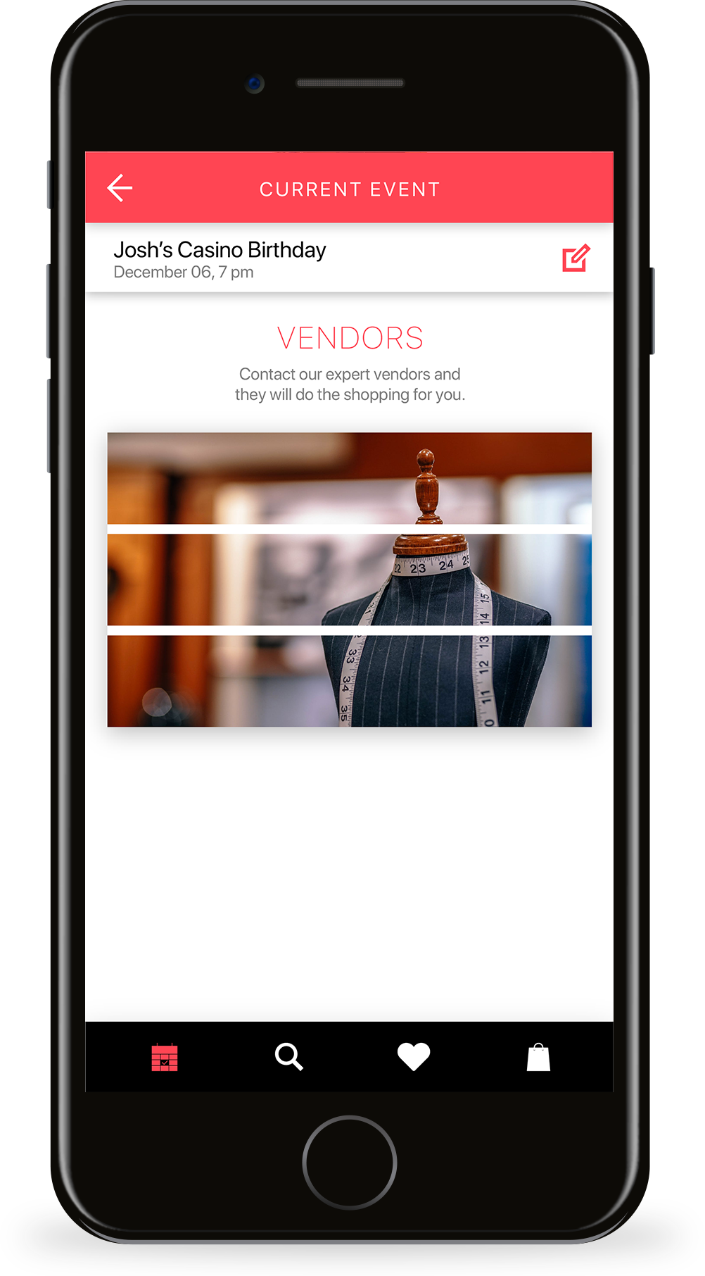
PROFESSIONAL HELP
After she has added items to her cart, she decides to take a look at the vendors to order a cake.
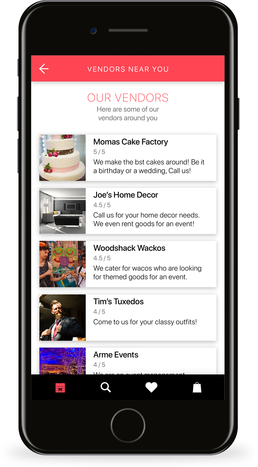
VENDORS
Sophia is happy to see a lot of vendors around her who can help. She chooses to call some of them.
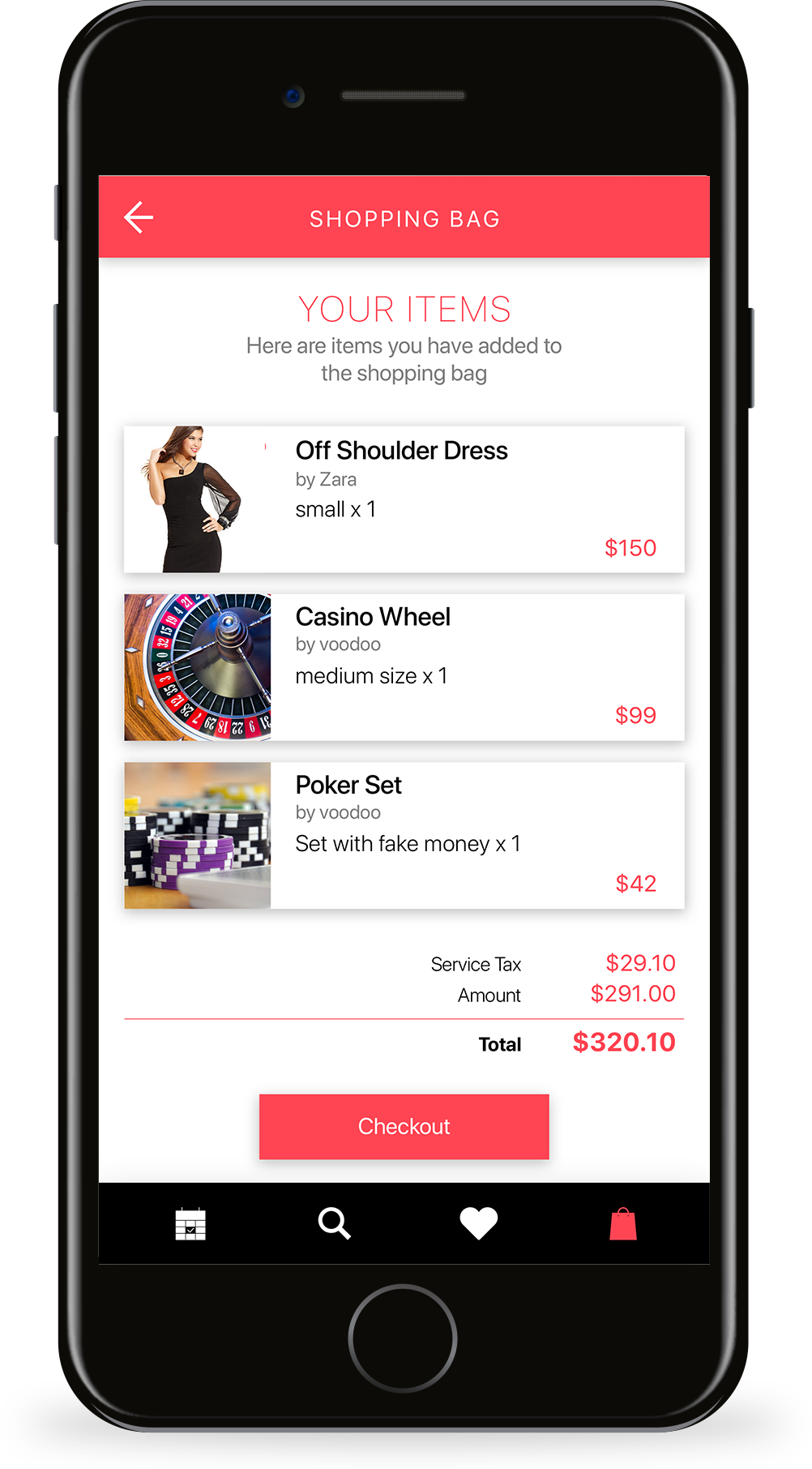
SHOPPING BAG
At last, she is ready to checkout with her items. She clicks on the cart button to see items she has added and checks out.
IN SHORT
With the help of SHOPR, Sophia was able to shop for items curated to a specific theme. She was successful in creating mood boards and finding items that suit her need. She was even able to order the cake and seek help from professionals for Josh's special day. She did all this in the one-stop solution to event shopping, SHOPR.

PROJECTS
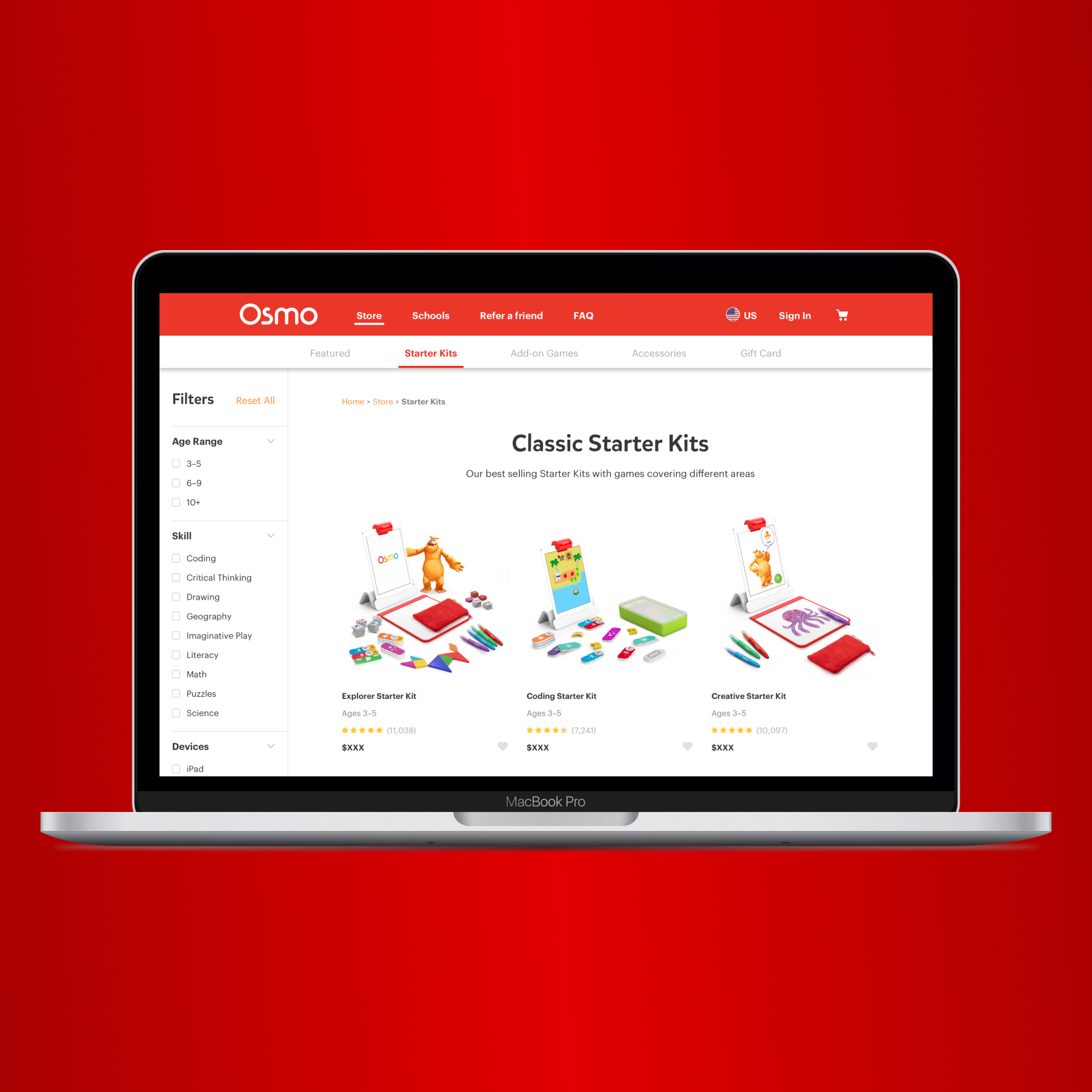
Osmo - PlayOsmo StoreSolving contextual challenges and designing the store infrastructure | UX UI Design | Prototyping |Testing
MFA Thesis - ROVAR Authentic Travel Leveraging Local Social Media | Interaction Design | Prototyping
Enel X - TrendsEnergy Management & Demand Response | UX UI Design
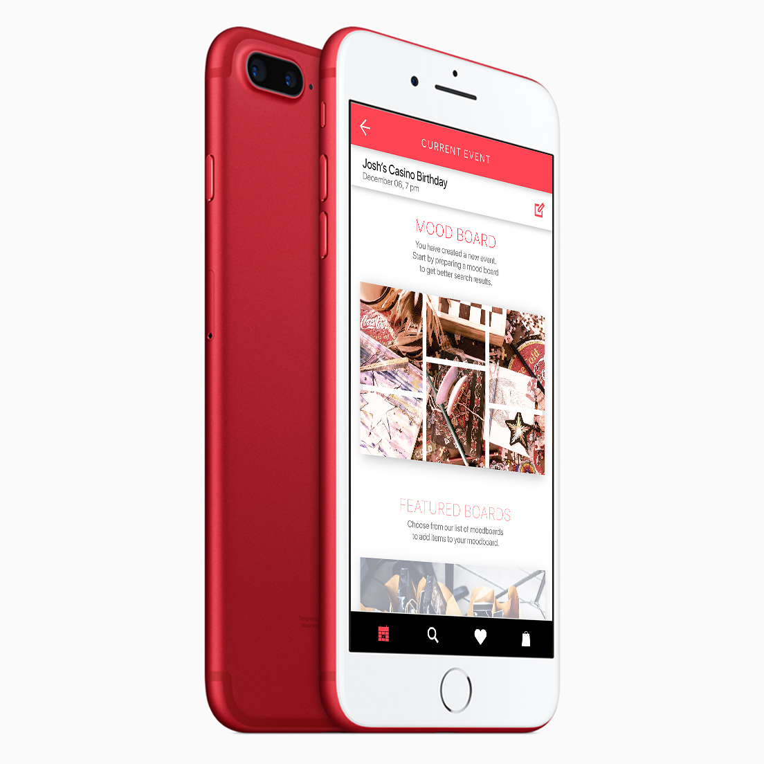
SHOPRSmart shopping for events | UX UI Design
GigtherapyAn anxiety free concert experience | UX UI Design
© 2022 Akshay Kumar Arun
