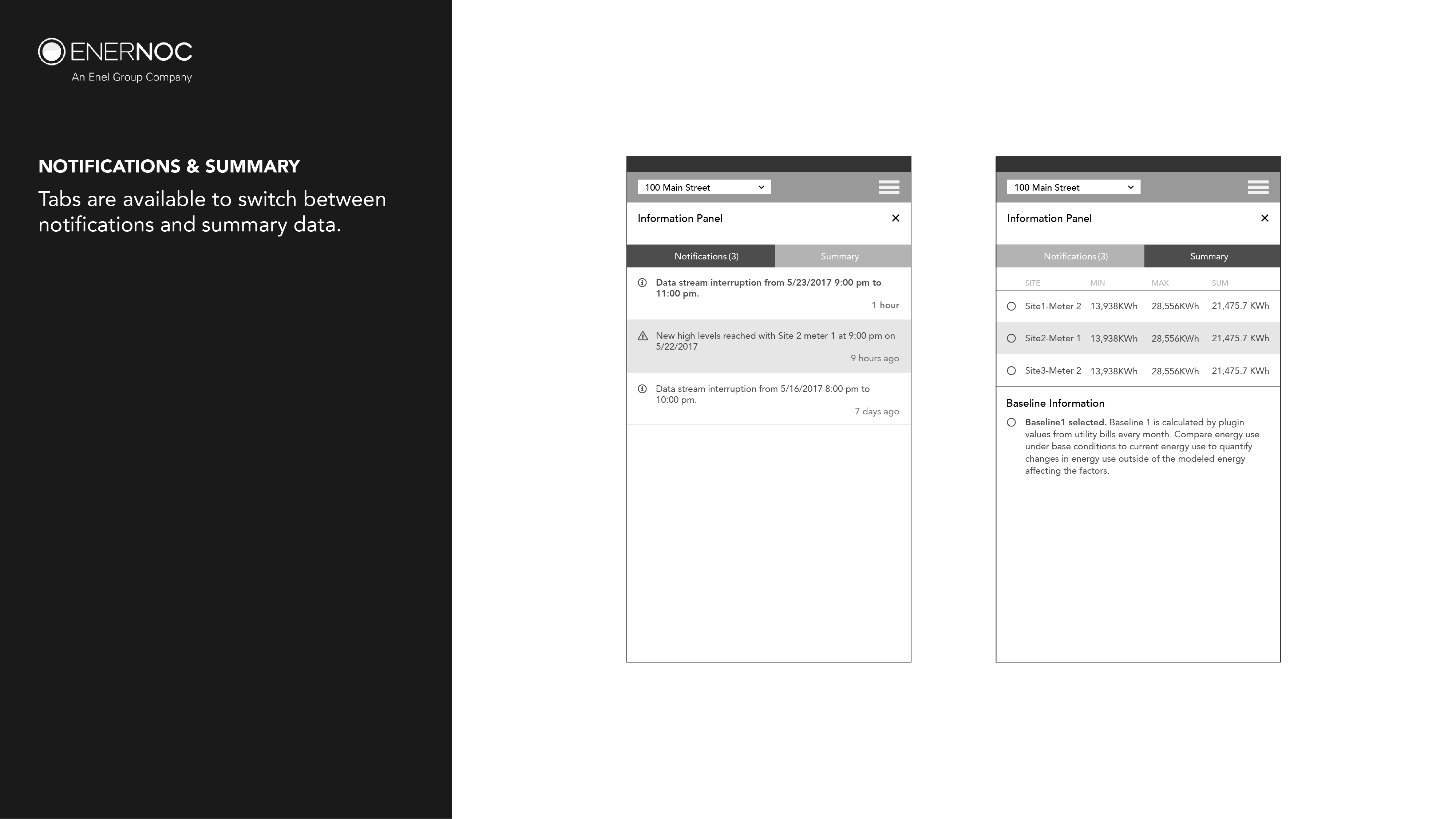
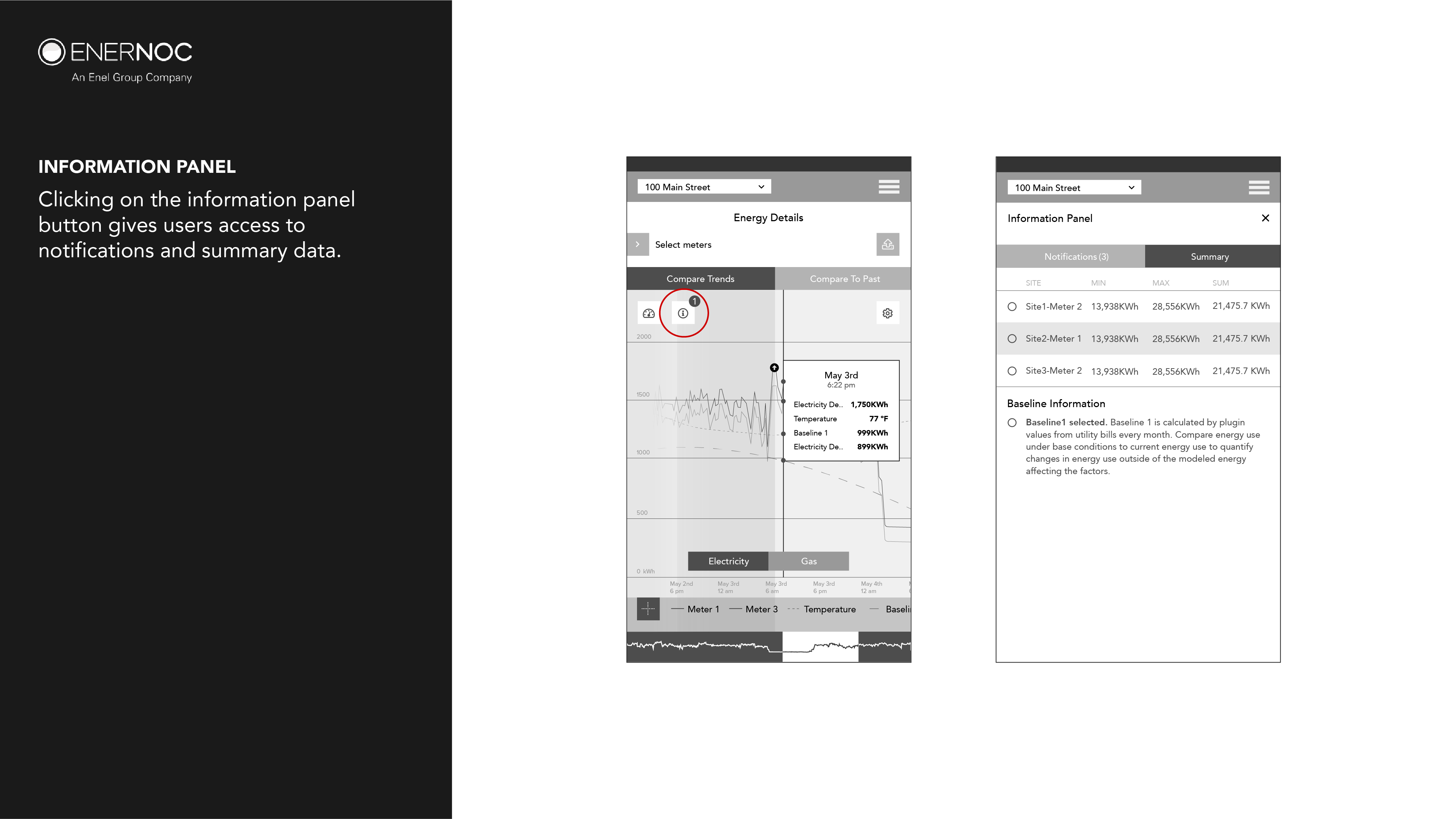
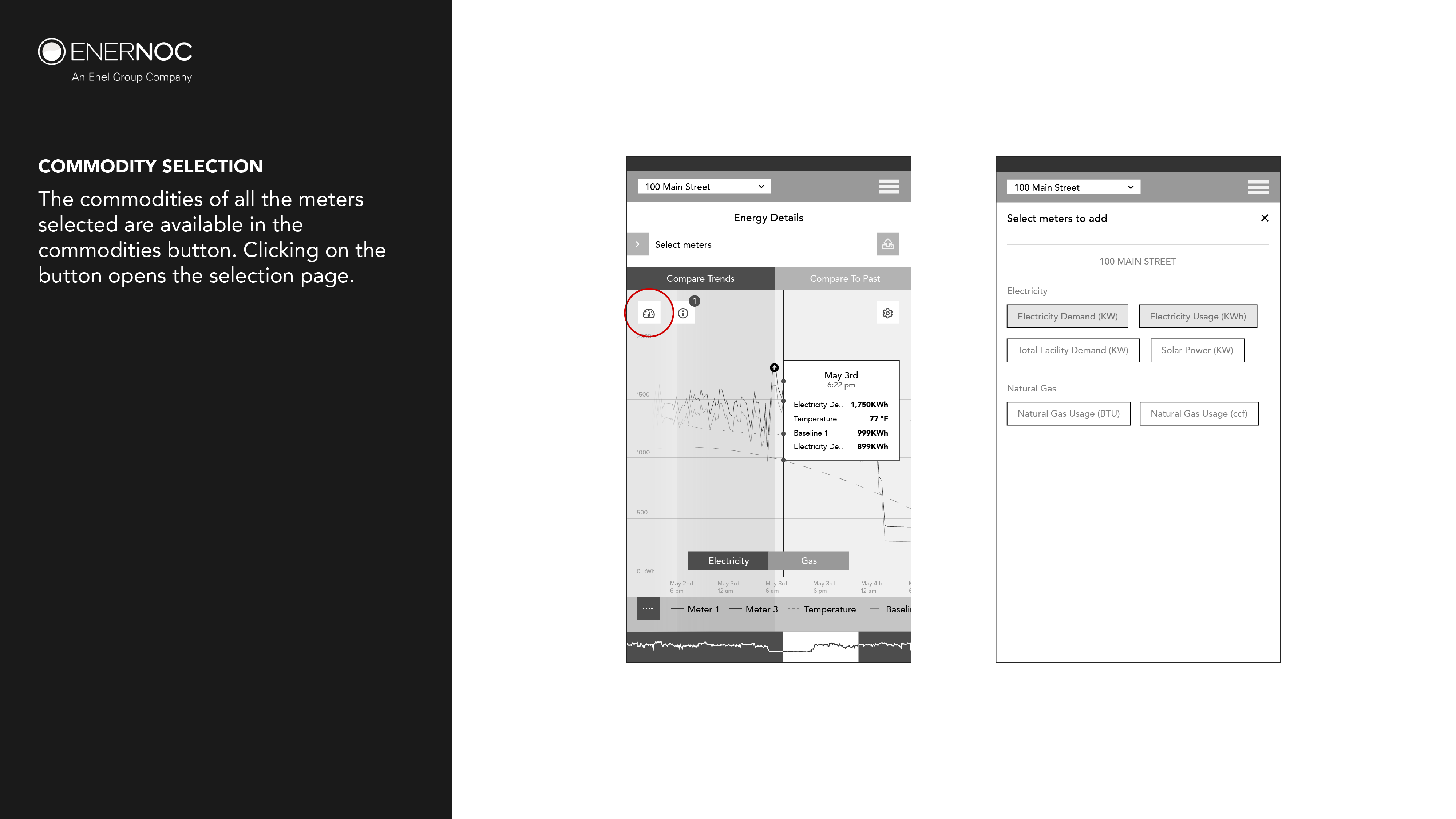
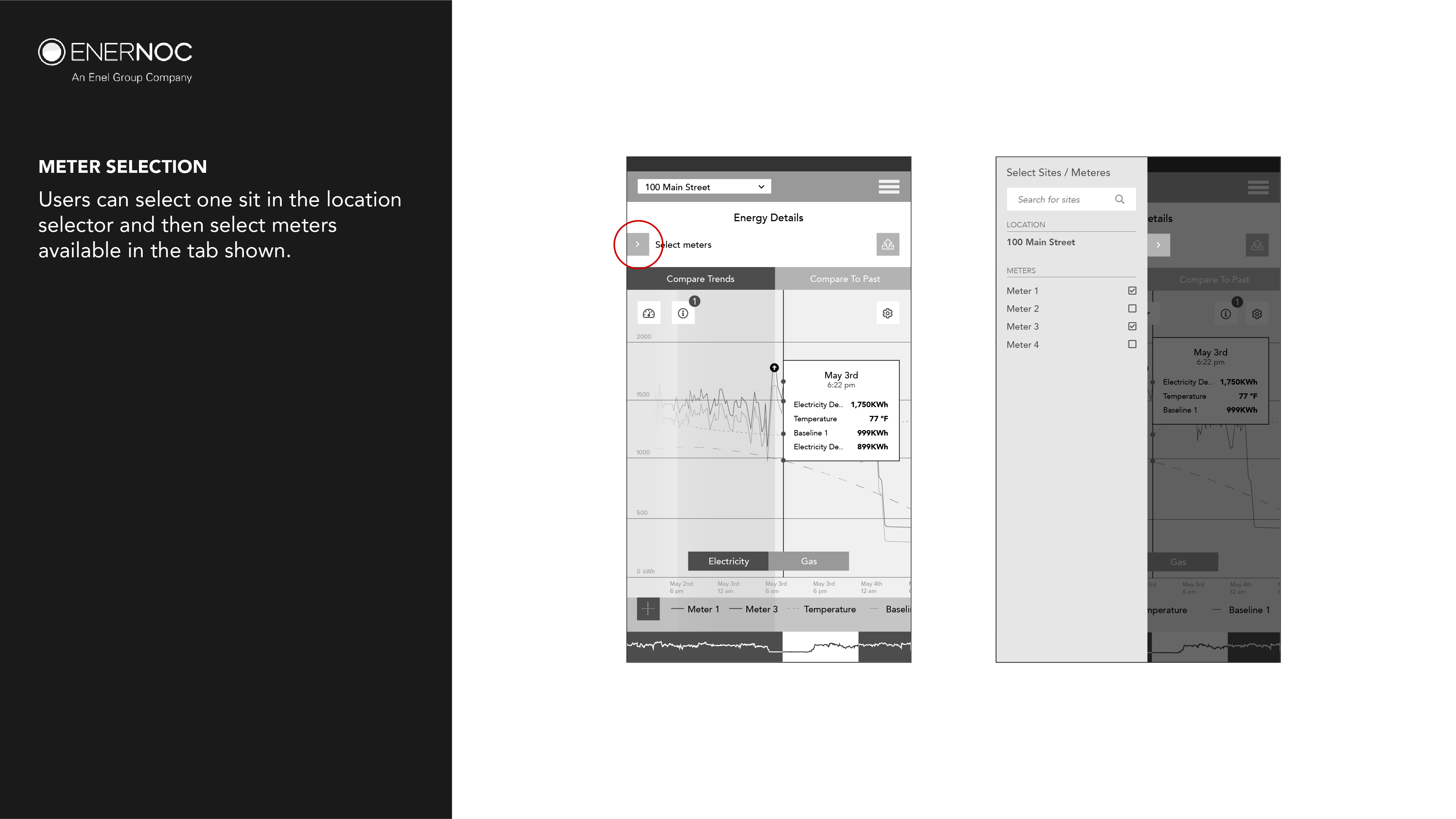
REDEFINING "TRENDS" EXPERIENCE
Trends is one of the most vital energy management software of EnerNoc’s users. Through the years, Trends had developed into a purely desktop application that had a haphazard interaction model which failed to meet the needs of the expanding user base when EnerNoc became Enel X in 2018.
I was part of an ambitious project to redesign Trends for both mobile and desktop for the largest demand response and energy intelligence software providers (EIS) in the world.
First Thoughts
Trends has been in agile development from the past 10 years while being on its 7th version. With the change in management and the larger user base, new use cases came up that the present version did not do very well. My first time with the software, I noticed there were a number of design and functional flaws.
- Small type sizes.
- Not designed to be handled on mobile
- The customers had complaints regarding missing functionality
- The overall design was outdated
- The classic version’s model of location selector separated commodity selection
- The compare to past feature was counter-intuitive
I began with a clean slate and wondered what was the ideal EIS software based on the requirement set given to me by the team. The point of this was not to give a solution but to understand the problem better. Over the next couple of sprints, I would come to understand the full feature set and what use cases they targeted.
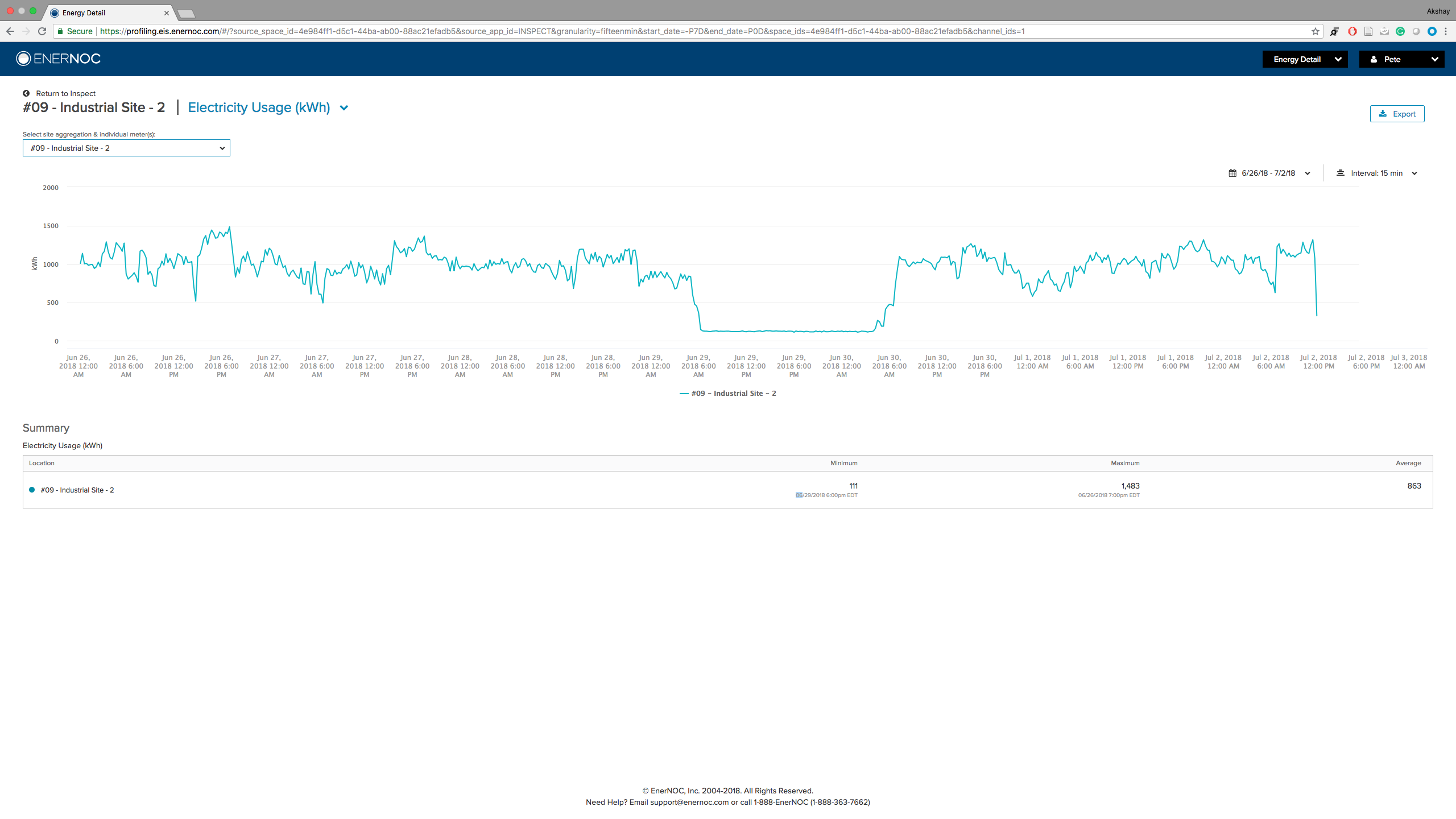
Screenshot from EnerNoc "Energy Details" in the mid 2018.
Identifying The Problem
The original premise was that Trends had 2 main roles to fulfill as a minimal viable product.
1. Display the current trends for one commodity for sites of the organization.
2. Display the historical trends of a single commodity for a site for a designated period.
The current version of Trends was developed to meet these two roles. What was it that the end users still craved? What is that aspect of the software that could help Enel X dominate the market in North America? To unlock that potential was my job.
Users
I began my research by identifying the different types of users the software had. With the help of Tara Litchfield, the UX lead of the company I understood that there are two main types of users.
1. Operations - The operations was involved in identifying the problem areas using Trends and explain them to the energy advisors.
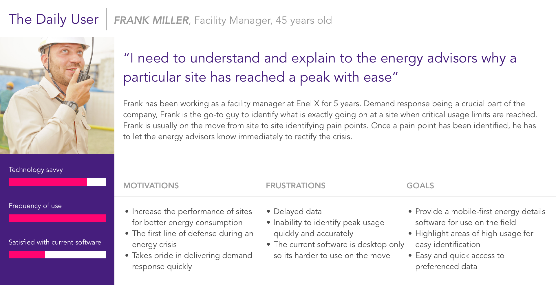
POV - Frank a 45-year-old facility manager at Enel X requires a platform that allows him to compare usage data of multiple sites and compare meter data to historical data while on the move in the facilities to explain to the energy advisors why a site has reached a peak with visual aid during an energy crisis.
2. Financial - The financial team was primarily concerned with coming up with a consumption plan with minimum costs while looking at the problem areas.
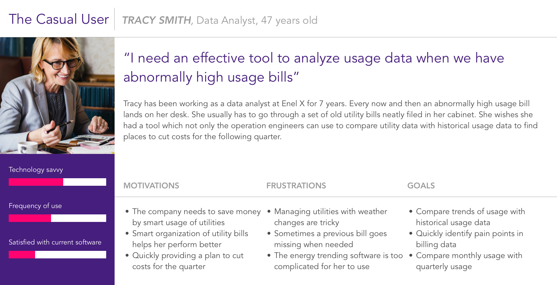
POV - Tracy a 47-year-old data analyst at Enel X needs a tool that allows her to analyze usage data easily to identify pain-points of various sites to help her project savings and energy consumption plans.
Learnings so far
- Users preferred functionality over ease of use
- Mobile compatibility and usage is a must
- The users preferred to see everything all at once
- A clear visual depiction of pain points is a must
- The users wanted to compare multiple site data
- Multiple graph types is a plus
Plan Of Action
I wanted to understand what is the ideal energy profiling software and its capabilities. For this, I placed functionality on the top and worked my way toward aesthetic appeal and ease of use. With this in mind, I decided to frame the problem statement for Trends.
Functionality > Robust Interaction Model > Aesthetics
Users preferred to see everything together although it would inhibit ease of use. My immediate goal was to give the users both.
“Trends” needs an interaction model that could support the display of trends for multiple sites comparing multiple commodities while also being capable of displaying historical trending data for one commodity for multiple sites.
Initial Approach
I started solving the ideal interaction model by divided the use case into 3 main parts. I decided to design mobile first. I adopted the global location selector model designed by Shelby Mason within trends for unifying with other products of Enel X.

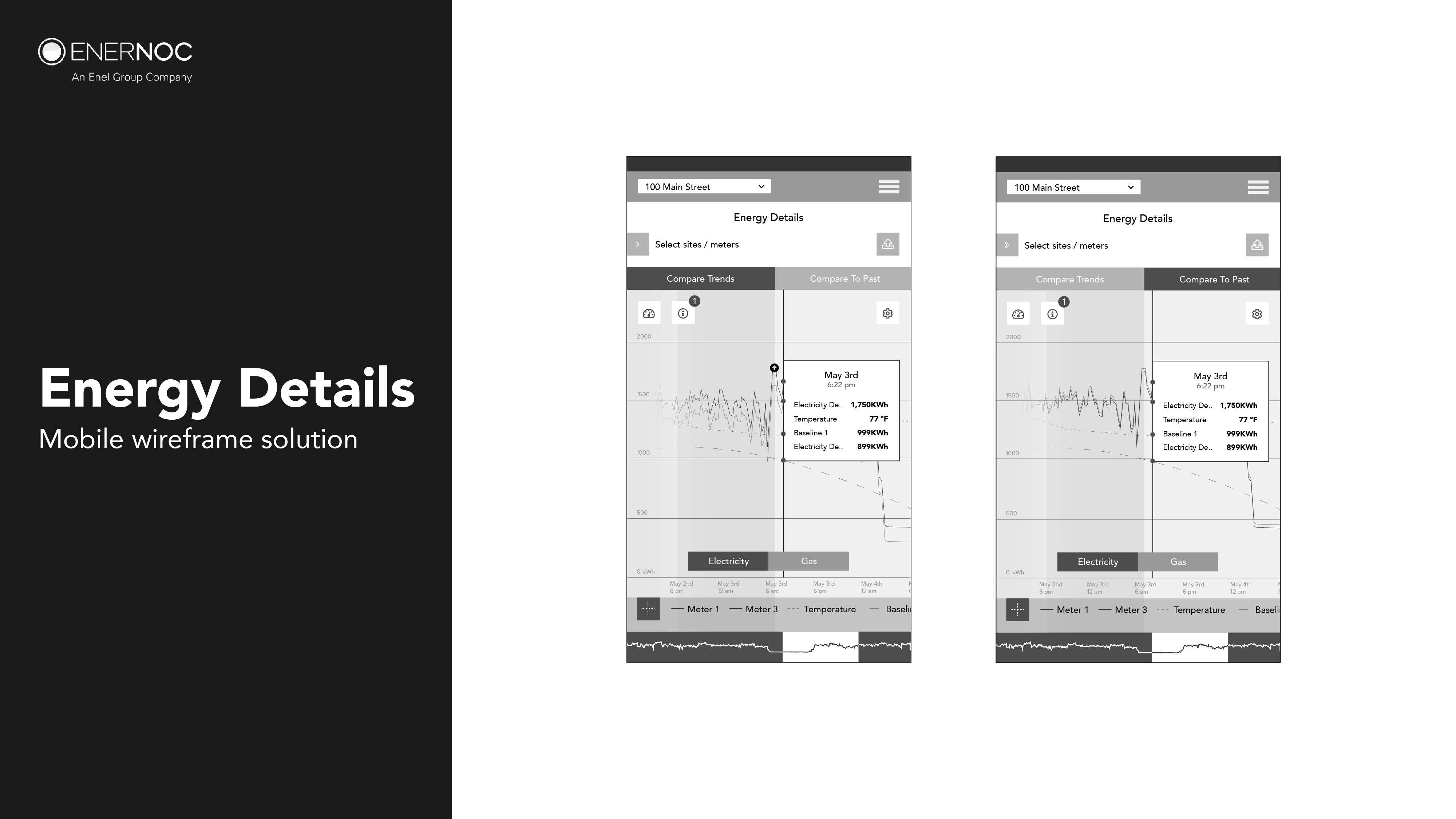
Trends was initially called Energy Details. For the initial round of testing with the energy advisors, I went with a wireframe model for testing. It was a purely learning experience to understand their expectations.
Learnings from testing
- All energy advisors were excited about the mobile first approach
- The commodity selection was ambiguous still
- The commodities need to be compared together
- The division of Compare trends and compare to past were clear
- The advisors preferred to compare different types of commodities for a site
- The advisors preferred to be able to compare 10+ trends on the same screen
- Isolating a trend to view it more clearly was a plus
- The tooltip occupies a majority of the graph area
- The advisors preferred to save graph settings
Finding Clarity
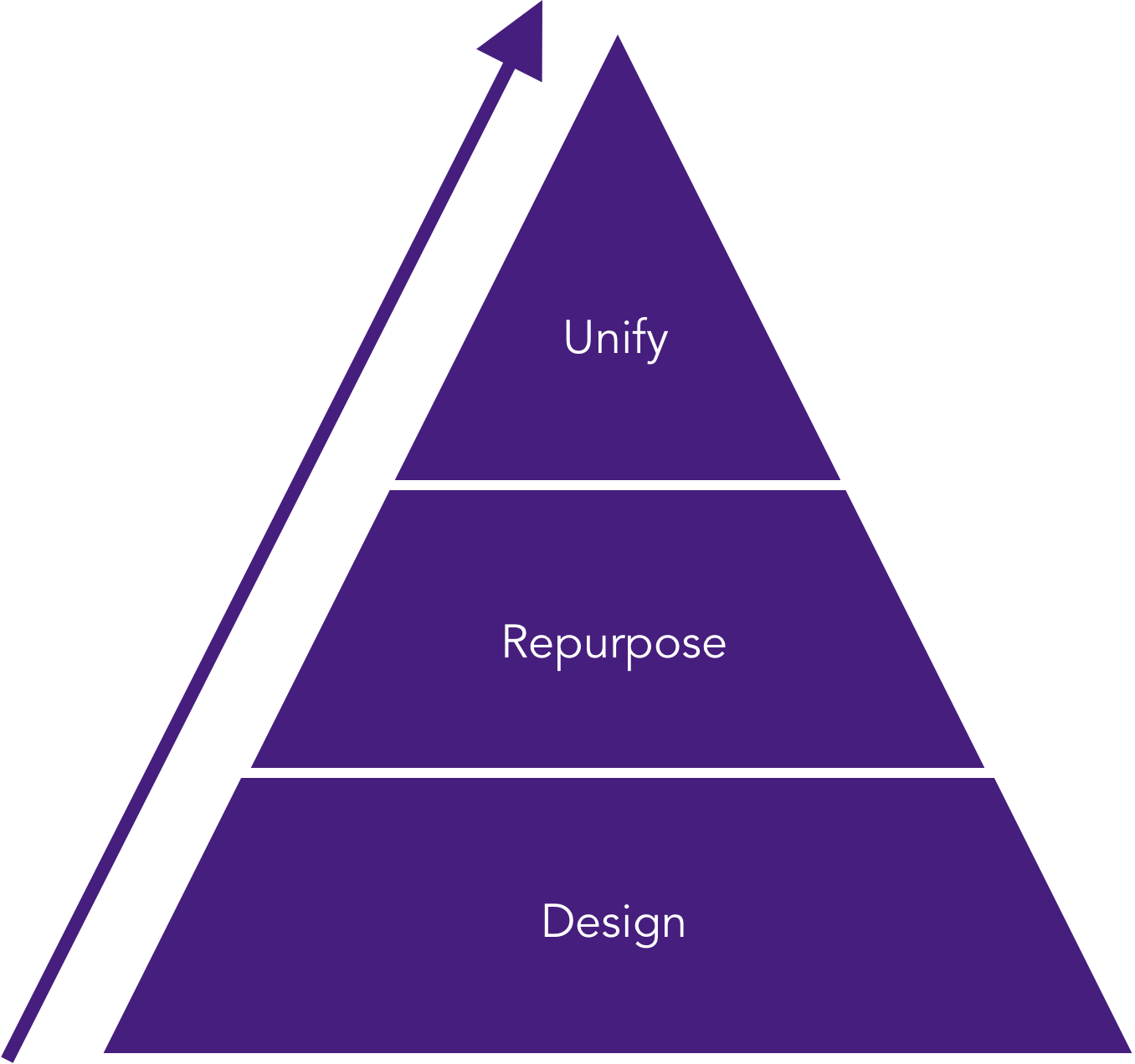
Many users in the first round of testing suggested features and use cases which they thought would be “Neat” to have. It was my job to streamline these use cases to a specific set which could be implemented in the form of information architecture. Since users placed functionality as a high-value entity and I placed ease of use as a set goal, I used a framework by Dave Birss to determine which features were actually necessary.

Referenced from "How to Get to Great Ideas: A System for Smart, Extraordinary Thinking" by Dave Birss
Resonating With Mental Models
To resonate with the users’ mental model of the already present location selector, I added the commodity selection as a second part of the location selection process. I also added an override to prevent multiple redundant interactions that achieved the same result. This streamlined the location + commodity selection combo while also identifying preferences for saving the graph.

Since the users have been using the same software for years, it would pose difficulties for the users if the interaction model was too different from what it already was. The redesigned Trends also had to be unified with other products of Enel X, for this purpose it was necessary to repurpose trends at every stage of the design process to be an effective addition to the software suite.
Every design iteration had to be repurposed to prove a valuable addition to the software suite which gave way to new branches in the information architecture.
Conceptualizing Trends
During the initial round of testing, there was a unanimous appeal for saving graph preferences when the user returns. For this purpose, I proposed the landing page of Trends should be the graphs the users have created with the last used graphs on the top. User's need for control over the data displayed and its dexterity extended into the graph screen.
With the insight provided by the energy advisors at Enel X, I revised the use case. I went with the concept of creating graphs. Each graph would have a set of selections that could be saved separately and accessed easily when the user returns to the interface.

Getting Things In Place
The information architecture was designed keeping in mind that Trends was not just a stand-alone product anymore. It had to be now unified with other Enel X products while maintaining a similar aesthetic appeal.
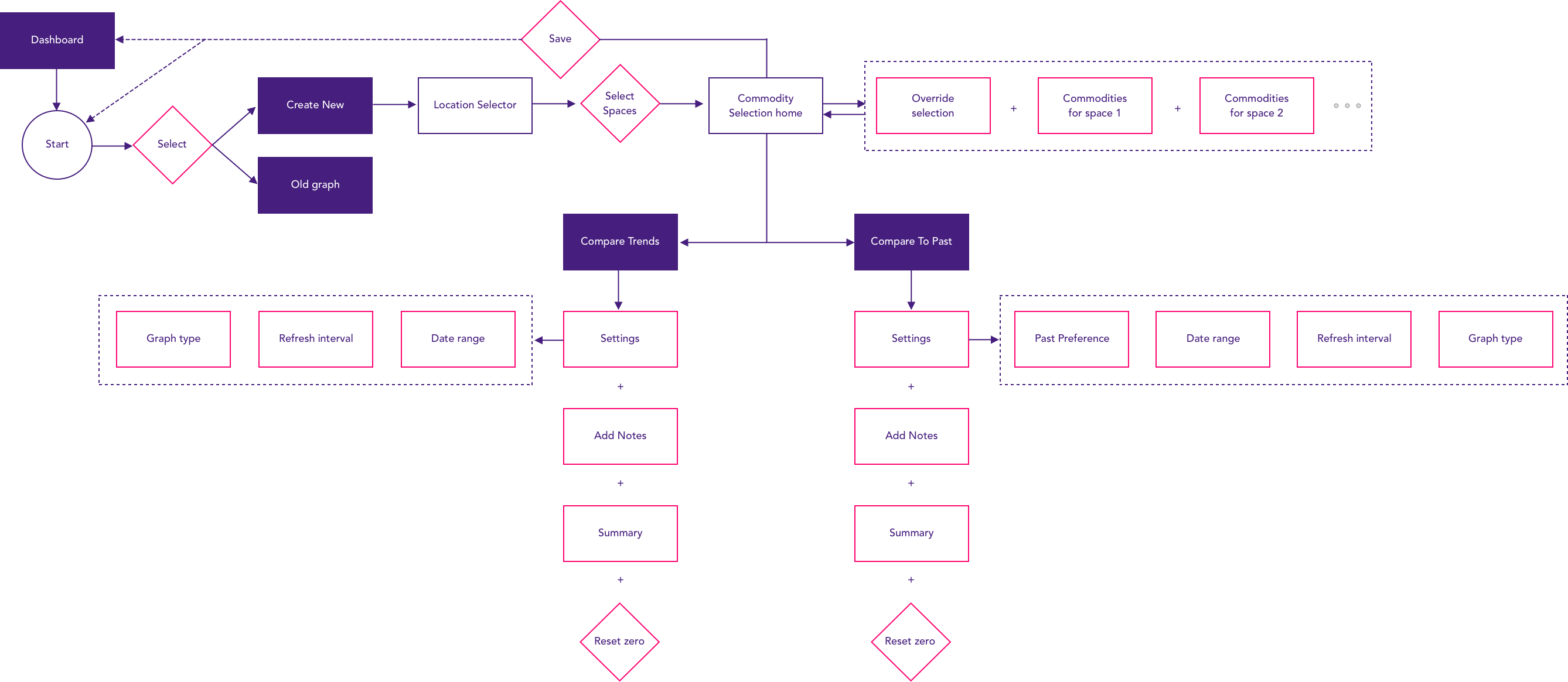
Override Commodity Selection
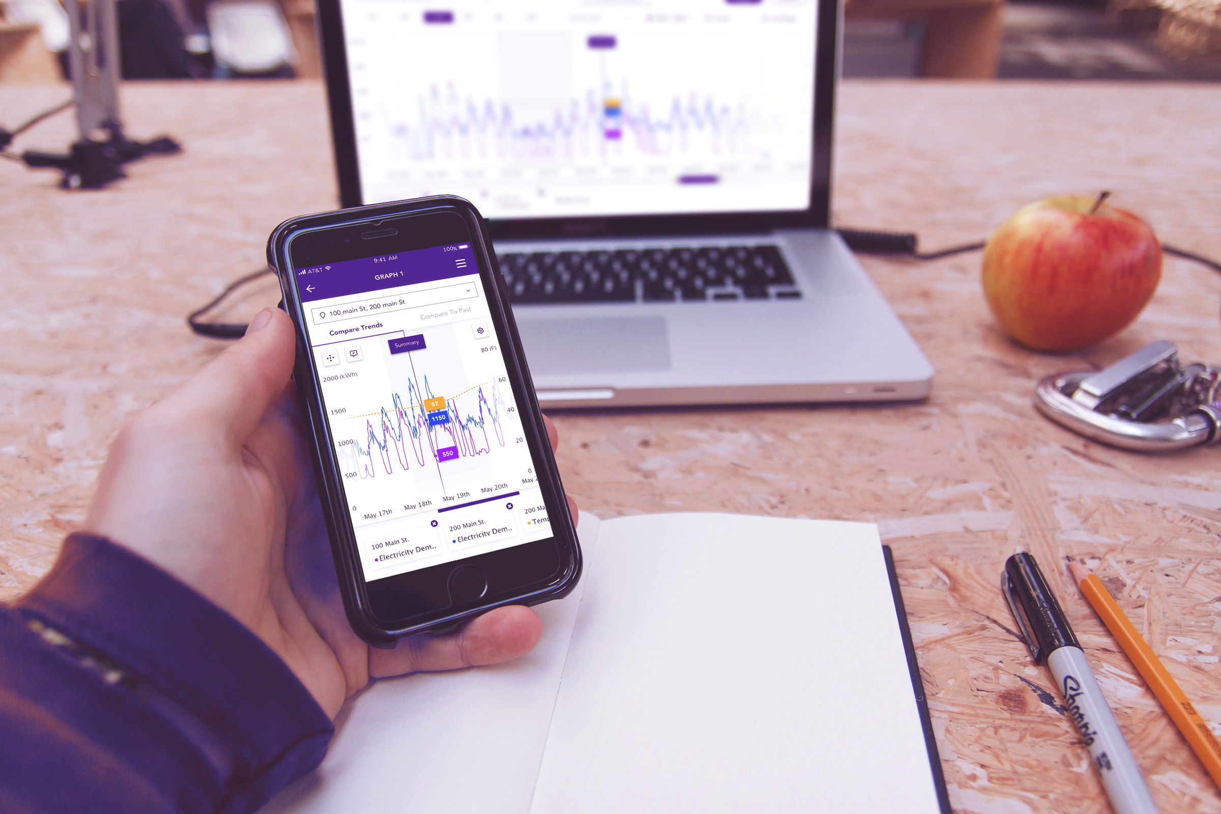
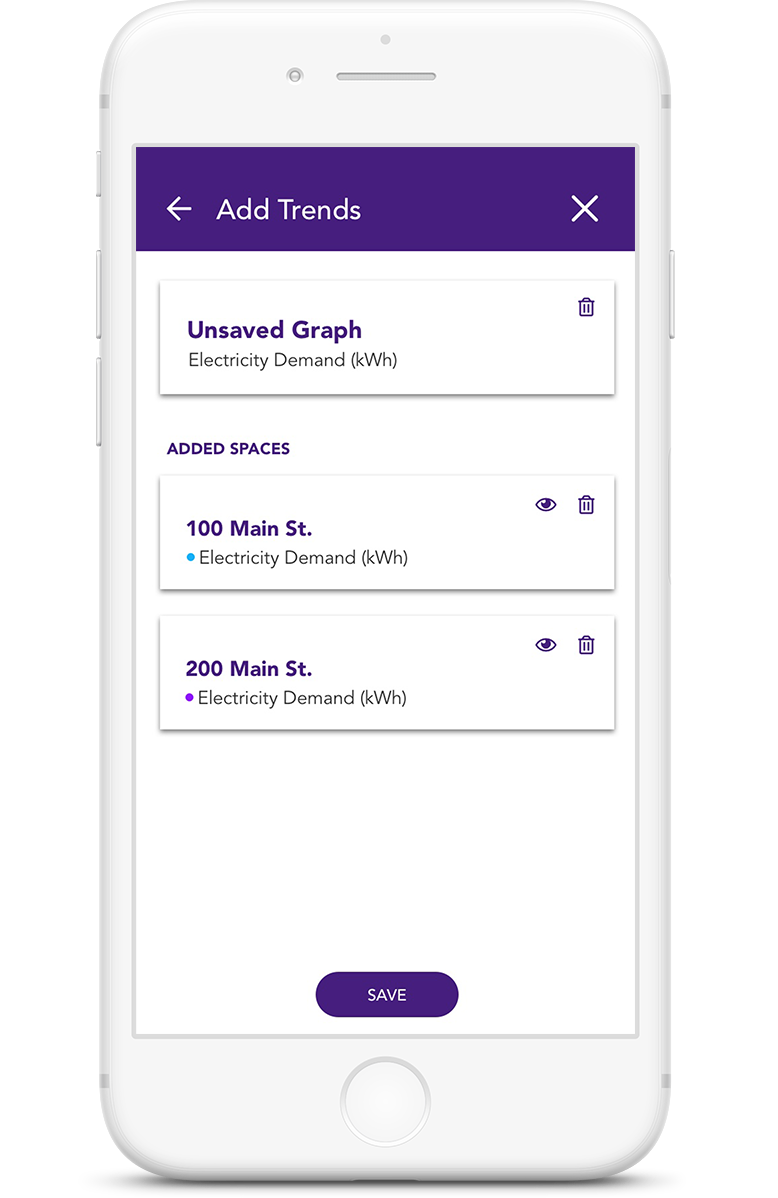
An override function was necessary to add trends to all the locations that are added in. The override would have commodities that all the spaces added have in common only. Selecting one trend, in this case, Electricity Demand, the override adds that commodity to both the spaces 100 main street and 200 main street.
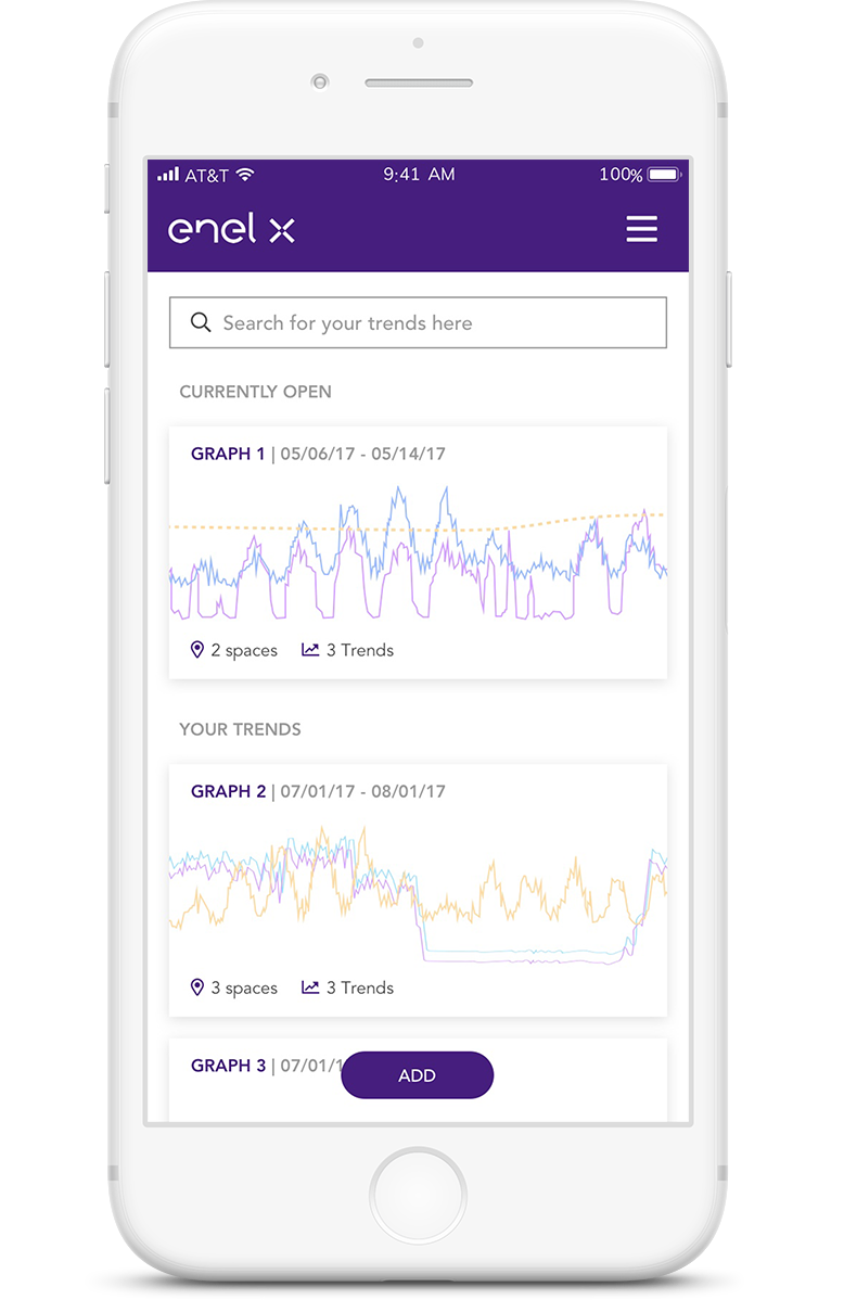
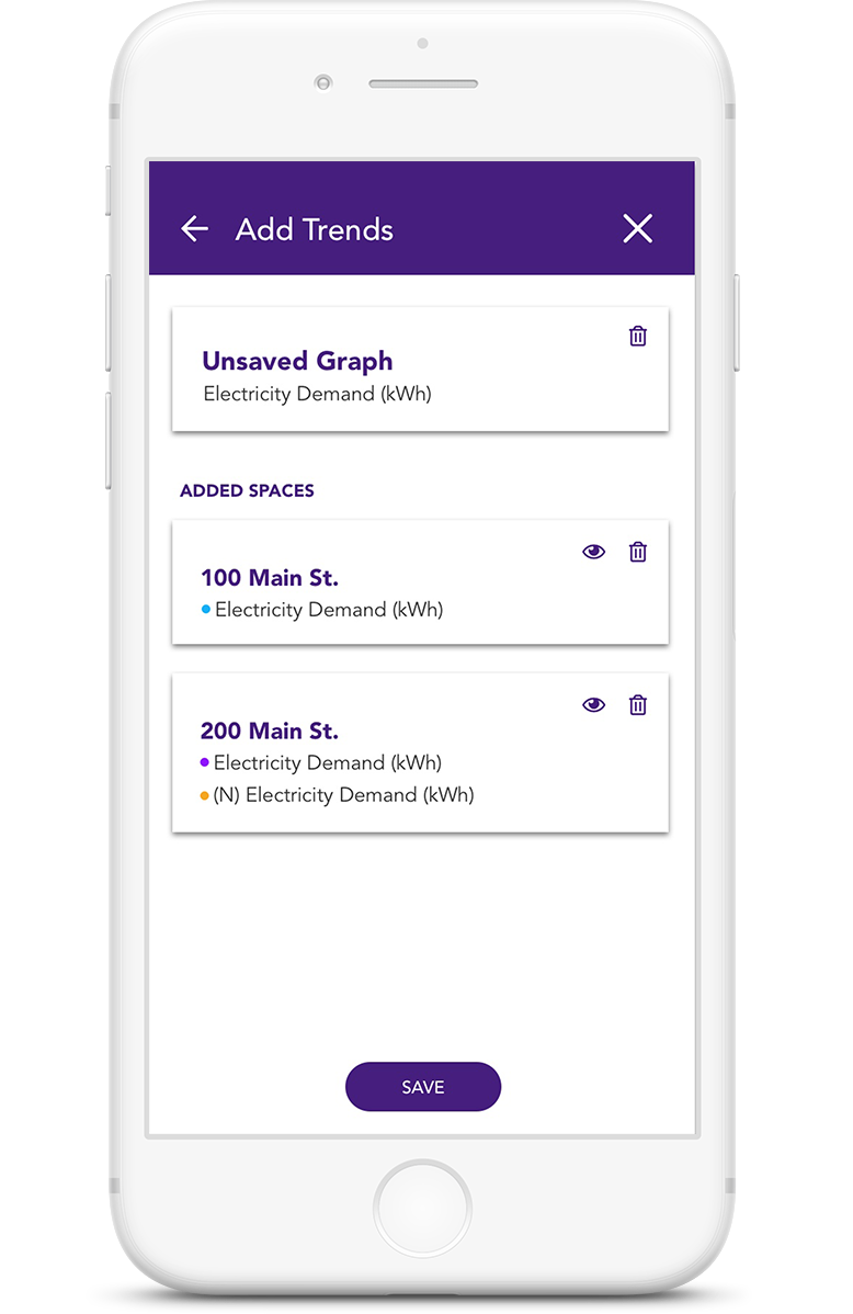
Saved Graphs
The user either selects a previously saved graph or decides to create a new graph by clicking on the "Add" button as in this case.
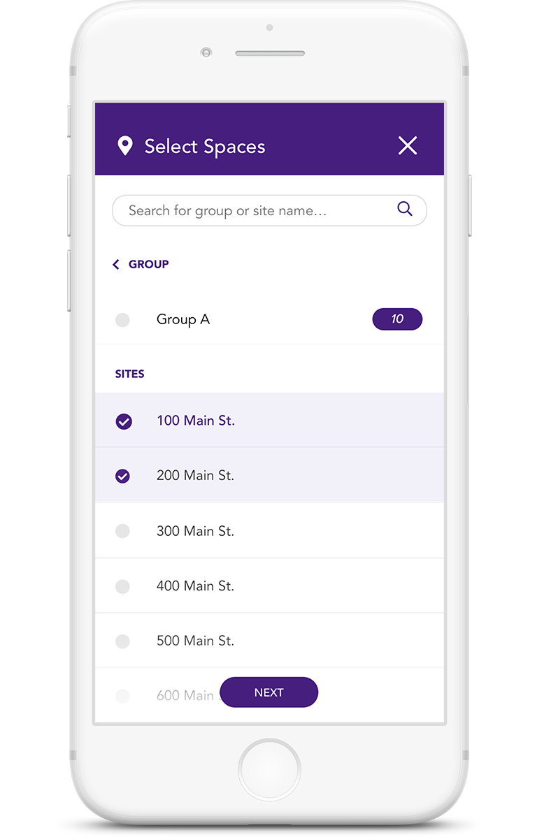
Location Selection
The user selects spaces that they wish to see the trends for. Once all the spaces have been selected, the user clicks "Next" to progress to commodity selection for those spaces.
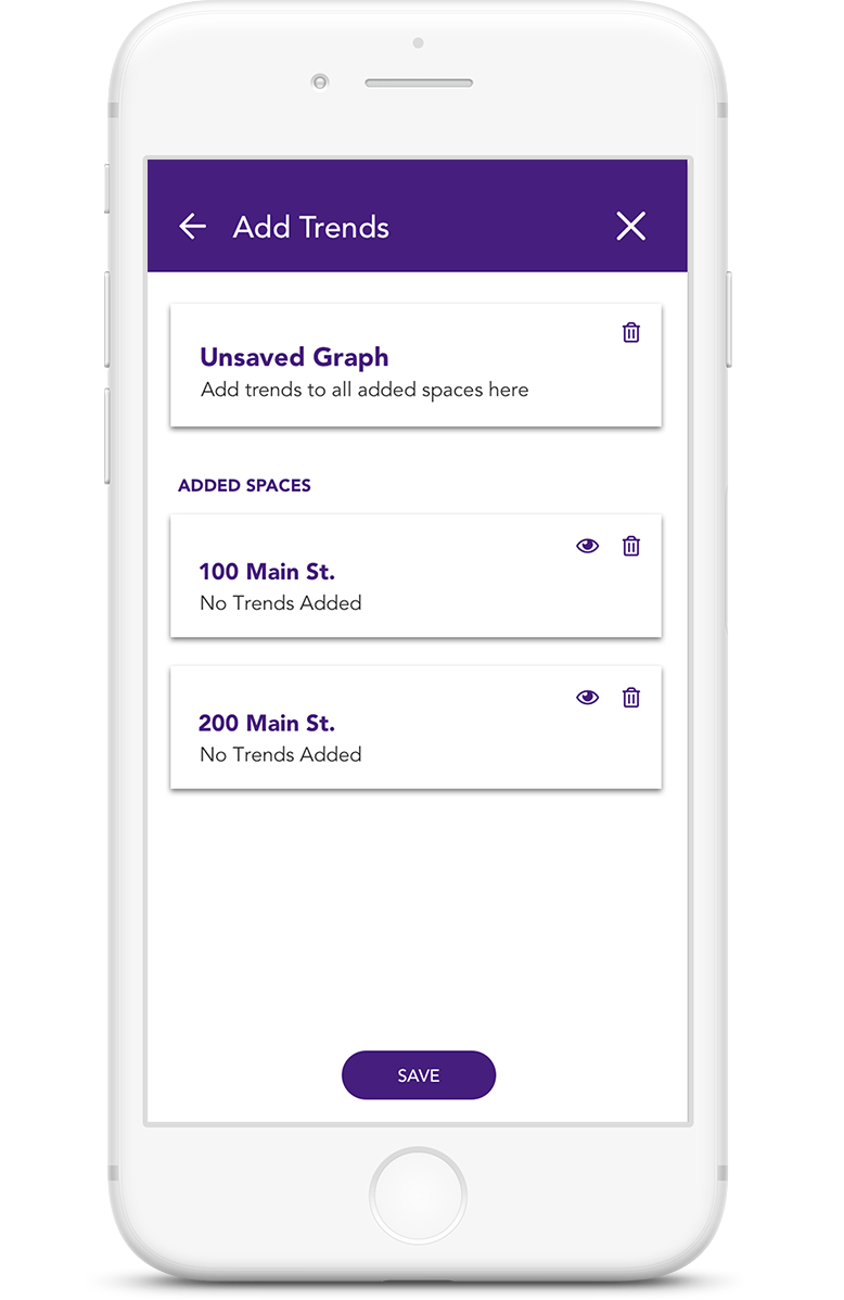
Added Spaces
The user lands on the screen with all added spaces. The override on the top allows users to add trends to all the spaces at once.
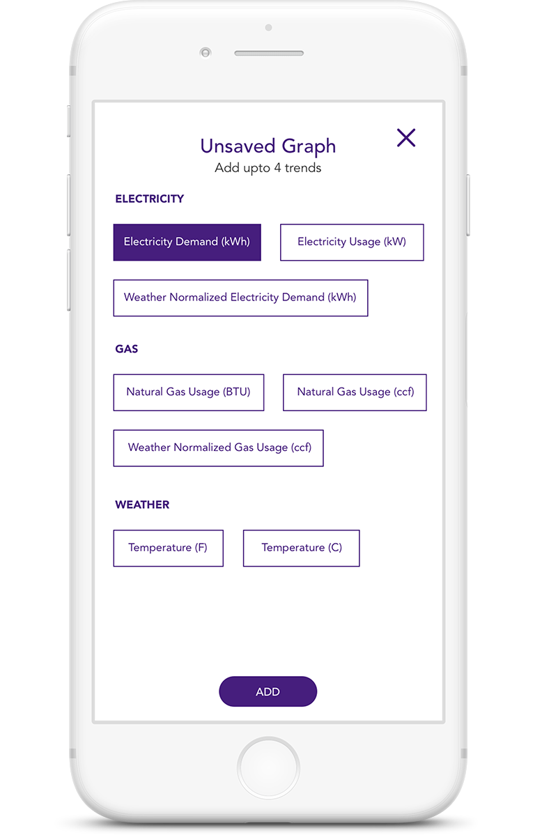
Commodity Override
In this case Electricity Demand is selected as an override for all added spaces.
Individual Commodity Selection
To resonate with the users’ mental model of the already present location selector, I added the commodity selection as a second part of the location selection process. I also added an override to prevent multiple redundant interactions that achieved the same result. This streamlined the location + commodity selection combo while also identifying preferences for saving the graph.
Individual Spaces
Commodities for individual spaces can be added independently by clicking on them. In this case 200 main street.
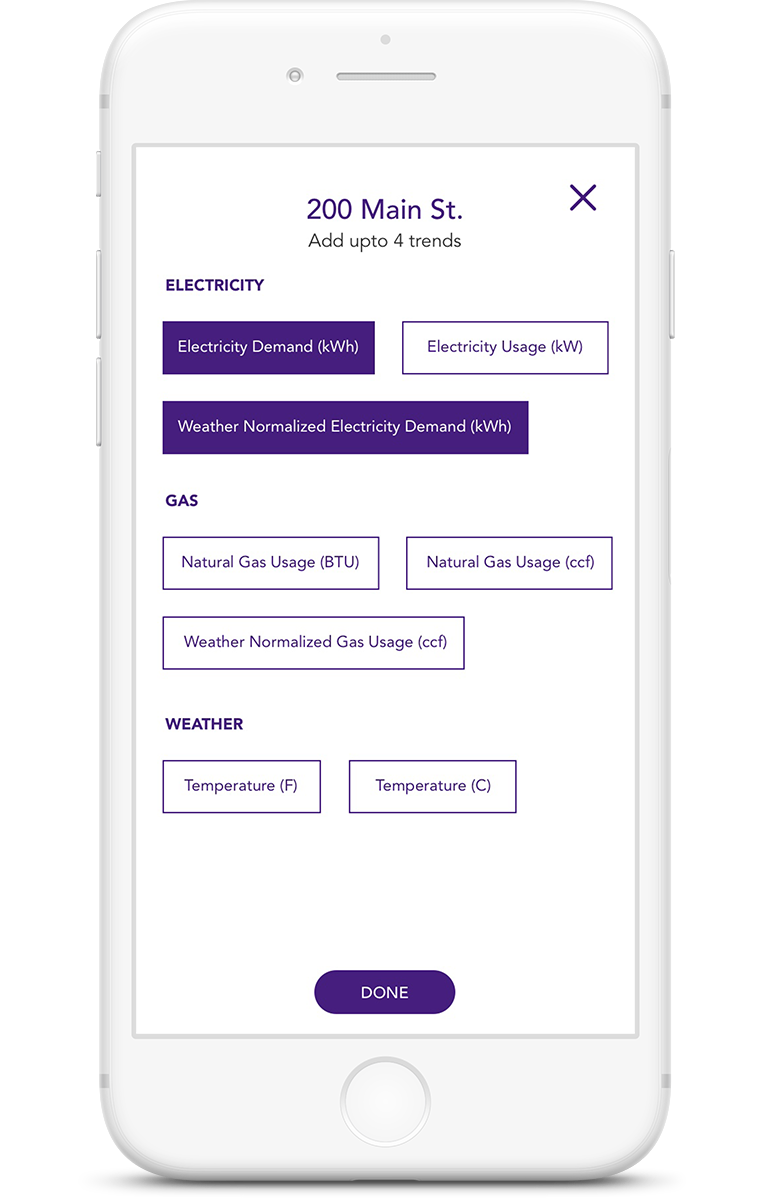
Individual Commodities
Commodities like weather normalized data for one site can be selected to compare with other sites added. After the selection is made, user clicks on the "Done" button.
Progressing To Details
After all the spaces and commodities have been selected, the user moves to either "Save" the graph or click on the "X" on the top to close and view the trends page.
Curating To Users Choice
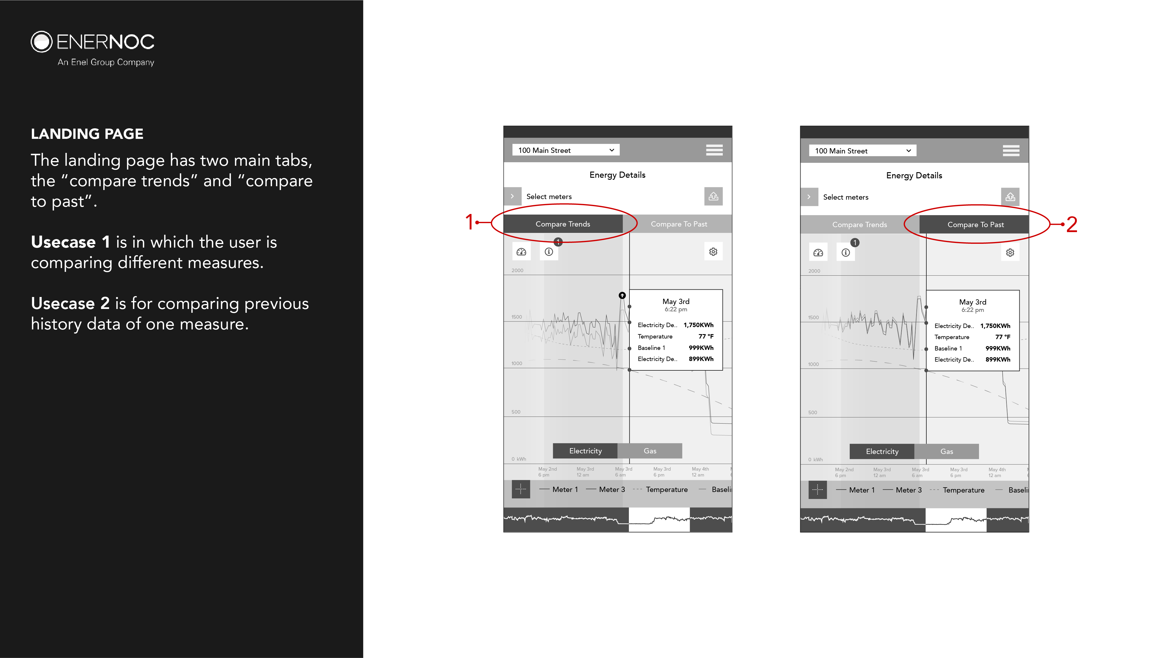
The graph screen needed to have an interaction model that would bilaterally accommodate comparison of different trends of different spaces while also capable of accommodating viewing of historical data. Thus "Compare Trends" and "Compare To Past" features became the two main tabs at the top of the graph screen.
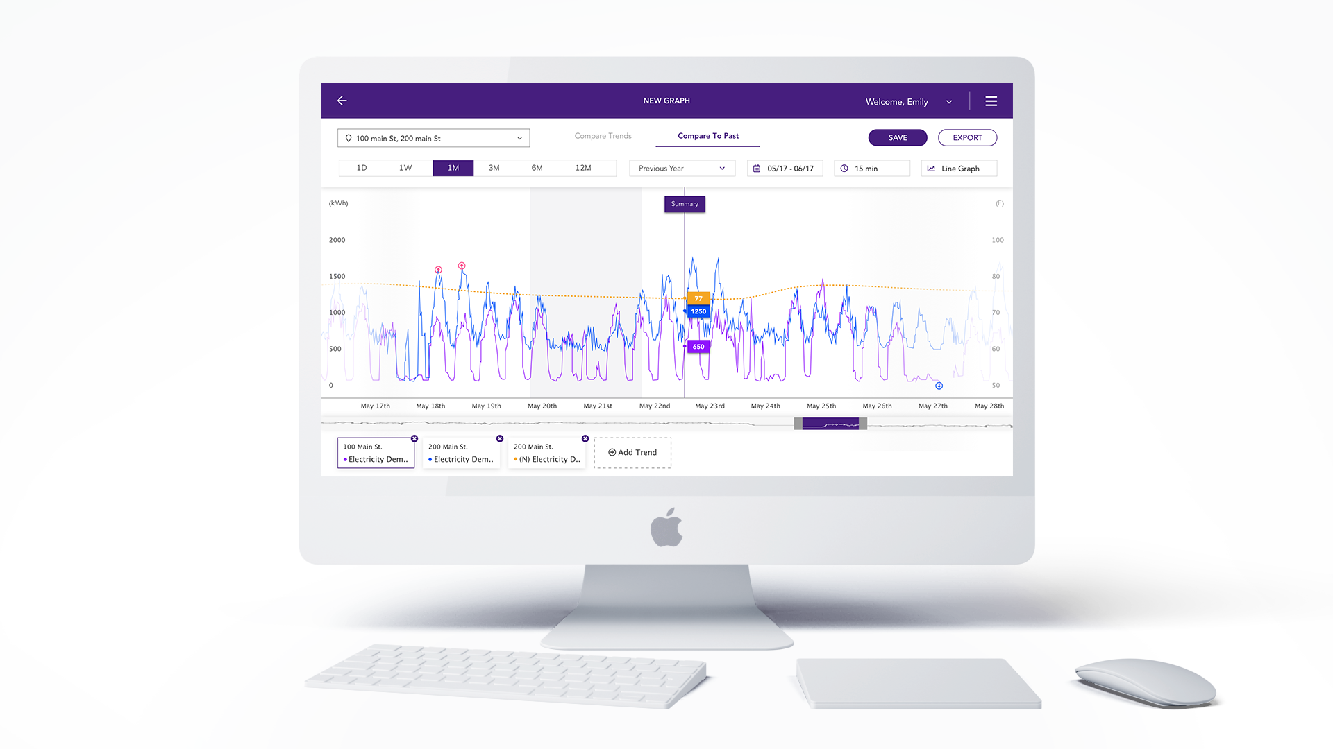
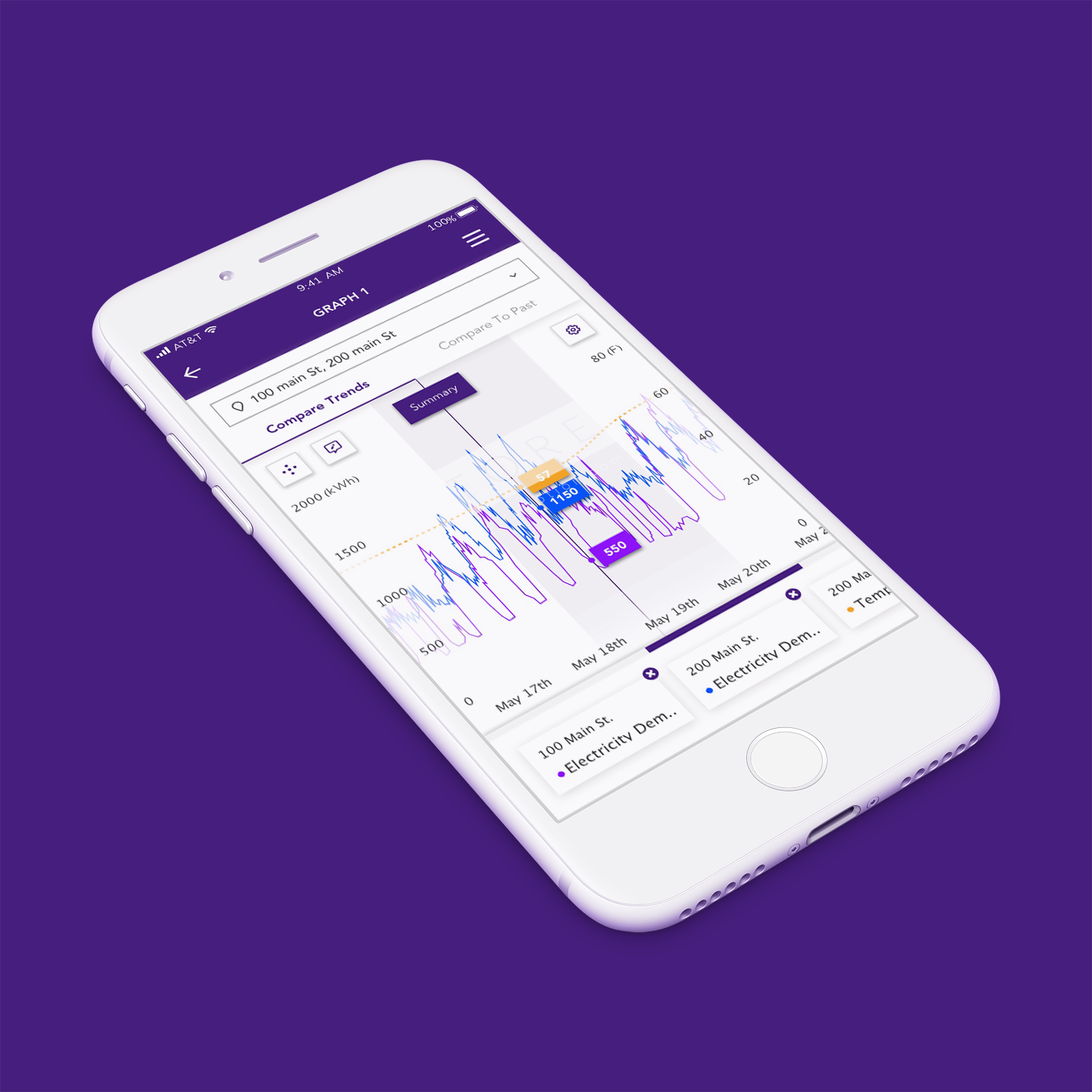
Compare Trends
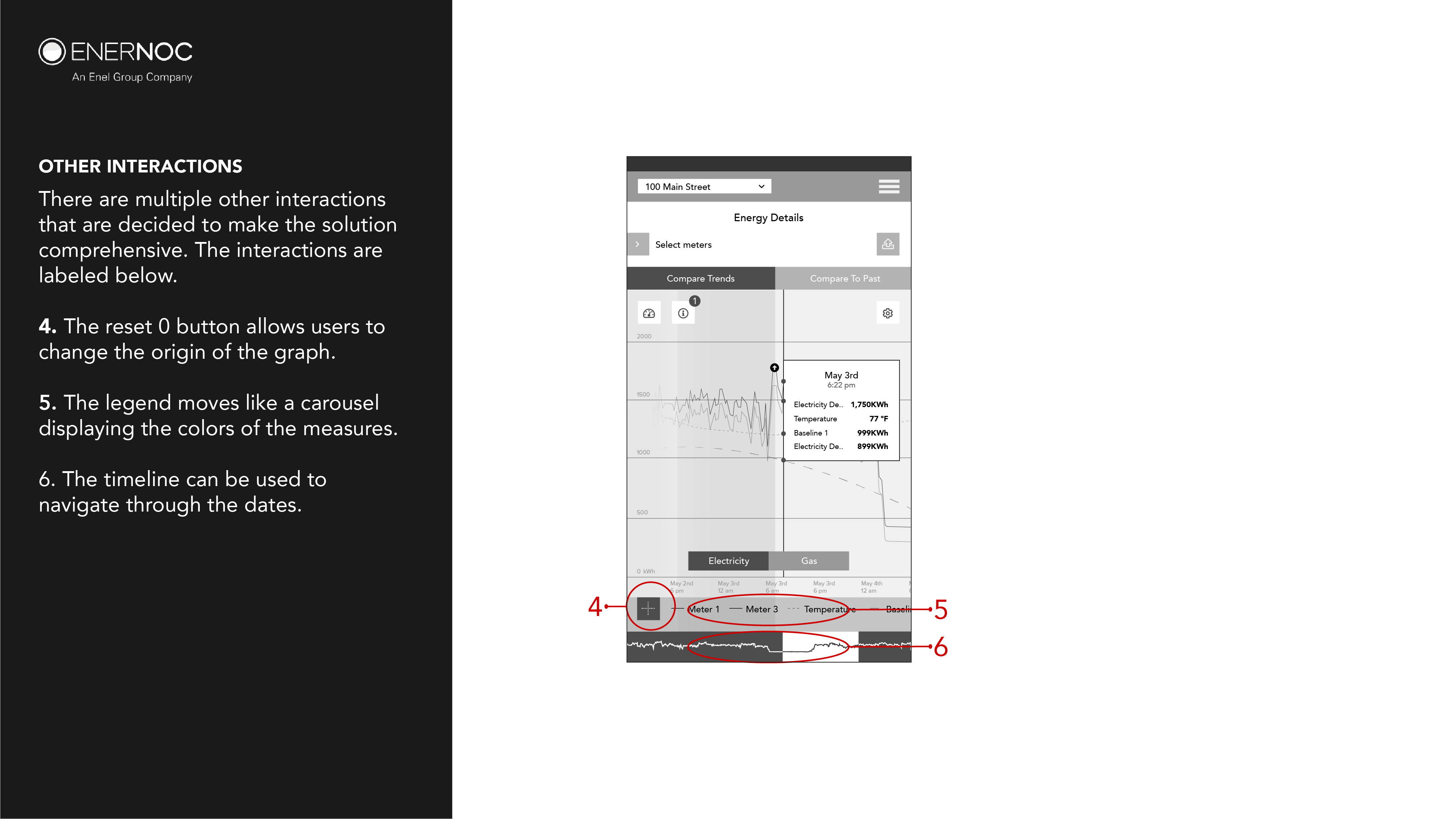
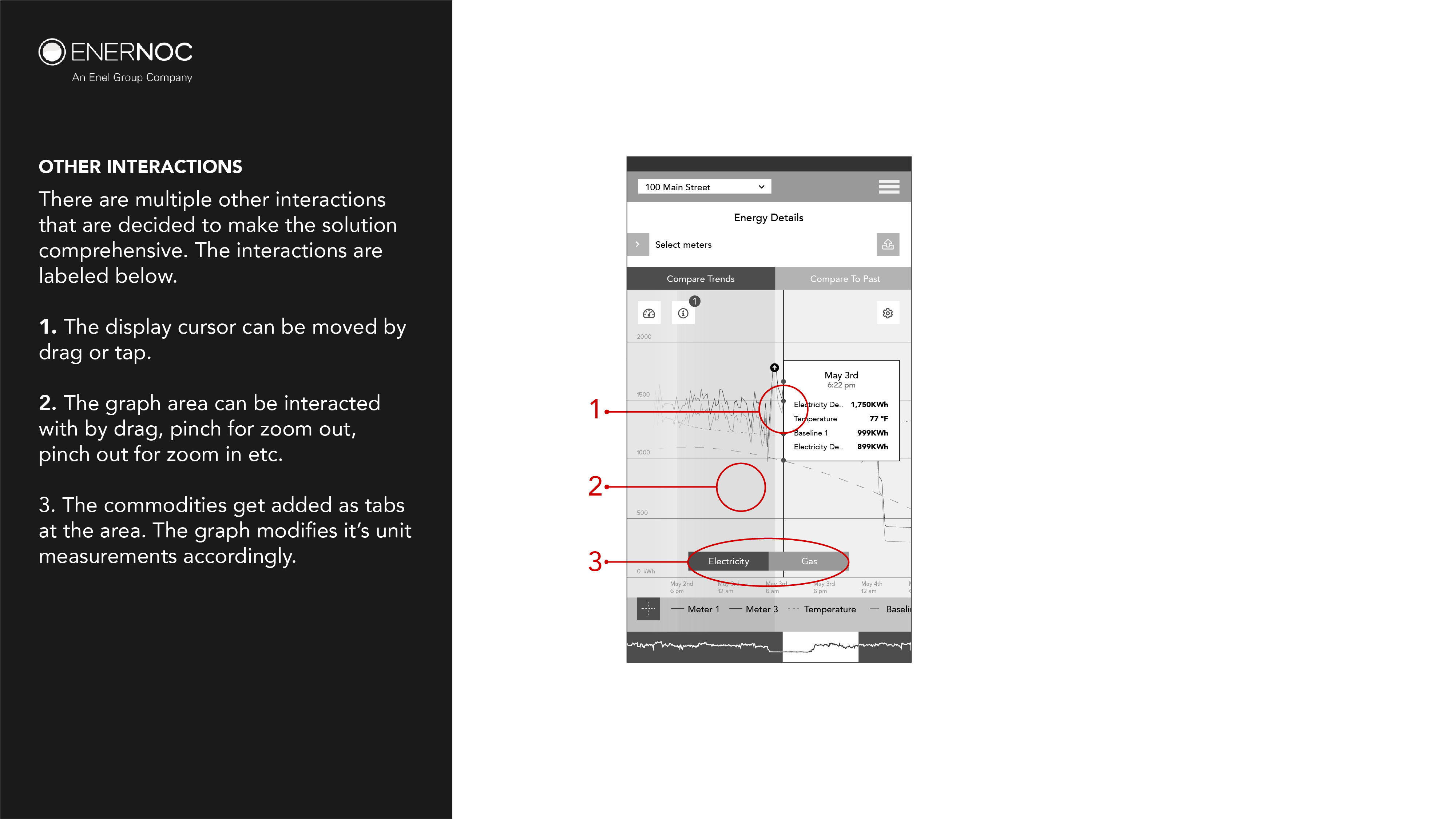
The most important functional screen for data dexterity and viewing is the compare trends feature. It needs to be able to compare up to 10 trends on the screen. This poses many interaction challenges. For this purpose, the added commodities per site are listed as a carousel on the bottom of the screen.
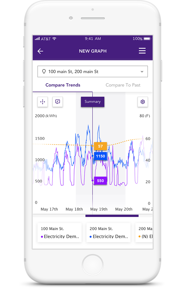
Trending Multiple Usages
All the commodities are trended with respect to each other. A carousel of commodities acts as a legend.
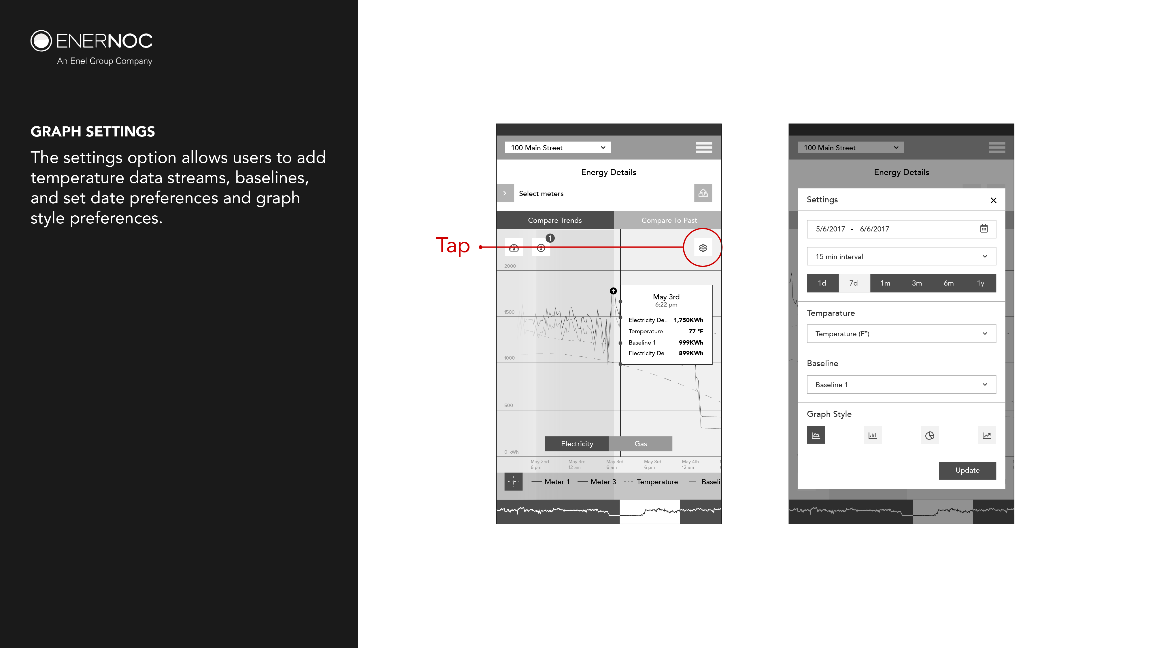
Preferencing Data
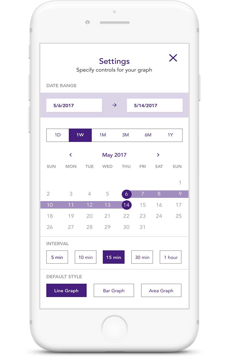
The users can click on the settings from Compare trends to access preferencing options.
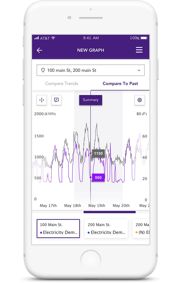
Compare To Past
Compare to past feature allows users to compare one commodity of one location to its historical data. The commodity carousel highlights which commodity has been shown and the settings allow for setting preferences for the data.
Learning From Mistakes
Compare one commodity of a single site to its previous or hostorical data displayed in grey scale. The commodity in use is highlighted.
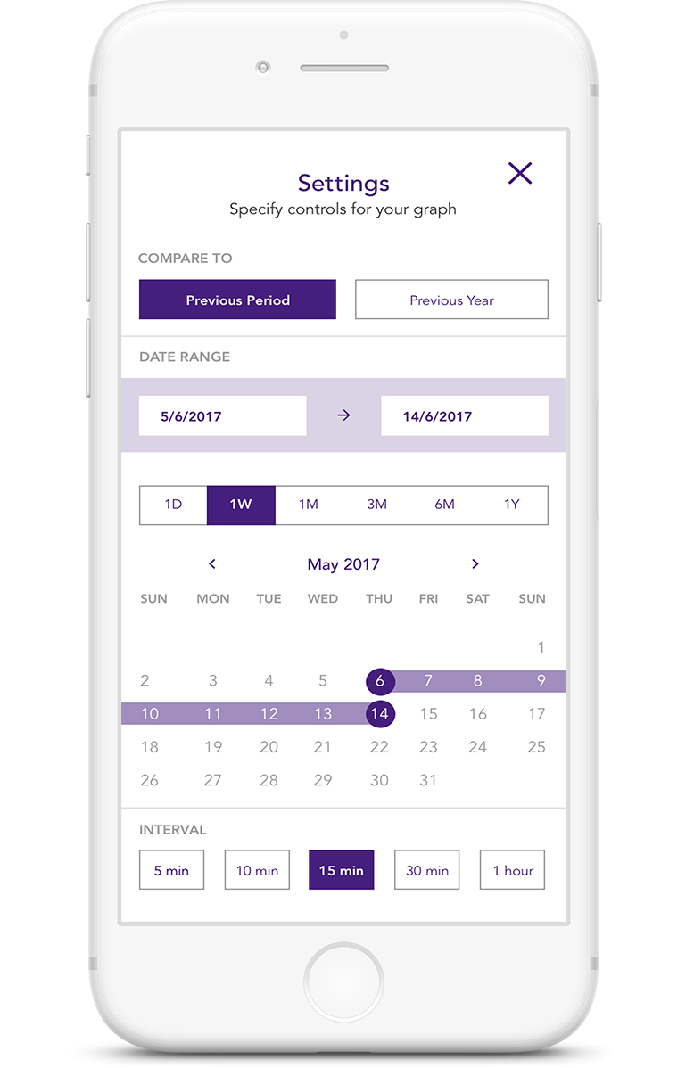
Preferencing Data
The user can set preferences for viewing past data from the settings button on compare to past.
Extending To Desktop
Trends began as a desktop application and because of the need for mobility, it was designed mobile first. But it still had a major user group which preferred to use trends on a desktop or on kiosks. For this purpose, the desktop version of trends was a requirement as well.
PROJECTS
Osmo - PlayOsmo StoreSolving contextual challenges and designing the store infrastructure | UX UI Design | Prototyping |Testing

MFA Thesis - ROVAR Authentic Travel Leveraging Local Social Media | Interaction Design | Prototyping
Enel X - TrendsEnergy Management & Demand Response | UX UI Design
SHOPRSmart shopping for events | UX UI Design
GigtherapyAn anxiety free concert experience | UX UI Design
© 2022 Akshay Kumar Arun