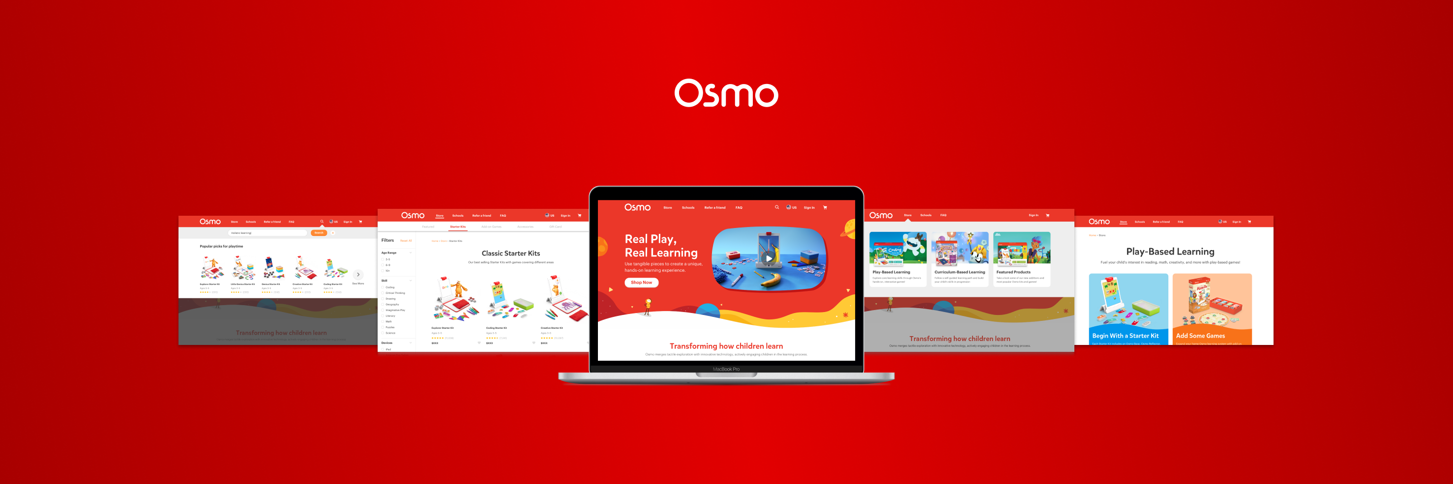
PLAYOSMO STORE ARCHITECTURE & OPTIMIZATIONS
Solving contextual challenges involved in the process of purchase and curation of an e-commerce store, playosmo.com
To comply with my non-disclosure agreement, I have omitted and obfuscated confidential information in this case study. All content in this case study are my views and does not necessarily reflect the views of Osmo.
THE PREMISE
The year is 2019, Osmo (TangiblePlay Inc.) an innovative e-learning company was acquired by BYJU'S, an India-based tech giant. I joined Osmo as a UX/UI Designer in 2019 to design their e-commerce ecosystem from the ground up.
The Osmo store at the time was a single scrollable webpage with product listings and the context behind the product hierarchy/categorizations conveyed progressively through scroll. This system while functional for the time being was not scalable with the upcoming product suites, the rapid expansion of the company, and increased product complexity.
Duration: 6 months
Skills: Information Architecture, UX Research, UI Design, Interaction Explorations, Prototyping, and Testing
Tools: Sketch, Figma, Adobe Illustrator, Photoshop, Principle
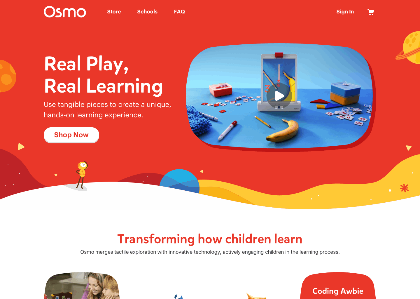
Previous PlayOsmo store (2019)
THE PROBLEM
I started by first identifying key pieces of context to provide to the user to help them start shopping and quickly realized this was going to be a problem. The amount of context the user needs to understand prior to differentiating between products was immense and could be categorized into three types.
THE PROBLEM
After identifying key pieces of context to provide to the user to help them get started, I quickly realized this was going to be a problem.
The amount of context the user needs to understand prior to differentiating between products was immense and could be categorized into three types.
1. COMMUNICATING THE SYSTEM
Osmo products are innovative and unique in it’s interaction model of combining digital feedback with tangible play.
The system itself includes the Osmo reflector, base for the tablet device, and tangible game pieces. The system’s complexity meant Osmo products were not immediately obvious to new users.

Animation created by the creative design team at Osmo
Animation created by the creative design team at Osmo
KEY TAKEAWAY
The first piece of context to give was how the Osmo system works. The user needs to understand the system in order to make critical decisions on the website.
2. COMMUNICATING PRODUCT HIERARCHY
Osmo retail products were designed for two types of users,
- New users just getting into the Osmo ecosystem
- Existing users who might want to purchase products to expand their Osmo system at home
Here are the main categories of products and their designated userbase—
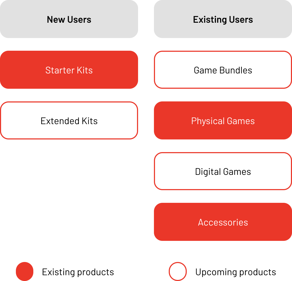
KEY TAKEAWAY
The user needs to understand the product hierarchy to decide which system works best for their situation. Product hierarchy was the second piece of context to establish.
3. NAVIGATING PRODUCT CONSTRAINTS
There were additional layers of abstraction to the existing contextual load in the form of product constraints—
3. NAVIGATING PRODUCT CONSTRAINTS
There were additional layers of abstraction to the existing contextual load in the form of product constraints—
- Digital games included in extended starter kits and game bundles, now required existing users to own certain tangible pieces prior to purchasing since these tangibles would not be included as a part of it.
- Game bundles were sub-divided into physical bundles (includes all pieces to play), and phygital bundles (includes part of the pieces but require users to have some pieces already).
- All games and Bundles also required a base to play which was not included as a part of the purchase since these were targetted at existing customers.
KEY TAKEAWAY
The final piece of context to give before the user decides which product would be best for them is the specific product constraints with each product listing in the store.
Design a scalable e-commerce system for a wide range of Osmo products while effectively communicating the product hierarchy and the benefits of the purchase of a product through a curated online store keeping in mind fast turnaround times for both design and development.
INITIAL APPROACH
PamyOsmo being an e-commerce web platform had a wide range of visitors ranging from parents in their early 20s to grandparents in their late 60s.
To drive better-curated design decisions, the primary target audience established by the team was parents/beneficiaries of children in the age range of 3–12, looking for supplementary learning tools to engage their child/children at home based on the current school curriculum standards—
- In the age range of 25–55
- Had an annual household income ranging from $40,000 – $1,00,000+ since the product lines had premium pricing and the family had to own either a Fire tablet or an iPad
- A resident of the United States since this was our primary market
Users from a wide range of age groups and skill sets would have to piece all of the above context as soon as possible to start shopping, and it would be overwhelming to provide all of this context at once to them.
INITIAL APPROACH
DIVIDE AND CONQUER
My initial approach was to segment the context into three parts on the website to test if it would still be overwhelming to our user base. This would also give us a chance to prioritize the order of information the user would get.
THE AHA MOMENT
My initial approach was to segment the context into three parts on the website to test if it would still be overwhelming to our user base. This would also give us a chance to prioritize the order of information the user would get.
USER JOURNEY
I began by mapping out the user journey and decision tree involved in purchasing a product for a new user since they needed the maximum context. This helped me understand the value system of the stakeholders and decide on the primary feature set.
CONTENT SCOPING
I began by mapping out the user journey and decision tree involved in purchasing a product for a new user since they needed the maximum context. This helped understand the value system of the stakeholders and decide the primary feature set.
CONCEPTUALIZING THE STORE
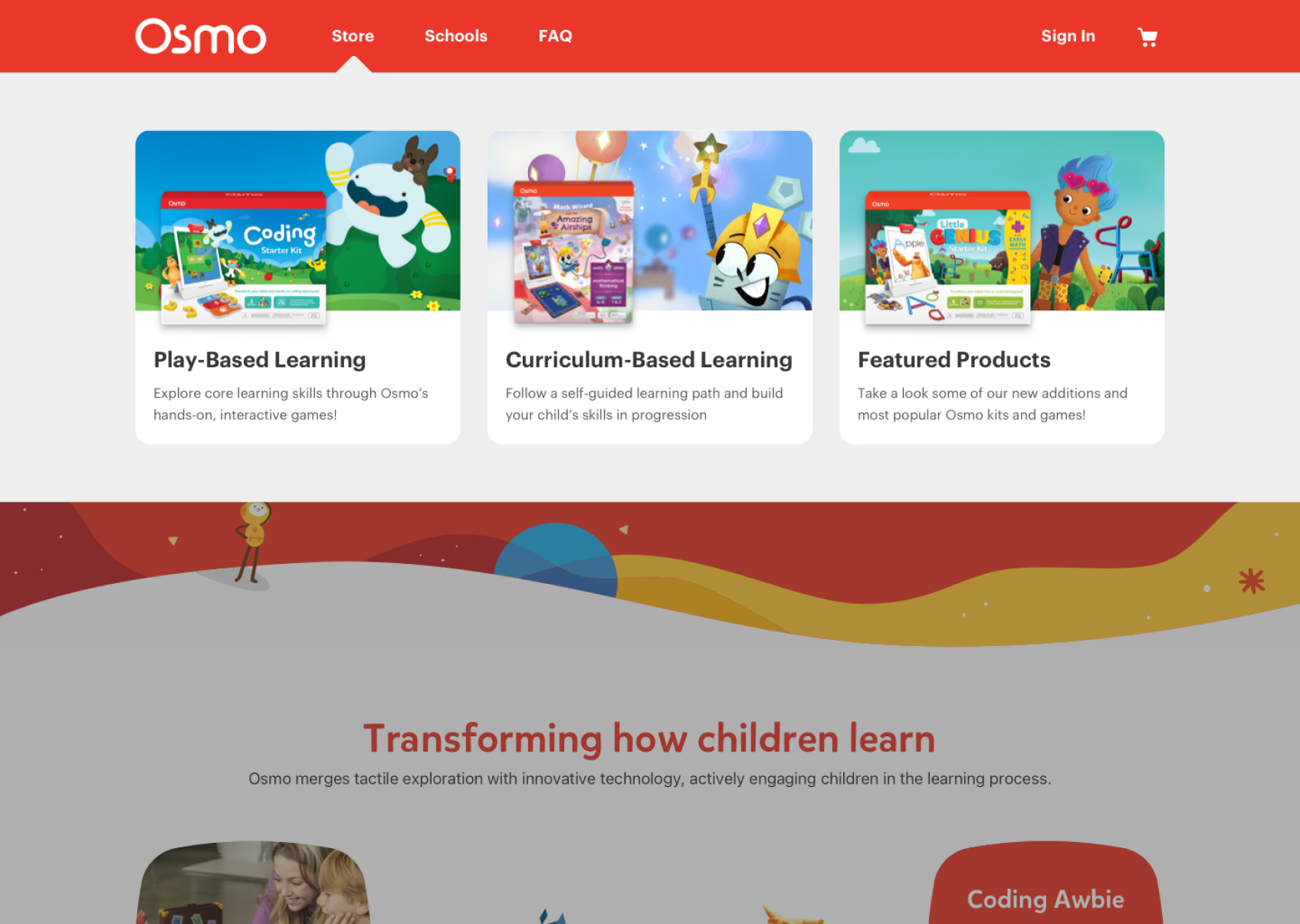
To combine the three feature sets established earlier, I started iterating on a layout for the store. I experimented with how filters would be applied and scoped which set of features would take priority for the initial launch.
After multiple rounds of reviews and discussions with the development team and stakeholders, I had a few takeaways to help me move forward—
- Having product types on their own page worked best from a scalability and communications standpoint. Starter Kits, Add-On games, and Accessories would be part of the store’s navigation moving forward.
- Development bandwidth constraints meant features like Search, New user survey flows and capabilities to filter based on hardware owned would have to be pushed beyond the scope of an MVP for launch.
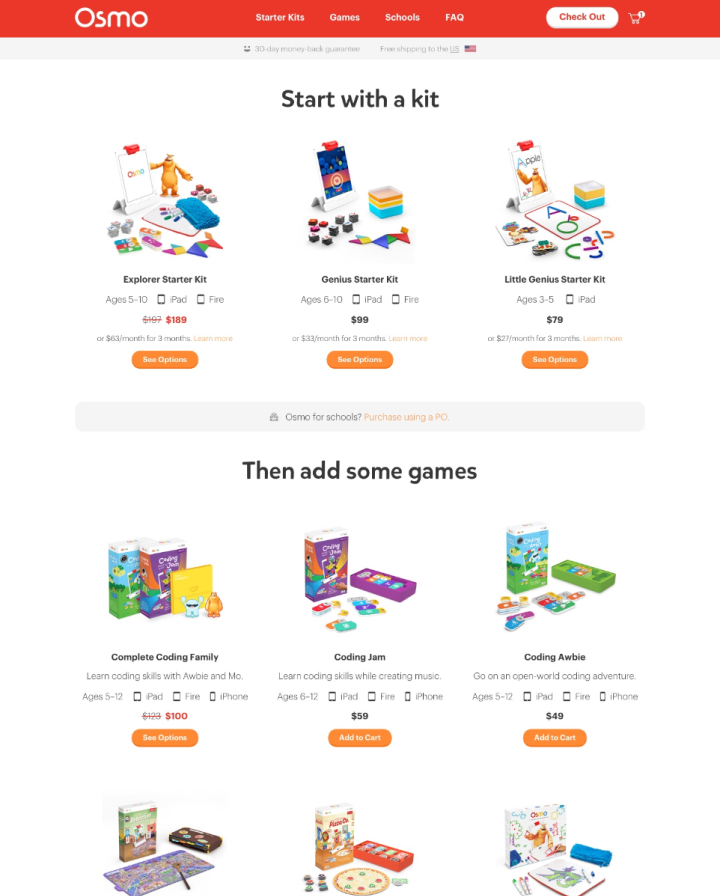
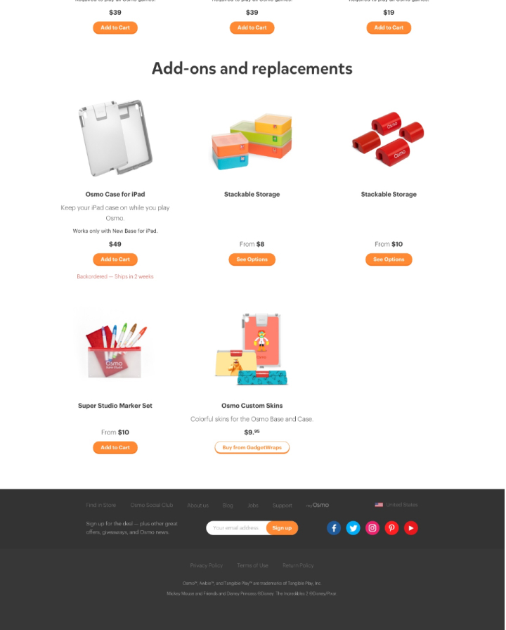
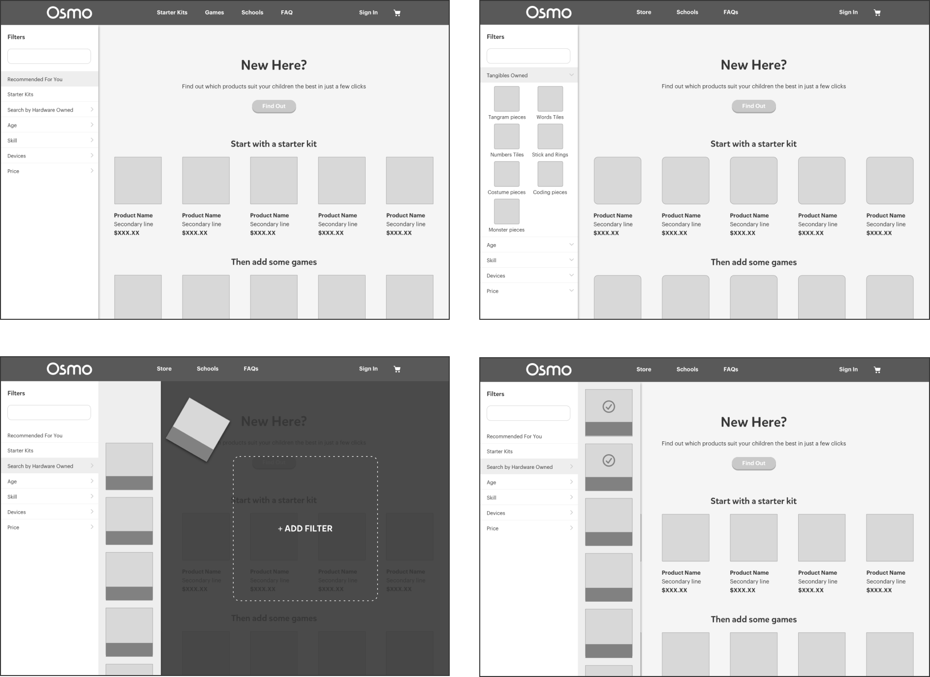
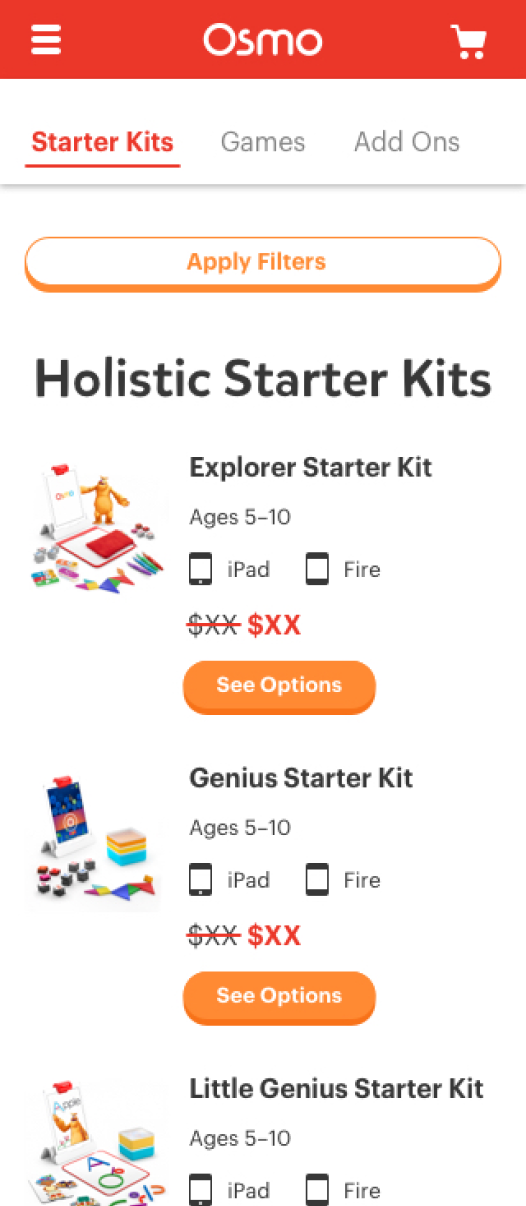
EVALUATING THE MVP
Osmo, a rapidly expanding ecosystem, needed the store to be live as soon as possible. The specifications for the minimum viable store were decided and further optimizations on the website would be done through research and performance tracking post-launch. This is what the minimum viable product looked like—
TESTING & LEARNINGS
I ran routine tests on the store to get an idea wether we were able to mitigate the cognitive load with our existing solution. I ran unmoderated tests in the form of think aloud user tests, heatmaps, and A/B tests to identify pain points.
Positives:
- Provided a scalable system for upcoming product suites
- The new filter system was working and we saw more user engagement with them.
Negatives:
- Conversion rates were still low
- Many live session recordings and heatmaps showed users leaving within the first 10 seconds. This was particularly true for users led directly to the store from external channels like social media.
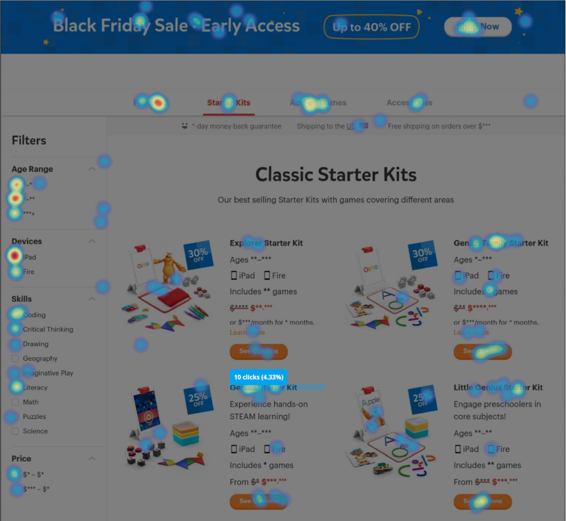
Heatmaps and think aloud user tests revealed user engagement with the new filters
THE VERDICT
Segmenting out the contextual load was working but the store itself was still overwhelming. When a user lands on the store directly from external channels, they don't know where to click and thus rely heavily on the filters.
THE VERDICT
Segmenting out the contextual load was working to an extent but the store itself was still overwhelming to users.
REVISED APPROACH
I compiled my learnings and noted the users were relying heavily on the filters. I decided to use the user's intent behind the purchase as a driver to help them land on the right page of the store. Here are some of the major initiatives undertaken to further ease the cognitive load.
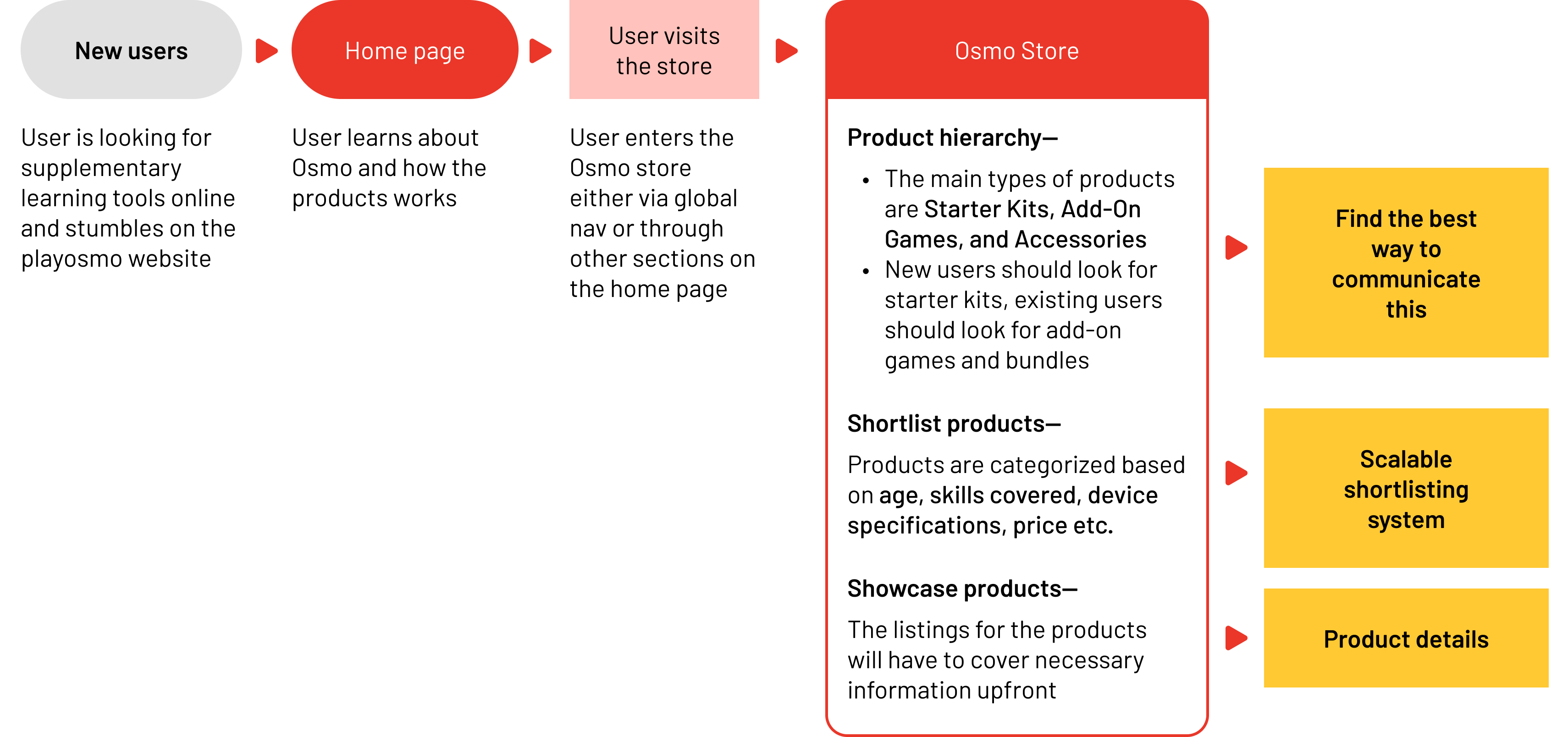
INTENT DRIVEN DESIGN
Based on testing results and user behavior data, the revised approach to tackling the user journey was to drive context and flow using user intents and help them make critical decisions first. The store would now have a home page providing buckets of intent to drive the purchase journey.
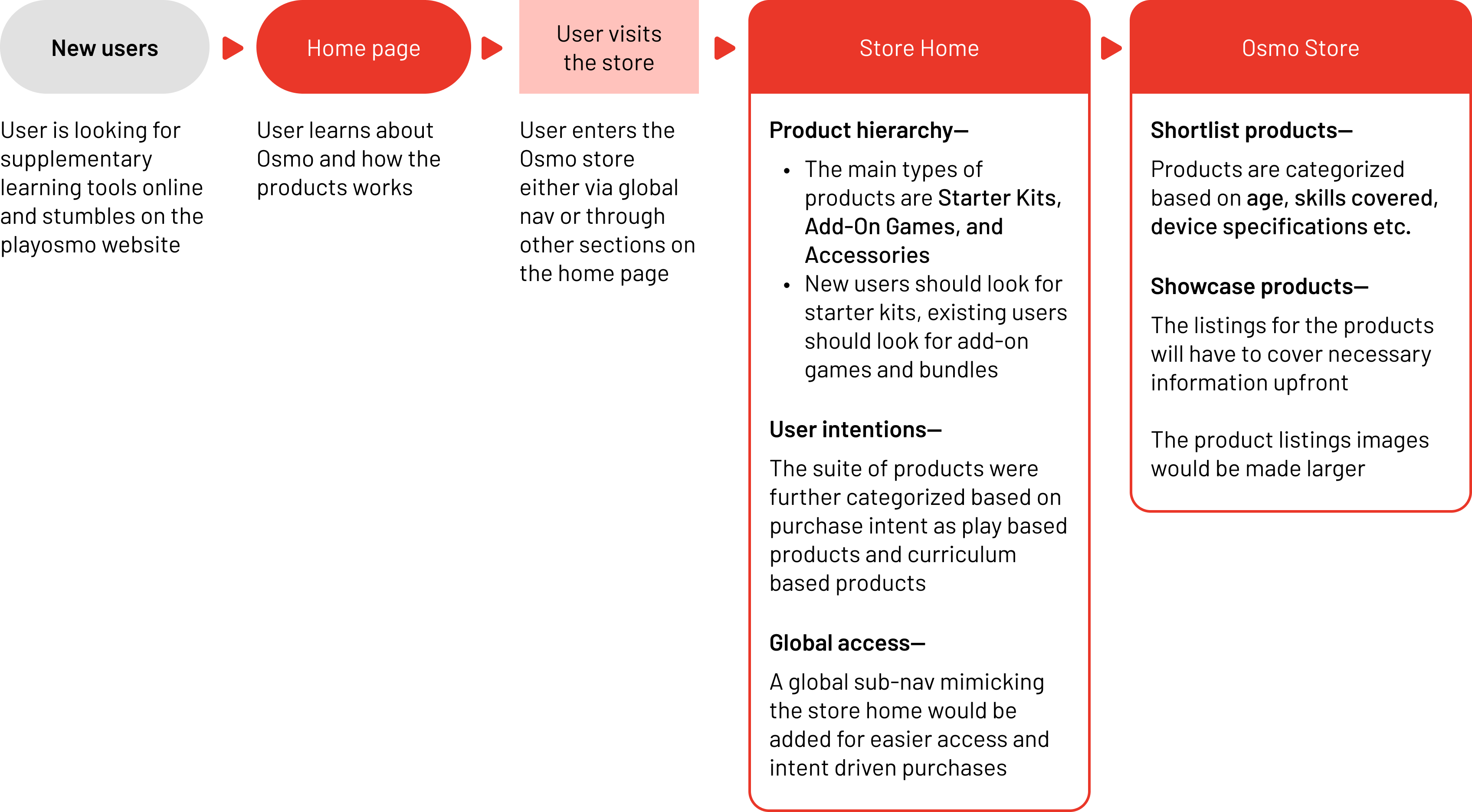
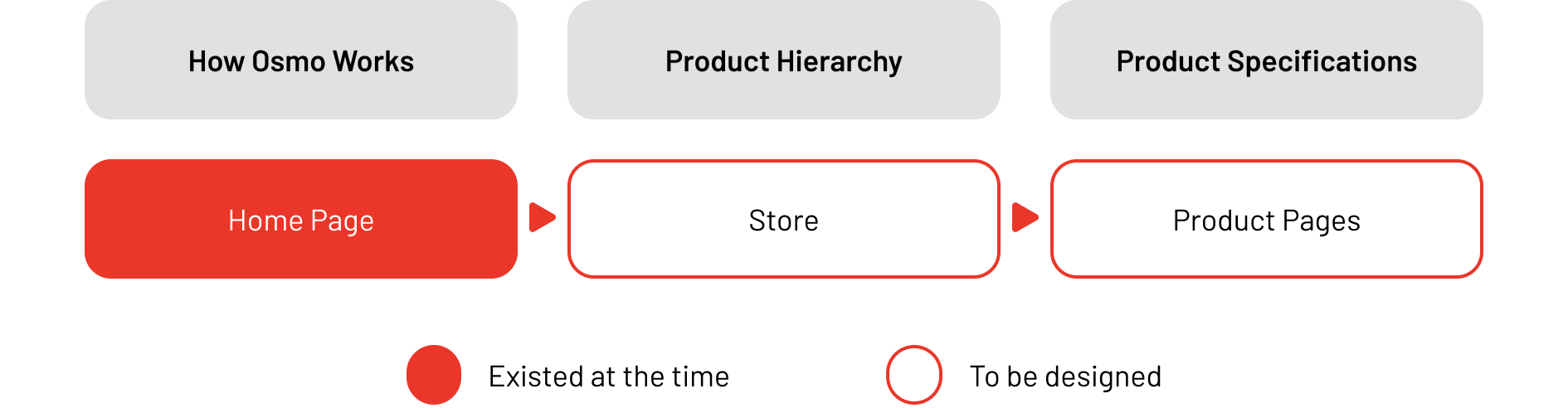
BUCKETS OF INTENT
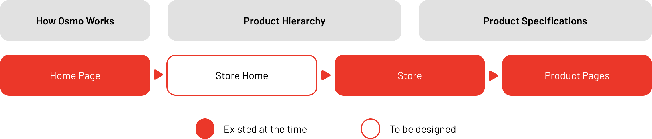
To provide external channels a landing page, and a dedicated place for establishing product hierarchy, I added a new step/page between the home page and the store itself. The store would now have a home page providing buckets of intent to drive the purchase journey.
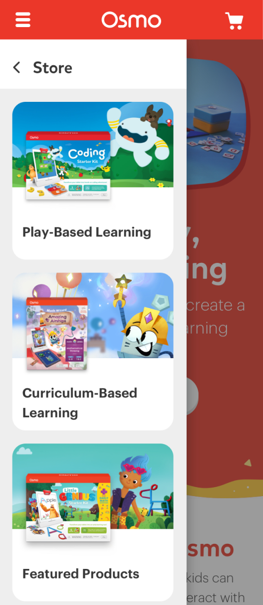
GLOBAL VISIBILITY
I added a sub-navigation bar to the store tab on the main navbar. This would activate on hover for desktop and tap on mobile. The purpose of this was to provide global exposure to the store home and facilitate intent-driven shopping further.
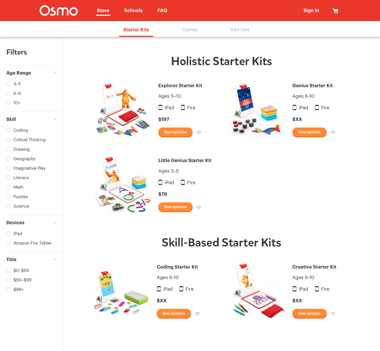
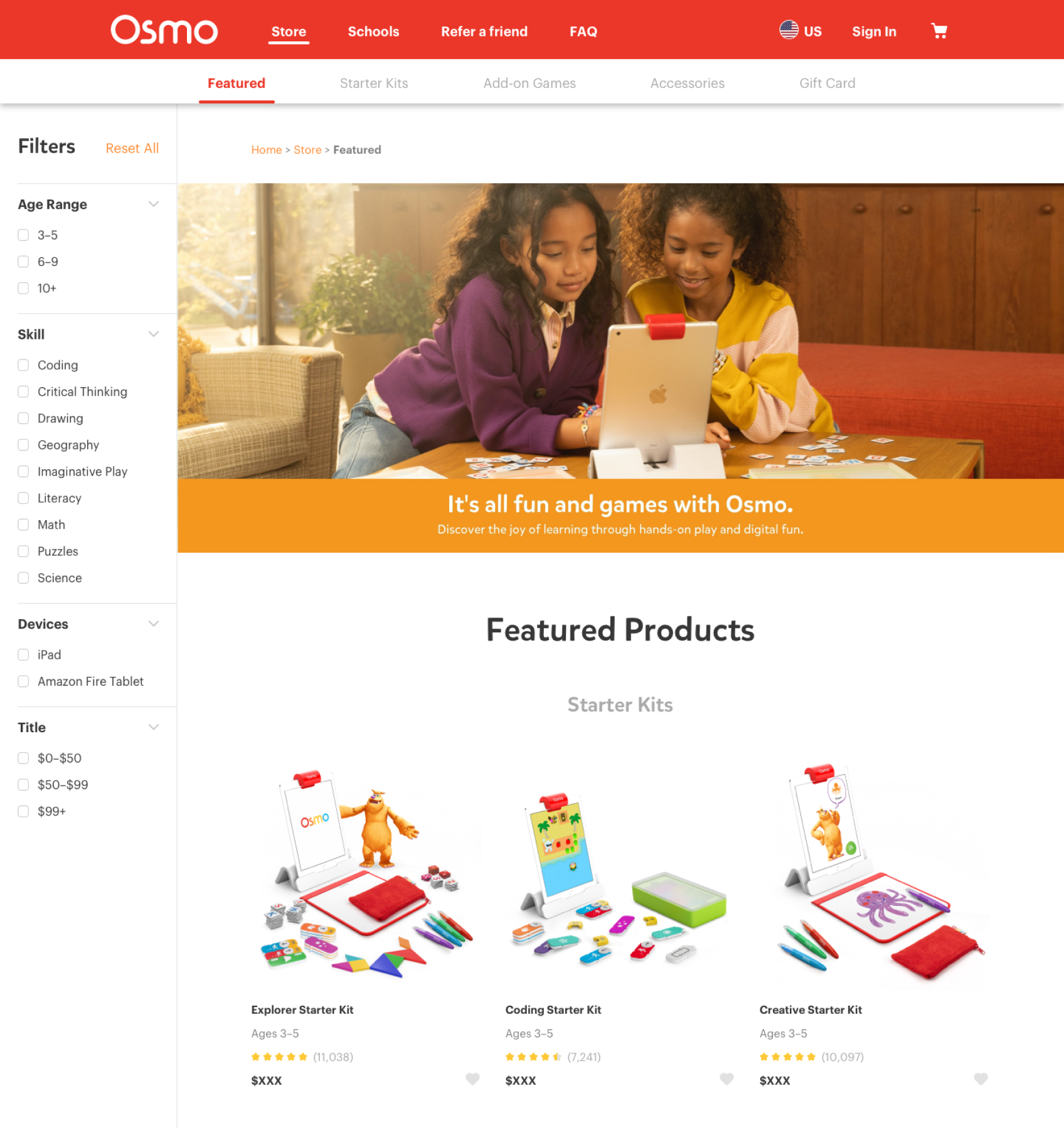
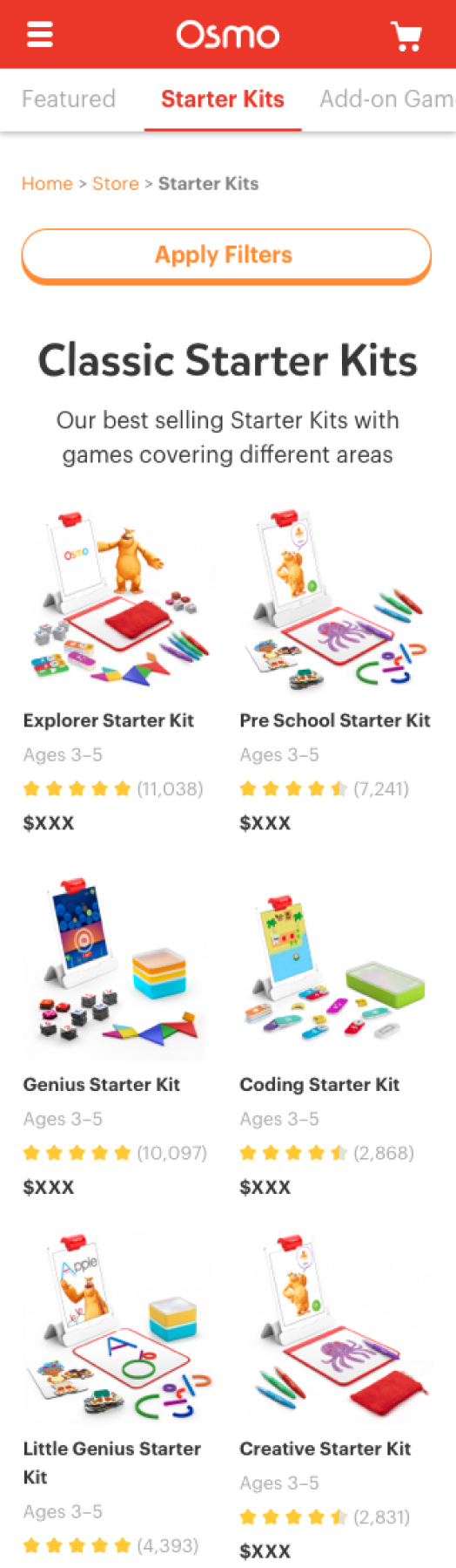
THE NEW OSMO STORE
There were a few updates to the Osmo store.
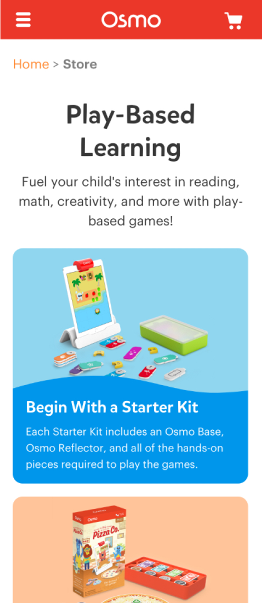
- The first update was the addition of the Featured page to showcase products with the highest demand.
- To compensate for the lack of context the user had, a lot of information had been added to the listings. This was detrimental as it added to the cognitive load instead of helping with context. I redesigned the product listing with just the primary information.
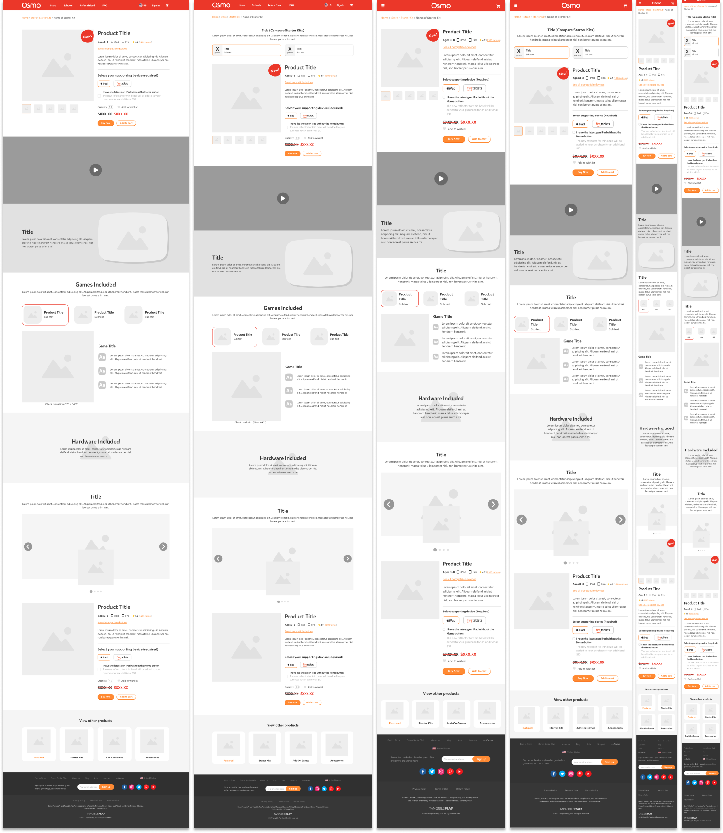
THE PRODUCT PAGES
With each new product launch, the primary initiative was to compile the product details and create a product display page for it. Here are few product pages that were created for Osmo's flagship products—
THE PRODUCT PAGES
With each new product launch, the primary initiative was to compile the product details and create a product display page for it. From my initial testing, I found that about 24% of the users failed to understand the various differences and nuances in bundled purchases and about 50% missed the important context that some of these purchases required the user to own certain tangibles.
The product pages had to be designed to be robust enough to avoid wrongful/incomplete purchases. Here are few product pages that were created for Osmo's flagship products—
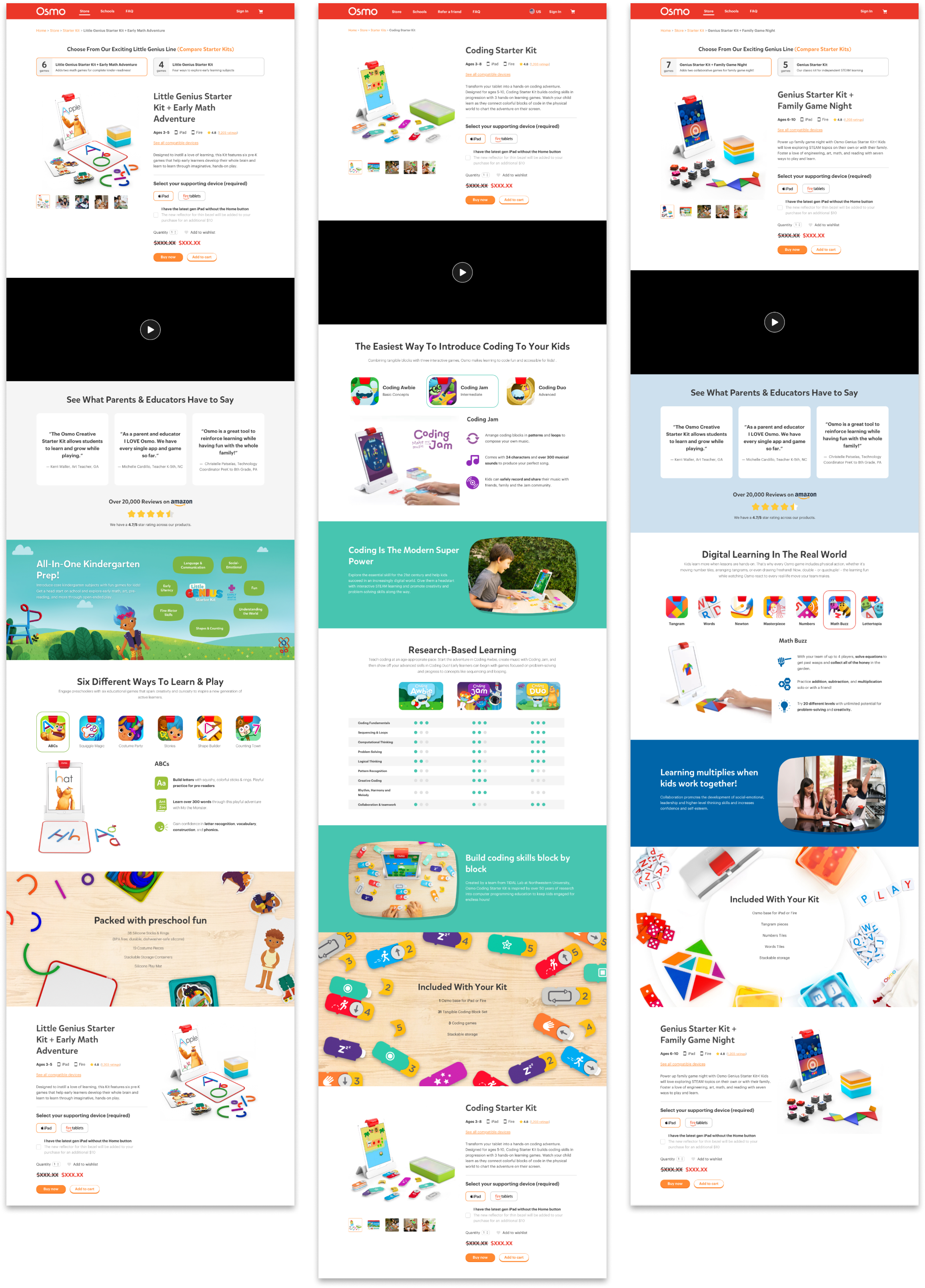
After identifying patterns in product context over multiple landing pages, I started templatizing the structure. This reduced design turnaround times for product pages from a few weeks to a few days.
This also allowed engineers to templatize product page sections on their end as well, decreasing development turnaround times.
INTEGRATING SEARCH
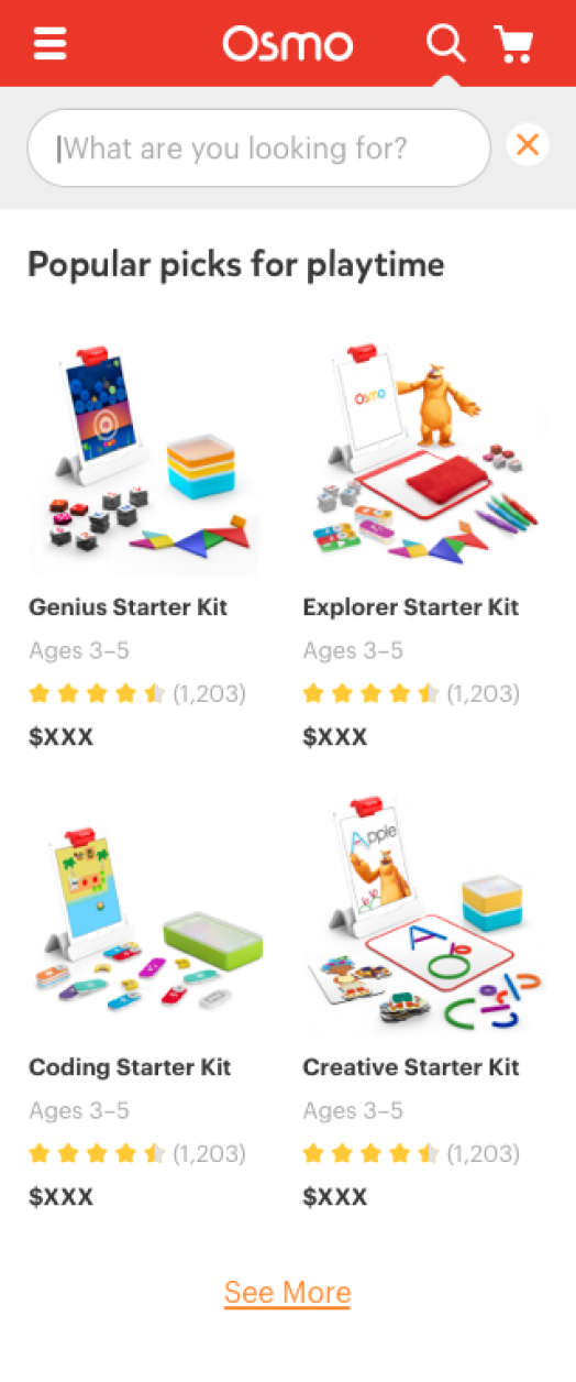
To further capture user intent and facilitate calculated purchasing decisions, we decided to integrate search into our global ecosystem. Similar to the store home, the search feature needed global exposure as well so a drop-down was added to the global navigation.
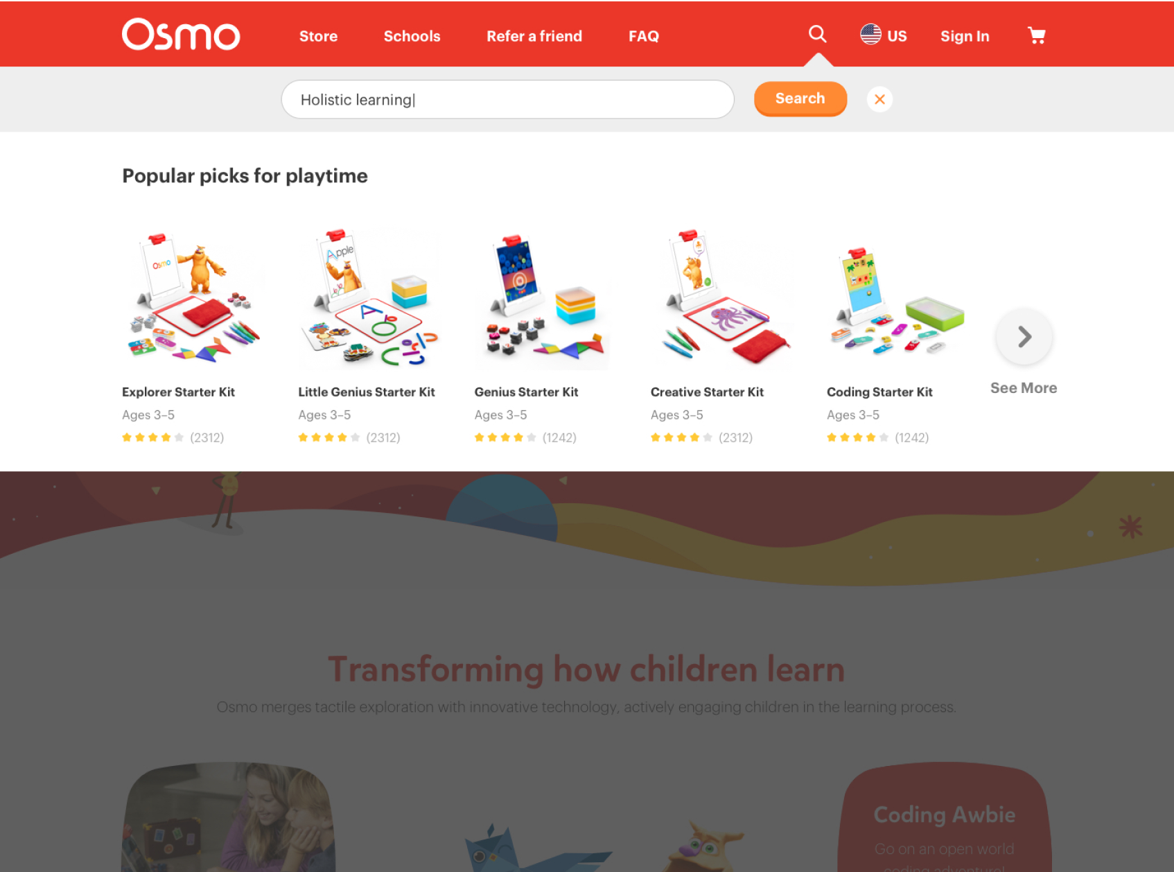
RESULTS
Here are some key highlights as a result of these design decisions—
- The new system is scalable to existing and upcoming product suites
- It is flexible to accommodate marketing campaigns to better drive sales
- It divides the cognitive load and helps deliver required context much better to new users
- Product page templates were effective in fast turnaround times with design and development.
All of the above factors and with the cumulative effort of the entire playosmo team,
The revenue from the playosmo.com website effectively doubled in 2020, and 2021 from what it was in 2019 when the project began
The rate at which users added products to cart from the store and transitioned into checkout also known as conversion rates increased exponentially through 2020 and 2021
PROJECTS
Osmo - PlayOsmo StoreSolving contextual challenges and designing the store infrastructure | UX UI Design | Prototyping |Testing

MFA Thesis - ROVAR Authentic Travel Leveraging Local Social Media | Interaction Design | Prototyping
Enel X - TrendsEnergy Management & Demand Response | UX UI Design
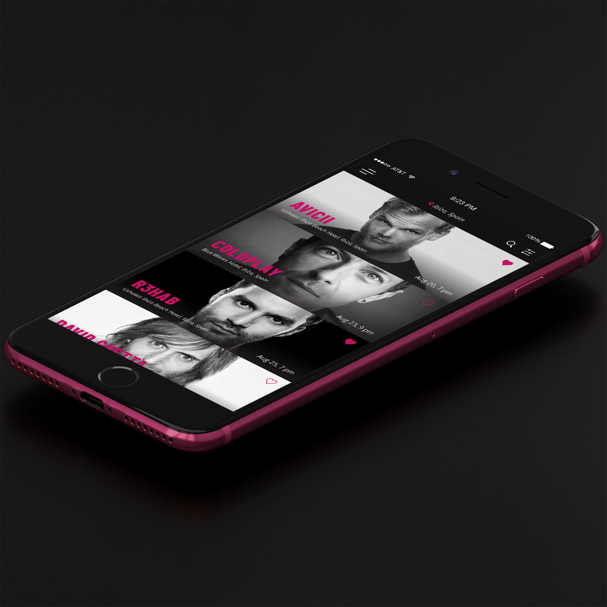
SHOPRSmart shopping for events | UX UI Design
GigtherapyAn anxiety free concert experience | UX UI Design
© 2022 Akshay Kumar Arun